This chapter discusses all UIView subclasses provided by UIKit that haven’t been discussed already (except for the two modal dialog classes, which are described in the next chapter). It’s remarkable how few of them there are; UIKit exhibits a noteworthy economy of means in this regard.
Additional UIView subclasses are provided by other frameworks. For example, the Map Kit framework provides the MKMapView (Chapter 34). Also, additional UIViewController subclasses are provided by other frameworks as a way of creating interface. For example, the MessageUI framework provides MFMailComposeViewController, which supplies a user interface for composing and sending a mail message (Chapter 33). There will be lots of examples in Part VI. Some Frameworks.
An activity indicator (UIActivityIndicatorView) appears as the spokes of a small wheel. You set the spokes spinning with startAnimating, giving the user a sense that some time-consuming process is taking place. You stop the spinning with stopAnimating. If the activity indicator’s hidesWhenStopped is YES (the default), it is visible only while spinning.
An activity indicator comes in a style, its activityIndicatorViewStyle; if it is created in code, you’ll set its style with initWithActivityIndicatorStyle:. Your choices are:
-
UIActivityIndicatorViewStyleWhiteLarge -
UIActivityIndicatorViewStyleWhite -
UIActivityIndicatorViewStyleGray
An activity indicator has a standard size, which depends on its style. Changing its size in code changes the size of the view, but not the size of the spokes. For bigger spokes, you can resort to a scale transform.
You can assign an activity indicator a color; this overrides the color assigned through the style. An activity indicator is a UIView, so you can set its backgroundColor; a nice effect is to give an activity indicator a contrasting background color and to round its corners by way of the view’s layer (Figure 25.1):
self.activity.color = [UIColor yellowColor];
self.activity.backgroundColor = [UIColor colorWithWhite:0.2 alpha:0.4];
self.activity.layer.cornerRadius = 10;
CGRect f = self.activity.bounds;
f.size.width += 10;
f.size.height += 10;
self.activity.bounds = f;

Here’s some code from a UITableViewCell subclass in one of my apps. In this app, it takes some time, after the user taps a cell to select it, for me to construct the next view and navigate to it; to cover the delay, I show a spinning activity indicator in the center of the cell while it’s selected:
- (void)setSelected:(BOOL)selected animated:(BOOL)animated {
    if (selected) {
        UIActivityIndicatorView* v =
            [[UIActivityIndicatorView alloc] initWithActivityIndicatorStyle:
                UIActivityIndicatorViewStyleWhiteLarge];
        v.center =
            CGPointMake(self.bounds.size.width/2.0,
                        self.bounds.size.height/2.0);
        v.frame = CGRectIntegral(v.frame);
        v.color = [UIColor yellowColor];
        v.tag = 1001;
        [self.contentView addSubview:v];
        [v startAnimating];
    } else {
        [[self.contentView viewWithTag:1001] removeFromSuperview];
        // no harm if non-existent
    }
    [super setSelected:selected animated:animated];
}
If activity involves the network, you might want to set UIApplication’s networkActivityIndicatorVisible to YES.
This displays a small spinning activity indicator in the status bar. The indicator is not reflecting actual network activity; if it’s visible, it’s spinning. Be sure to set it back to NO when the activity is over.
An activity indicator is simple and standard, but you can’t change the way it’s drawn. One obvious alternative would be a UIImageView with an animated image, as described in Chapter 17.
A progress view (UIProgressView, Figure 25.2) is a “thermometer,” graphically displaying a percentage. It is often used to represent a time-consuming process whose percentage of completion is known (if the percentage of completion is unknown, you’re more likely to use an activity indicator). But it’s good for static percentages too. In one of my apps, I use a progress view to show the current position within the song being played by the built-in music player; in another app, which is a card game, I use a progress view to show how many cards are left in the deck.
A progress view comes in a style, its progressViewStyle; if the progress view is created in code, you’ll set its style with initWithProgressViewStyle:. Your choices are:
-
UIProgressViewStyleDefault -
UIProgressViewStyleBar
The latter is intended for use in a UIBarButtonItem, as the title view of a navigation item, and so on.
The height (the narrow dimension) of a progress view is generally not up to you; it’s determined by the progress view’s style. Changing a progress view’s height has no visible effect on how the thermometer is drawn.
The fullness of the thermometer is the progress view’s progress property. This is a value between 0 and 1, inclusive; obviously, you’ll need to do some elementary arithmetic in order to convert from the actual value you’re reflecting to a value within that range. For example, to reflect the number of cards remaining in a deck of 52 cards:
prog.progress = [[deck cards] count] / 52.0;
You can animate the change from one progress value to another by calling setProgress:animated:.
You can customize the colors or images of the parts of the progress view. To customize the colors, set the progress view’s progressTintColor and trackTintColor (the track is the unfilled part of the progress view); this can also be done in the nib. To customize the images, set the progress view’s progressImage and trackImage; these, if set, override the tint colors. The images will be squashed and stretched to fill the appropriate bounds, so a good choice is a resizable image whose height is the progress view’s standard height (9 points). In this simple example, the track image and progress image are squares rotated 45 degrees:
UIGraphicsBeginImageContextWithOptions(CGSizeMake(9,9), NO, 0);
CGContextRef con = UIGraphicsGetCurrentContext();
CGContextSetFillColorWithColor(con, [UIColor blackColor].CGColor);
CGContextMoveToPoint(con, 0, 4.5);
CGContextAddLineToPoint(con, 4.5, 9);
CGContextAddLineToPoint(con, 9, 4.5);
CGContextAddLineToPoint(con, 4.5, 0);
CGContextClosePath(con);
CGPathRef p = CGContextCopyPath(con);
CGContextFillPath(con);
UIImage* im = UIGraphicsGetImageFromCurrentImageContext();
CGContextSetFillColorWithColor(con, [UIColor whiteColor].CGColor);
CGContextAddPath(con, p);
CGContextFillPath(con);
UIImage* im2 = UIGraphicsGetImageFromCurrentImageContext();
CGPathRelease(p);
UIGraphicsEndImageContext();
im = [im resizableImageWithCapInsets:UIEdgeInsetsMake(4, 4, 4, 4)
                        resizingMode:UIImageResizingModeStretch];
im2 = [im2 resizableImageWithCapInsets:UIEdgeInsetsMake(4, 4, 4, 4)
                          resizingMode:UIImageResizingModeStretch];
prog.trackImage = im;
prog.progressImage = im2;
For additional customization — for example, to make a taller progress view — you can design your own UIView subclass that draws something similar to a thermometer. Figure 25.3 shows a simple custom thermometer view; it has a value property, and you set this to something between 0 and 1 and call setNeedsDisplay to make the view redraw itself. Here’s its drawRect: code:
- (void)drawRect:(CGRect)rect {
    CGContextRef c = UIGraphicsGetCurrentContext();
    [[UIColor whiteColor] set];
    CGFloat ins = 2.0;
    CGRect r = CGRectInset(self.bounds, ins, ins);
    CGFloat radius = r.size.height / 2.0;
    CGMutablePathRef path = CGPathCreateMutable();
    CGPathMoveToPoint(path, nil, CGRectGetMaxX(r)-radius, ins);
    CGPathAddArc(path, nil,
        radius+ins, radius+ins, radius, -M_PI/2.0, M_PI/2.0, true);
    CGPathAddArc(path, nil,
        CGRectGetMaxX(r)-radius, radius+ins, radius,
        M_PI/2.0, -M_PI/2.0, true);
    CGPathCloseSubpath(path);
    CGContextAddPath(c, path);
    CGContextSetLineWidth(c, 2);
    CGContextStrokePath(c);
    CGContextAddPath(c, path);
    CGContextClip(c);
    CGContextFillRect(c, CGRectMake(
        r.origin.x, r.origin.y, r.size.width * self.value, r.size.height));
}

A UIPickerView displays selectable choices using a rotating drum metaphor. It has a standard legal range of possible heights, which is undocumented and must be discovered by trial and error (attempting to set the height outside this range will fail with a warning in the console); its width is largely up to you. Each drum, or column, is called a component.
Your code configures the UIPickerView’s content through its data source (UIPickerViewDataSource) and delegate (UIPickerViewDelegate), which are usually the same object (see also Chapter 11). Your data source and delegate must answer questions similar to those posed by a UITableView (Chapter 21):
-
numberOfComponentsInPickerView:(data source) - How many components (drums) does this picker view have?
-
pickerView:numberOfRowsInComponent:(data source) -
How many rows does this component have? The first component is numbered
0. -
pickerView:titleForRow:forComponent:
pickerView:attributedTitleForRow:forComponent:(new in iOS 6)
pickerView:viewForRow:forComponent:reusingView:(delegate) -
What should this row of this component display? The first row is numbered
0. You can supply a simple string, an attributed string (Chapter 23), or an entire view such as a UILabel; but you should supply every row of every component the same way. ThereusingViewparameter, if not nil, is a view that you supplied for a row now no longer visible, giving you a chance to reuse it, much as cells are reused in a table view.
Here’s the code for a UIPickerView (Figure 25.4) that displays the names of the 50 U.S. states, stored in an array. We implement pickerView:viewForRow:forComponent:reusingView: just because it’s the most interesting case; as our views, we supply UILabel instances. The state names appear centered because the labels are centered within the picker view:
- (NSInteger)numberOfComponentsInPickerView:(UIPickerView *)pickerView {
    return 1;
}

- (NSInteger)pickerView:(UIPickerView *)pickerView
        numberOfRowsInComponent:(NSInteger)component {
    return 50;
}

- (UIView *)pickerView:(UIPickerView *)pickerView viewForRow:(NSInteger)row
          forComponent:(NSInteger)component reusingView:(UIView *)view {
    UILabel* lab;
    if (view)
        lab = (UILabel*)view; // reuse it
    else
        lab = [UILabel new];
    lab.text = self.states[row];
    lab.backgroundColor = [UIColor clearColor];
    [lab sizeToFit];
    return lab;
}
The delegate may further configure the UIPickerView’s physical appearance by means of these methods:
-
pickerView:rowHeightForComponent: -
pickerView:widthForComponent:
The delegate may implement pickerView:didSelectRow:inComponent: to be notified each time the user spins a drum to a new position. You can also query the picker view directly by sending it selectedRowInComponent:.
You can set the value to which any drum is turned using selectRow:inComponent:animated:. Other handy picker view methods allow you to request that the data be reloaded, and there are properties and methods to query the picker view’s contents (though of course they do not relieve you of responsibility for knowing the data model from which the picker view’s contents are supplied):
-
reloadComponent: -
reloadAllComponents -
numberOfComponents -
numberOfRowsInComponent: -
viewForRow:forComponent:
By implementing pickerView:didSelectRow:inComponent: and using reloadComponent: you can make a picker view where the values displayed by one drum depend dynamically on what is selected in another. For example, one can imagine expanding our U.S. states example to include a second drum listing major cities in each state; when the user switches to a different state in the first drum, a different set of major cities appears in the second drum.
A search bar (UISearchBar) is essentially a wrapper for a text field; it has a text field as one of its subviews, though there is no official access to it. It is displayed by default as a rounded rectangle containing a magnifying glass icon, where the user can enter text (Figure 25.5). It does not, of itself, do any searching or display the results of a search; a common interface involves displaying the results of a search as a table, and the UISearchDisplayController class makes this easy to do (see Chapter 21).
A search bar’s current text is its text property. It can have a placeholder, which appears when there is no text. A prompt can be displayed above the search bar to explain its purpose. Delegate methods (UISearchBarDelegate) notify you of editing events; for their use, compare the text field and text view delegate methods discussed in Chapter 23:
-
searchBarShouldBeginEditing: -
searchBarTextDidBeginEditing: -
searchBar:textDidChange: -
searchBar:shouldChangeTextInRange:replacementText: -
searchBarShouldEndEditing: -
searchBarTextDidEndEditing:
A search bar has a barStyle, for which your choices are UIBarStyleDefault or UIBarStyleBlack, and either translucent or not. Alternatively, the search bar may have a tintColor. The bar style and tint color are the same as for a navigation bar or toolbar (see later in this chapter), and are drawn as a navigation bar or toolbar would draw them; thus, a search bar looks good where a navigation bar or toolbar might go.
A search bar can have a custom backgroundImage; this will be treated as a resizable image (that is, it will be either stretched or tiled; see Chapter 15), and overrides the bar style or tint color.
The search field area where the user enters text can be offset with respect to its background with the searchFieldBackgroundPositionAdjustment property; you might use this, for example, if you had enlarged the search bar’s height and wanted to position the field area within that height. The text can be offset within the field area with the searchTextPositionAdjustment property.
You can also replace the image of the search field itself; this is the image that is normally a rounded rectangle. To do so, call setSearchFieldBackgroundImage:forState:. According to the documentation, the possible state: values are UIControlStateNormal and UIControlStateDisabled; but the API provides no way in which a search field can be disabled, so what does Apple have in mind here? The only way I’ve found is to cycle through the search bar’s subviews, find the search field, and disable it:
for (UIView* v in self.sb.subviews) {
    if ([v isKindOfClass: [UITextField class]]) {
        UITextField* tf = (UITextField*)v;
        tf.enabled = NO;
        break;
    }
}
The search field image will be drawn in front of the background and behind the contents of the search field (such as the text); its width will be adjusted for you, but its height will not be — instead, the image is placed vertically centered where the search field needs to go, and choosing an appropriate height, and ensuring a light-colored area in the middle so the user can read the text, is up to you.
A search bar displays an internal cancel button automatically (normally an X in a circle) if there is text in the search field. Internally, at its right end, a search bar may display a search results button (showsSearchResultsButton), which may be selected or not (searchResultsButtonSelected), or a bookmark button (showsBookmarkButton); if you ask to display both, you’ll get the search results button. These buttons vanish if text is entered in the search bar so that the cancel button can be displayed. There is also an option to display a Cancel button externally (showsCancelButton, or call setShowsCancelButton:animated:). The internal cancel button works automatically to remove whatever text is in the field; the other buttons do nothing, but delegate methods notify you when they are tapped:
-
searchBarResultsListButtonClicked: -
searchBarBookmarkButtonClicked: -
searchBarCancelButtonClicked:
You can customize the images used for the internal left icon (the magnifying glass, by default) and any of the internal right icons (the cancel button, the search results button, and the bookmark button) with setImage:forSearchBarIcon:state:. About 20×20 seems to be a good size for the image. The icons are specified with constants:
-
UISearchBarIconSearch -
UISearchBarIconClear -
UISearchBarIconBookmark -
UISearchBarIconResultsList
The documentation says that the possible state: values are UIControlStateNormal and UIControlStateDisabled, but this is wrong; the choices are UIControlStateNormal and UIControlStateHighlighted. The highlighted image appears while the user taps on the icon (except for the left icon, which isn’t a button). If you don’t supply a normal image, the default image is used; if you supply a normal image but no highlighted image, the normal image is used for both. Setting searchResultsButtonSelected to YES reverses this button’s behavior: it displays the highlighted image, but when the user taps it, it displays the normal image.
The position of an icon can be adjusted with setPositionAdjustment:forSearchBarIcon:.
A search bar may also display scope buttons (see the example in Chapter 21). These are intended to let the user alter the meaning of the search; precisely how you use them is up to you. To make the scope buttons appear, use the showsScopeBar property; the button titles are the scopeButtonTitles property, and the currently selected scope button is the selectedScopeButtonIndex property. The delegate is notified when the user taps a different scope button:
-
searchBar:selectedScopeButtonIndexDidChange:
The overall look of the scope bar can be heavily customized. Its background is the scopeBarBackgroundImage, which will be stretched or tiled as needed. To set the background of the smaller area constituting the actual buttons, call setScopeBarButtonBackgroundImage:forState:; the states are UIControlStateNormal and UIControlStateSelected. If you don’t supply a separate selected image, a darkened version of the normal image is used. If you don’t supply a resizable image, the image will be made resizable for you; the runtime decides what region of the image will be stretched behind each button.
The dividers between the buttons are normally vertical lines, but you can customize them as well: call setScopeBarButtonDividerImage:forLeftSegmentState:rightSegmentState:. A full complement of dividers consists of three images, one when the buttons on both sides of the divider are normal (unselected) and one each when a button on one side or the other is selected; if you supply an image for just one state combination, it is used for the other two state combinations. The height of the divider image is adjusted for you, but the width is not; you’ll normally use an image just a few pixels wide.
The font attributes of the titles of the scope buttons can customized with respect to their font, color, shadow color, and shadow offset; this is done by calling setScopeBarButtonTitleTextAttributes:forState:. The attributes: argument is a dictionary whose possible keys will be used for several interface objects in this chapter, so I’ll call it a text attributes dictionary. Don’t confuse a text attributes dictionary and its keys with an attributed string attributes dictionary and its keys:
-
UITextAttributeFont, a UIFont; a zero size means “the default size” -
UITextAttributeTextColor, a UIColor -
UITextAttributeTextShadowColor, a UIColor -
UITextAttributeTextShadowOffset, a UIOffset wrapped up as an NSValue
(All the customizing set... methods I’ve mentioned have a corresponding getter, whose name is the same without the “set” prefix.)
It may appear that there is no way to customize the external Cancel button, but in fact, although you’ve no official direct access to it through the search bar, the Cancel button is a UIBarButtonItem and you can customize it using the UIBarButtonItem appearance proxy, discussed later in this chapter.
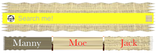
By combining the various customization possibilities, a completely unrecognizable search bar of inconceivable ugliness can easily be achieved (Figure 25.6). Let’s be careful out there.
The problem of allowing the keyboard to appear without hiding the search bar is exactly as for a text field (Chapter 23). Text input properties of the search bar configure its keyboard and typing behavior like a text field as well: keyboardType, autocapitalizationType, autocorrectionType, and spellCheckingType (and, new in iOS 6, inputAccessoryView). When the user taps the Search key in the keyboard, the delegate is notified, and it is then up to you to dismiss the keyboard (resignFirstResponder) and perform the search:
-
searchBarSearchButtonClicked:
A common interface on the iPad is to embed a search bar as a bar button item’s view in a toolbar at the top of the screen. This approach has its pitfalls; for example, there is no room for a prompt, and scope buttons or an external Cancel button may not appear either. One rather slimy workaround is to layer the search bar over the toolbar rather than having it genuinely live in the toolbar. Another is to have the search bar itself occupy the position of the toolbar at the top of the screen. On the other hand, a search bar in a toolbar that is managed by a UISearchDisplayController will automatically display search results in a popover, which can be a considerable savings of time and effort (though the popover controller is unfortunately out of your hands); see Chapter 22 for an example.
UIControl is a subclass of UIView whose chief purpose is to be the superclass of several further built-in classes and to endow them with common behavior. These are classes representing views with which the user can interact (controls).
The most important thing that controls have in common is that they automatically track and analyze touch events (Chapter 18) and report them to your code as significant control events by way of action messages. Each control implements some subset of the possible control events. The full set of control events is listed under UIControlEvents in the Constants section of the UIControl class documentation:
-
UIControlEventTouchDown -
UIControlEventTouchDownRepeat -
UIControlEventTouchDragInside -
UIControlEventTouchDragOutside -
UIControlEventTouchDragEnter -
UIControlEventTouchDragExit -
UIControlEventTouchUpInside -
UIControlEventTouchUpOutside -
UIControlEventTouchCancel -
UIControlEventValueChanged -
UIControlEventEditingDidBegin -
UIControlEventEditingChanged -
UIControlEventEditingDidEnd -
UIControlEventEditingDidEndOnExit -
UIControlEventAllTouchEvents -
UIControlEventAllEditingEvents -
UIControlEventAllEvents
The control events also have informal names that are visible in the Connections inspector when you’re editing a nib. I’ll mostly use the informal names in the next couple of paragraphs.
Control events fall roughly into three groups: the user has touched the screen (Touch Down, Touch Drag Inside, Touch Up Inside, etc.), edited text (Editing Did Begin, Editing Changed, etc.), or changed the control’s value (Value Changed).
Apple’s documentation is rather coy about which controls normally emit actions for which control events, so here’s a list obtained through experimentation. Keep in mind that Apple’s silence on this matter may mean that the details are subject to change:
- UIButton
- All “Touch” events.
- UIDatePicker
- Value Changed.
- UIPageControl
- All “Touch” events, Value Changed.
- UIRefreshControl
- Value Changed.
- UISegmentedControl
- Value Changed.
- UISlider
- All “Touch” events, Value Changed.
- UISwitch
- All “Touch” events, Value Changed.
- UIStepper
- All “Touch” events, Value Changed.
- UITextField
- All “Touch” events except the “Up” events, and all “Editing” events (see Chapter 23 for details).
For each control event that you want to hear about automatically, you attach to the control one or more target–action pairs. You can do this in the nib (Chapter 7) or in code (Chapter 11).
For any given control, each control event and its target–action pairs form a dispatch table. The following methods permit you to manipulate and query the dispatch table:
-
addTarget:action:forControlEvents: -
removeTarget:action:forControlEvents: -
actionsForTarget:forControlEvent: -
allTargets -
allControlEvents(a bitmask of control events to which a target–action pair is attached)
An action selector may adopt any of three signatures, whose parameters are:
- The control and the UIEvent
- The control only
- No parameters
The second signature is by far the most common. It’s unlikely that you’d want to dispense altogether with the parameter telling you which control sent the control event. On the other hand, it’s equally unlikely that you’d want to examine the original UIEvent that triggered this control event, since control events deliberately shield you from dealing with the nitty-gritty of touches — though you might have some reason to examine the UIEvent’s timestamp.
When a control event occurs, the control consults its dispatch table, finds all the target–action pairs associated with that control event, and reports the control event by sending each action message to the corresponding target.
Note
The action messaging mechanism is actually more complex than I’ve just stated. The UIControl does not really send the action message directly; rather, it tells the shared application to send it. When a control wants to send an action message reporting a control event, it calls its own sendAction:to:forEvent: method. This in turn calls the shared application instance’s sendAction:to:from:forEvent:, which actually sends the specified action message to the specified target. In theory, you could call or override either of these methods to customize this aspect of the message-sending architecture, but it is extremely unlikely that you would do so.
To make a control emit its action message to a particular control event right now, in code, call its sendActionsForControlEvents: method (which is never called automatically by the framework). For example, suppose you tell a UISwitch programmatically to change its setting from Off to On. This doesn’t cause the switch to report a control event, as it would if the user had slid the switch from off to on; if you wanted it to do so, you could use sendActionsForControlEvents:, like this:
[switch setOn: YES animated: YES];
[switch sendActionsForControlEvents:UIControlEventValueChanged];
You might also use sendActionsForControlEvents: in a subclass to customize the circumstances under which a control reports control events.
A control has enabled, selected, and highlighted properties; any of these can be YES or NO independently of the others. These correspond to its state, which is reported as a bitmask of three possible values:
-
UIControlStateHighlighted -
UIControlStateDisabled -
UIControlStateSelected
A fourth state, UIControlStateNormal, corresponding to a zero state bitmask, means that enabled, selected, and highlighted are all NO.
A control that is not enabled does not respond to user interaction; whether the control also portrays itself differently, to cue the user to this fact, depends upon the control. For example, a disabled UISwitch is faded. But a rounded rect text field, unless you explicitly configure it to display a different background image when disabled (Chapter 23), gives the user no cue that it is disabled. The visual nature of control selection and highlighting, too, depends on the control. Neither highlighting nor selection make any difference to the appearance of a UISwitch, but a highlighted UIButton usually looks quite different from a nonhighlighted UIButton.
A control has contentHorizontalAlignment and contentVerticalAlignment properties. Again, these matter only if the control has content that can be aligned. You are most likely to use these properties in connection with a UIButton to position its title and internal image.
A text field (UITextField) is a control; see Chapter 23. A refresh control (UIRefreshControl) is a control; see Chapter 21. The remaining controls are covered here, and then I’ll give a simple example of writing your own custom control.
A UISwitch (Figure 25.7) portrays a BOOL value: it looks like a sliding switch whose positions are labeled ON and OFF, and its on property is either YES or NO. The user can slide or tap to toggle the switch’s position. When the user changes the switch’s position, the switch reports a Value Changed control event. To change the on property’s value with accompanying animation, call setOn:animated:.

A switch has only one size (apparently 79×27); any attempt to set its size will be ignored. A switch is not as wide, or drawn the same way, as it was in system versions before iOS 5.
Starting in iOS 5 it became possible to set a switch’s onTintColor, and in iOS 6, after years of developer trickery and workarounds, Apple has at last relented and now permits you set a switch’s tintColor and thumbTintColor as well. The switch in Figure 25.8 has a black onTintColor and an orange thumbTintColor; it also has a red tintColor, but you can’t see that because the switch is ON.

But wait, there’s more! iOS 6 also allows you set a switch’s onImage and offImage. This means that you can at last legally change the words shown inside the switch. Here’s how I drew the “YES” in Figure 25.9:
UIGraphicsBeginImageContextWithOptions(CGSizeMake(79,27), NO, 0);
[[UIColor blackColor] setFill];
UIBezierPath* p = [UIBezierPath bezierPathWithRect:CGRectMake(0,0,79,27)];
[p fill];
NSMutableParagraphStyle* para = [NSMutableParagraphStyle new];
para.alignment = NSTextAlignmentCenter;
NSAttributedString* att =
    [[NSAttributedString alloc] initWithString:@"YES" attributes:
        @{
            NSFontAttributeName:[UIFont fontWithName:@"GillSans-Bold" size:16],
            NSForegroundColorAttributeName:[UIColor whiteColor],
            NSParagraphStyleAttributeName:para
        }];
[att drawInRect:CGRectMake(0,5,79,22)];
UIImage* im = UIGraphicsGetImageFromCurrentImageContext();
UIGraphicsEndImageContext();
self.sw2.onImage = im;

Warning
Don’t name a UISwitch instance variable or property switch, as this is a reserved word in C.
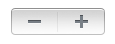
A stepper (UIStepper, Figure 25.10) lets the user increase or decrease a numeric value: it looks like two buttons side by side, one labeled (by default) with a minus sign, the other with a plus sign. The user can slide a finger from one button to the other as part of the same interaction with the stepper. It has only one size (apparently 94×27). It maintains a numeric value, which is its value. Each time the user increments or decrements the value, it changes by the stepper’s stepValue. If the minimumValue or maximumValue is reached, the user can go no further in that direction, and to show this, the corresponding button is disabled — unless the stepper’s wraps property is YES, in which case the value goes beyond the maximum by starting again at the minimum, and vice versa.
As the user changes the stepper’s value, a Value Changed control event is reported. Portraying the numeric value itself is up to you; you might, for example, use a label or (as in this example) a progress view:
- (IBAction)doStep:(UIStepper*)step {
    self.prog.progress = step.value / (step.maximumValue - step.minimumValue);
}
If a stepper’s continuous is YES (the default), a long touch on one of the buttons will update the value repeatedly; the updates start slowly and get faster. If the stepper’s autorepeat is NO, the updated value is not reported as a Value Changed control event until the entire interaction with the stepper ends; the default is YES.
Starting in iOS 6, the appearance of a stepper can be customized.
You can give it an overall tintColor instead of the default gray, and you can dictate the images that constitute its structure with these methods:
-
setDecrementImageForState: -
setIncrementImageForState: -
setDividerImage:forLeftSegmentState:rightSegmentState: -
setBackgroundImage:forState:
The images work similarly to a search bar and its scope bar (described earlier in this chapter). The background images should probably be resizable (see Chapter 15). They are stretched behind both buttons, half the image being seen as the background of each button. If the button is disabled (because we’ve reached the value’s limit in that direction), it displays the UIControlStateDisabled background image; otherwise, it displays the UIControlStateNormal background image, except that it displays the UIControlStateHighlighted background image while the user is tapping it. You’ll probably want to provide all three background images if you’re going to provide any; the default (or the tint) is used if a state’s background image is nil. You’ll probably want to provide three divider images as well, to cover the three combinations normal left and normal right, highlighted left and normal right, and normal left and highlighted right. The increment and decrement images are composited on top of the background image; at a minimum, you’ll provide a UIControlStateNormal image, which will be adjusted automatically for the other two states, though of course you can provide all three images for each button. Figure 25.10 shows a customized stepper.
A UIPageControl is a row of dots; each dot is called a page, because it is intended to be used in conjunction with some other interface that portrays something analogous to pages, such as a UIScrollView with its pagingEnabled set to YES. Coordinating the page control with this other interface is usually up to you; see Chapter 20 for an example and Figure 20.3 for an illustration. A UIPageViewController in scroll style can optionally display a page control that’s automatically coordinated with its content (Chapter 19).
The dot colors differentiate the current page, the page control’s currentPage, from the others; by default, the current page is portrayed as a solid dot, while the others are slightly transparent. Starting in iOS 6, you can customize a page control’s pageIndicatorTintColor, the color of the dots in general, and currentPageIndicatorTintColor, the color of the current dot.
The number of dots is the page control’s numberOfPages; this should be small, as the dots need to fit within the page control’s bounds. The user can tap to one side or the other of the current page’s dot to increment or decrement the current page; the page control then reports a Value Changed control event. You can make the page control wider than the dots to increase the target region on which the user can tap. (You can make the page control taller as well, but only the horizontal component of a tap is taken into account, so this would probably be pointless as well as confusing to the user.) To learn the minimum size required for a given number of pages, call sizeForNumberOfPages:.
If a page control’s hidesForSinglePage is YES, the page control becomes invisible when its numberOfPages changes to 1.
If a page control’s defersCurrentPageDisplay is YES, then when the user taps to increment or decrement the page control’s value, the display of the current page is not changed. A Value Changed control event is reported, but it is up to your code to handle this action and call updateCurrentPageDisplay. A case in point might be if the user’s changing the current page starts an animation, but you don’t want the current page dot to change until the animation ends.
A date picker (UIDatePicker) looks like a UIPickerView (discussed earlier in this chapter), but it is not a UIPickerView subclass; it uses a UIPickerView to draw itself, but it provides no official access to that picker view. Its purpose is to express the notion of a date and time, taking care of the calendrical and numerical complexities so that you don’t have to. When the user changes its setting, the date picker reports a Value Changed control event.
A UIDatePicker has one of four modes (datePickerMode), determining how it is drawn:
-
UIDatePickerModeTime - The date picker displays a time; for example, it has an hour component and a minutes component.
-
UIDatePickerModeDate - The date picker displays a date; for example, it has a month component, a day component, and a year component.
-
UIDatePickerModeDateAndTime - The date picker displays a date and time; for example, it has a component showing day of the week, month, and day, plus an hour component and a minutes component.
-
UIDatePickerModeCountDownTimer - The date picker displays a number of hours and minutes; for example, it has an hours component and a minutes component.
Exactly what components a date picker displays, and what values they contain, depends by default upon system settings. For example, a U.S. time displays an hour (numbered 1 through 12), minutes, and AM or PM, but a British time displays an hour (numbered 1 through 24) and minutes. If your app contains a date picker displaying a time, and the user changes the system region format on the device from United States to United Kingdom, the date picker’s display will change immediately, eliminating the AM/PM component and changing the hour numbers to run from 1 to 24.
A date picker has calendar and timeZone properties, respectively an NSCalendar and an NSTimeZone; these are nil by default, meaning that the date picker responds to the user’s system-level settings. You can also change these values manually; for example, if you live in California and you set a date picker’s timeZone to GMT, the displayed time is shifted forward by 8 hours, so that 11 AM is displayed as 7 PM (if it is winter).
Warning
Don’t change the timeZone of a UIDatePickerModeCountDownTimer date picker, or the displayed value will be shifted and you will confuse the heck out of yourself and your users.
The minutes component, if there is one, defaults to showing every minute, but you can change this with the minuteInterval property. The maximum value is 30, in which case the minutes component values are 0 and 30. An attempt to set a value that doesn’t divide evenly into 60 will be silently ignored.
The maximum and minimum values enabled in the date picker are determined by its maximumDate and minimumDate properties. Values outside this range may appear disabled. There isn’t really any practical limit on the range that a date picker can display, because the “drums” representing its components are not physical, and values are added dynamically as the user spins them. In this example, we set the initial minimum and maximum dates of a date picker (dp) to the beginning and end of 1954. We also set the actual date, because otherwise the date picker will appear initially set to now, which will be disabled because it isn’t within the minimum–maximum range:
NSDateComponents* dc = [NSDateComponents new];
[dc setYear:1954];
[dc setMonth:1];
[dc setDay:1];
NSCalendar* c =
    [[NSCalendar alloc] initWithCalendarIdentifier:NSGregorianCalendar];
NSDate* d = [c dateFromComponents:dc];
dp.minimumDate = d;
dp.date = d;
[dc setYear:1955];
d = [c dateFromComponents:dc];
dp.maximumDate = d;
Warning
Don’t set the maximumDate and minimumDate properties values for a UIDatePickerModeCountDownTimer date picker, or you might cause a crash with an out-of-range exception.
The date represented by a date picker (unless its mode is UIDatePickerModeCountDownTimer) is its date property, an NSDate. The default date is now, at the time the date picker is instantiated. For a UIDatePickerModeDate date picker, the time by default is 12 AM (midnight), local time; for a UIDatePickerModeTime date picker, the date by default is today. The internal value is reckoned in the local time zone, so it may be different from the displayed value, if you have changed the date picker’s timeZone.
The value represented by a UIDatePickerModeCountDownTimer date picker is its countDownDuration. The minimum countDownDuration a countdown date picker will report is 1 minute. If the minuteInterval is more than 1, and if the date picker reports 1 minute, you should deduce that the user has set the timer to zero. (This is probably a bug; the user should not be able to set the timer to zero!)
The date picker does not actually do any counting down; you are expected to use some other interface to display the countdown. The Timer tab of Apple’s Clock app shows a typical interface; the user configures the date picker to set the countDownDuration initially, but once the counting starts, the date picker is hidden and a label displays the remaining time. The countDownDuration is an NSTimeInterval, which is a double representing a number of seconds; converting to hours and minutes is up to you. You could use the built-in calendrical classes:
NSTimeInterval t = datePicker.countDownDuration;
NSDate* d = [NSDate dateWithTimeIntervalSinceReferenceDate:t];
NSCalendar* c =
    [[NSCalendar alloc] initWithCalendarIdentifier:NSGregorianCalendar];
[c setTimeZone: [NSTimeZone timeZoneForSecondsFromGMT:0]]; // normalize
NSUInteger units = NSHourCalendarUnit | NSMinuteCalendarUnit;
NSDateComponents* dc = [c components:units fromDate:d];
NSLog(@"%i hr, %i min", [dc hour], [dc minute]);
Similarly, to convert between an NSDate and a string, you’ll need an NSDateFormatter (see Chapter 10, and Apple’s Date and Time Programming Guide):
NSDate* d = datePicker.date;
NSDateFormatter* df = [NSDateFormatter new];
[df setTimeStyle:kCFDateFormatterFullStyle];
[df setDateStyle:kCFDateFormatterFullStyle];
NSLog(@"%@", [df stringFromDate:d]);
// "Tuesday, August 10, 1954, 3:16:25 AM GMT-07:00"
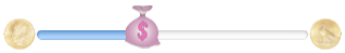
A slider (UISlider) is an expression of a continuously settable value (its value) between some minimum and maximum (its minimumValue and maximumValue; they are 0 and 1 by default). It is portrayed as an object, the thumb, positioned along a track. As the user changes the thumb’s position, the slider reports a Value Changed control event; it may do this continuously as the user presses and drags the thumb (if the slider’s continuous is YES, the default) or only when the user releases the thumb (if its continuous is NO). While the user is pressing on the thumb, the slider is in the highlighted state. To change the slider’s value with animation, call setValue:animated:.
A commonly expressed desire is to modify a slider’s behavior so that if the user taps on its track, the slider moves to the spot where the user tapped. Unfortunately, a slider does not, of itself, respond to taps on its track; such a tap doesn’t even cause it to report a Touch Up Inside. However, with a gesture recognizer, most things are possible; here’s the action handler for a UITapGestureRecognizer attached to a UISlider:
- (void) tapped: (UIGestureRecognizer*) g {
    UISlider* s = (UISlider*)g.view;
    if (s.highlighted)
        return; // tap on thumb, let slider deal with it
    CGPoint pt = [g locationInView: s];
    CGRect track = [s trackRectForBounds:s.bounds];
    if (!CGRectContainsPoint(CGRectInset(track, 0, -10), pt))
        return; // not on track, forget it
    CGFloat percentage = pt.x / s.bounds.size.width;
    CGFloat delta = percentage * (s.maximumValue - s.minimumValue);
    CGFloat value = s.minimumValue + delta;
    [s setValue:value animated:YES];
}
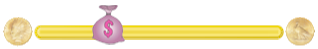
To customize a slider’s appearance, you can change the color of the thumb and the track on either side of it (thumbTintColor, minimumTrackTintColor, and maximumTintColor), or you can go even further and provide your own thumb image and your own track image, along with images to appear at each end of the track, and you can override in a subclass the methods that position these.
The images at the ends of the track are the slider’s minimumValueImage and maximumValueImage, and they are nil by default. If you set them to actual images (which can also be done in the nib), the slider will attempt to position them within its own bounds, shrinking the drawing of the track to compensate. The slider does not clip its subviews by default, so the images can extend outside the slider’s bounds.
For example, suppose the slider’s dimensions are 250×23 (the standard height), and suppose the images are 30×30. Then the minimum image is drawn with its origin at {0,-4} — its left edge matches the slider’s left edge, and its top is raised so that the center of its height matches the center of the slider’s height — and the maximum image is drawn with its origin at {220,-4}. But the track is drawn with a width of only 164 pixels, instead of the normal 246; instead of being nearly the full width of the slider, the track is contracted to allow room for the images.
You can change these dimensions by overriding minimumValueImageRectForBounds:, maximumValueImageRectForBounds:, and trackRectForBounds: in a subclass. The bounds passed in are the slider’s bounds. In this example, we expand the track width to the full width of the slider, and draw the images outside the slider’s bounds (Figure 25.12; I’ve given the slider a gray background color so you can see how the track and images are related to its bounds):
- (CGRect)maximumValueImageRectForBounds:(CGRect)bounds {
    CGRect result = [super maximumValueImageRectForBounds:bounds];
    result = CGRectOffset(result, 31, 0);
    return result;
}

- (CGRect)minimumValueImageRectForBounds:(CGRect)bounds {
    CGRect result = [super minimumValueImageRectForBounds:bounds];
    result = CGRectOffset(result, -31, 0);
    return result;
}

- (CGRect)trackRectForBounds:(CGRect)bounds {
    CGRect result = [super trackRectForBounds:bounds];
    result.origin.x = 0;
    result.size.width = bounds.size.width;
    return result;
}

The thumb is also an image, and you set it with setThumbImage:forState:. There are two chiefly relevant states, UIControlStateNormal and UIControlStateHighlighted, so if you supply images for both, the thumb will change automatically while the user is dragging it. If you supply just an image for the normal state, the thumb image won’t change while the user is dragging it. By default, the image will be centered in the track at the point represented by the slider’s current value; you can shift this position by overriding thumbRectForBounds:trackRect:value: in a subclass. In this example, the image is repositioned upward slightly (Figure 25.13):
- (CGRect)thumbRectForBounds:(CGRect)bounds
                   trackRect:(CGRect)rect value:(float)value {
    CGRect result =
        [super thumbRectForBounds:bounds trackRect:rect value:value];
    result = CGRectOffset(result, 0, -7);
    return result;
}
Enlarging a slider’s thumb can mislead the user as to the area on which it can be tapped to drag it. The slider, not the thumb, is the touchable UIControl; only the part of the thumb that intersects the slider’s bounds will be draggable. The user may try to drag the part of the thumb that is drawn outside the slider’s bounds, and will fail (and be confused). A solution is to increase the slider’s height; you can’t do this in the nib editor, but you can do it in code.
The track is two images, one appearing to the left of the thumb, the other to its right. They are set with setMinimumTrackImage:forState: and setMaximumTrackImage:forState:. If you supply images both for normal state and for highlighted state, the images will change while the user is dragging the thumb.
The images should be resizable (Chapter 15), because that’s how the slider cleverly makes it look like the user is dragging the thumb along a single static track. In reality, there are two images; as the user drags the thumb, one image grows horizontally and the other shrinks horizontally. For the left track image, the right end cap inset will be partially or entirely hidden under the thumb; for the right track image, the left end cap inset will be partially or entirely hidden under the thumb. Figure 25.14 shows a track derived from a single 15×15 image of a circular object (a coin):
UIImage* coin = [UIImage imageNamed: @"coin.png"];
UIImage* coinEnd = [coin resizableImageWithCapInsets:UIEdgeInsetsMake(0,7,0,7)
                                      resizingMode:UIImageResizingModeStretch];
[slider setMinimumTrackImage:coinEnd forState:UIControlStateNormal];
[slider setMaximumTrackImage:coinEnd forState:UIControlStateNormal];
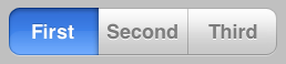
A segmented control (UISegmentedControl, Figure 25.15) is a row of tappable segments; a segment is rather like a button. This provides a way for the user to choose among several related options. By default (momentary is NO), the most recently tapped segment remains selected. Alternatively (momentary is YES), the tapped segment is shown as highlighted momentarily (by default, highlighted is indistinguishable from selected, but you can change that); afterward, however, no segment selection is displayed, though internally the tapped segment remains the selected segment.
The selected segment can be retrieved with the selectedSegmentIndex property; it can also be set with the selectedSegmentIndex property, and remains visibly selected (even for a momentary segmented control). A selectedSegmentIndex value of UISegmentedControlNoSegment means no segment is selected. When the user taps a segment that is not already visibly selected, the segmented control reports a Value Changed event.
A segment can be separately enabled or disabled with setEnabled:forSegmentAtIndex:, and its enabled state can be retrieved with isEnabledForSegmentAtIndex:. A disabled segment, by default, is drawn faded; the user can’t tap it, but it can still be selected in code.
A segment has either a title or an image; when one is set, the other becomes nil. The methods for setting and fetching the title and image for existing segments are:
-
setTitle:forSegmentAtIndex: -
setImage:forSegmentAtIndex: -
titleForSegmentAtIndex: -
imageForSegmentAtIndex:
You will also want to set the title or image when creating the segment. You can do this in code if you’re creating the segmented control from scratch, with initWithItems:, which takes an array each item of which is either a string or an image.
Methods for managing segments dynamically are:
-
insertSegmentWithTitle:atIndex:animated: -
insertSegmentWithImage:atIndex:animated: -
removeSegmentAtIndex:animated: -
removeAllSegments
The number of segments can be retrieved with the read-only numberOfSegments property.
A segment’s width is adjusted automatically when you create it or call sizeToFit, or you can set it manually with setWidth:forSegmentAtIndex: (and retrieve it with widthForSegmentAtIndex:). Alternatively, if you set a segment’s width to 0, the system will adjust the width for you if the segmented control’s apportionsSegmentWidthsByContent property is YES. If you’re using autolayout (Chapter 14), the segmented control’s width constraint (which will exist if the segmented control is created in a nib or storyboard) must have its priority reduced to less than 750 for its width to adjust itself automatically.
You can also change the position of the content (title or image) within a segment. To set this position in code, call setContentOffset:forSegmentAtIndex: (and retrieve it with contentOffsetForSegmentAtIndex:), where the offset is expressed as a CGSize describing how much to move the content from its default centered position.
A segmented control’s height is standard in accordance with its style. You can change a segmented control’s height in code (if you’re using autolayout, this would involve adding a height constraint), but if you later call sizeToFit, it will resume its standard height. A more coherent way to change a segmented control’s height is to set its background image, as I’ll describe in a moment.
A segmented control comes in a choice of styles (its segmentedControlStyle):
-
UISegmentedControlStylePlain - Large default height (44 pixels) and large titles. Deselected segments are gray; the selected segment is blue and has a depressed look.
-
UISegmentedControlStyleBordered -
Just like
UISegmentedControlStylePlain, but a dark border emphasizes the segmented control’s outline. -
UISegmentedControlStyleBar -
Small default height (30 pixels) and small titles. All segments are blue, but you can change this by setting the
tintColor; the selected segment is slightly darker.
Warning
A fourth style, UISegmentedControlStyleBezeled, is deprecated (in the header) and appears to be no longer available. This is a pity, as it was a nice style, with a large default height (44 pixels) and small titles, and could be tinted with the tintColor.
Further methods for customizing a segmented control’s appearance are parallel to those for setting the look of a stepper or the scope bar portion of a search bar, both described earlier in this chapter. You can set the overall background, the divider image, the text attributes for the segment titles, and the position of segment contents:
-
setBackgroundImage:forState:barMetrics: -
setDividerImage:forLeftSegmentState:rightSegmentState:barMetrics: -
setTitleTextAttributes:forState: -
setContentPositionAdjustment:forSegmentType:barMetrics:
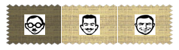
You don’t have to customize for every state, as the segmented control will use the normal state setting for the states you don’t specify. As I mentioned a moment ago, setting a background image is a robust way to change a segmented control’s height. Here’s the code that achieved Figure 25.16; selecting a segment automatically darkens the background image for us (similar to a button’s adjustsImageWhenHighlighted, described in the next section), so there’s no need to specify a separate selected image:
// background, set desired height but make width resizable
// sufficient to set for Normal only
UIImage* image = [UIImage imageNamed: @"linen.png"];
CGFloat w = 100;
CGFloat h = 60;
UIGraphicsBeginImageContextWithOptions(CGSizeMake(w,h), NO, 0);
[image drawInRect:CGRectMake(0,0,w,h)];
UIImage* image2 = UIGraphicsGetImageFromCurrentImageContext();
UIGraphicsEndImageContext();
UIImage* image3 =
    [image2 resizableImageWithCapInsets:UIEdgeInsetsMake(0,10,0,10)
                           resizingMode:UIImageResizingModeStretch];
[self.seg setBackgroundImage:image3 forState:UIControlStateNormal
                  barMetrics:UIBarMetricsDefault];

// segment images, redraw at final size
NSArray* pep = @[@"manny.jpg", @"moe.jpg", @"jack.jpg"];
for (int i = 0; i < 3; i++) {
    UIImage* image = [UIImage imageNamed: pep[i]];
    UIGraphicsBeginImageContextWithOptions(CGSizeMake(30,30), NO, 0);
    [image drawInRect:CGRectMake(0,0,30,30)];
    UIImage* image2 = UIGraphicsGetImageFromCurrentImageContext();
    UIGraphicsEndImageContext();
    [self.seg setImage:image2 forSegmentAtIndex:i];
}

// divider, set at desired width, sufficient to set for Normal only
UIGraphicsBeginImageContextWithOptions(CGSizeMake(1,10), NO, 0);
[[UIColor whiteColor] set];
CGContextFillRect(UIGraphicsGetCurrentContext(), CGRectMake(0,0,1,10));
UIImage* div = UIGraphicsGetImageFromCurrentImageContext();
UIGraphicsEndImageContext();
[self.seg setDividerImage:div
      forLeftSegmentState:UIControlStateNormal
        rightSegmentState:UIControlStateNormal
               barMetrics:UIBarMetricsDefault];
The segmentType: parameter in setContentPositionAdjustment:forSegmentType:barMetrics: is needed because, by default, the segments at the two extremes have rounded ends (and, if a segment is the lone segment, both its ends are rounded). The argument allows you distinguish between the various possibilities:
-
UISegmentedControlSegmentAny -
UISegmentedControlSegmentLeft -
UISegmentedControlSegmentCenter -
UISegmentedControlSegmentRight -
UISegmentedControlSegmentAlone
The barMetrics: parameter will recur later in this chapter, in the discussion of navigation bars, toolbars, and bar button items; for a segmented control, its value matters only if the segmented control has UISegmentedControlStyleBar and only if it is being used inside a navigation bar or toolbar. Otherwise, use UIBarMetricsDefault. See Landscape iPhone Bar Metrics for more information.
A button (UIButton) is a fundamental tappable control; its appearance is extremely flexible. It is endowed at creation with a type. The code creation method is a class method, buttonWithType:. The types are:
-
UIButtonTypeCustom -
Could be completely invisible, if the
backgroundColorisclearColorand there’s no title or other content. If abackgroundColoris supplied, a thin, subtle rectangular border is also present; you can add more of a border by modifying the button’slayer. Alternatively, you can provide a background image, thus making the button appear to be any shape you like (though this does not automatically affect its tappable region). -
UIButtonTypeDetailDisclosure
UIButtonTypeContactAdd
UIButtonTypeInfoLight
UIButtonTypeInfoDark -
Basically, these are all
UIButtonTypeCustombuttons whose image is set automatically to standard button images: a right-pointing chevron, a plus sign, a light letter “i,” and a dark letter “i,” respectively. -
UIButtonTypeRoundedRect -
A rounded rectangle with a white background and an antialiased gray border. However, supplying a rectangular opaque background image results in a rectangle similar to a
UIButtonTypeCustombutton. (A rounded rect button is actually an instance of a UIButton subclass, UIRoundedRectButton, but you’re probably not supposed to know that.)A rounded rect button can have a
tintColorwhich fills the button only while the button is highlighted.
A button has a title, a title color, and a title shadow color. In iOS 6, you can supply instead an attributed title, thus dictating these features and more in a single value through an NSAttributedString (Chapter 23).
Distinguish a button’s image from its background image. The background image, if any, is stretched to fit the button’s bounds. The image, on the other hand, if smaller than the button, is not resized, and is thus shown internally within the button. The button can have both a title and an image, if the image is small enough; in that case, the image is shown to the left of the title by default.
These six features (title, title color, title shadow color, attributed title, image, and background image) can all be made to vary depending on the button’s current state: UIControlStateHighlighted, UIControlStateSelected, UIControlStateDisabled, and UIControlStateNormal. The button can be in more than one state at once, except for UIControlStateNormal which effectively means “none of the other states”. A state change, whether automatic (the button is highlighted while the user is tapping it) or programmatically imposed, will thus in and of itself alter a button’s appearance. To make this possible, the methods for setting these button features all involve specifying a corresponding state — or multiple states, using a bitmask:
-
setTitle:forState: -
setTitleColor:forState:(by default, the title color is white when the button is highlighted) -
setTitleShadowColor:forState: -
setAttributedTitle:forState: -
setImage:forState: -
setBackgroundImage:forState:
Similarly, when getting these button features, you must either use a method to specify a single state you’re interested in or use a property to ask about the feature as currently displayed:
-
titleForState: -
titleColorForState: -
titleShadowColorForState: -
attributedTitleForState: -
imageForState: -
backgroundImageForState: -
currentTitle -
currentTitleColor -
currentTitleShadowColor -
currentAttributedTitle -
currentImage -
currentBackgroundImage
If you don’t specify a feature for a particular state, or if the button adopts more than one state at once, an internal heuristic is used to determine what to display. I can’t describe all possible combinations, but here are some general observations:
- If you specify a feature for a particular state (highlighted, selected, or disabled), and the button is in only that state, that feature will be used.
-
If you don’t specify a feature for a particular state (highlighted, selected, or disabled), and the button is in only that state, the normal version of that feature will be used as fallback. (That’s why many examples earlier in this book have assigned a title for
UIControlStateNormalonly; this is sufficient to give the button a title in every state.) - Combinations of states often cause the button to fall back on the feature for normal state. For example, if a button is both highlighted and selected, the button will display its normal title, even if it has a highlighted title, a selected title, or both.
Don’t try to use an attributed title for one state and a plain string title for another state; if you’re going to use an attributed title at all, use an attributed title for every state whose title you set. If you set an attributed title for the normal state, you won’t automatically get a white version of that title for the highlighted state. This is not surprising, since all of this is being handled by a UILabel (see Chapter 23), the button’s titleLabel; I’ll talk more about it in a moment.
In this example, we modify an existing button with an image and a title, so as to use an attributed title instead (Figure 25.17). To get the white color when highlighted, we supply a second version of the same string. I’ll show how the background image was achieved later in this section:
NSMutableAttributedString* mas =
    [[NSMutableAttributedString alloc]
        initWithString:self.button.currentTitle
            attributes: @{
                NSFontAttributeName:
                    self.button.titleLabel.font,
                NSForegroundColorAttributeName:
                    self.button.titleLabel.textColor
            }
    ];
[mas addAttributes:
    @{
        NSStrokeColorAttributeName:[UIColor redColor],
        NSStrokeWidthAttributeName:@(-2.0),
        NSUnderlineStyleAttributeName:@1
    } range:NSMakeRange(4,mas.length-4)];
[self.button setAttributedTitle:mas forState:UIControlStateNormal];

mas = [mas mutableCopy];
[mas setAttributes:
    @{
        NSForegroundColorAttributeName:[UIColor whiteColor]
    } range:NSMakeRange(0,mas.length)];
[self.button setAttributedTitle:mas forState:UIControlStateHighlighted];
In addition, a UIButton has some properties determining how it draws itself in various states, which can save you the trouble of specifying different images for different states:
-
showsTouchWhenHighlighted -
If YES, then the button projects a circular white glow when highlighted. If the button has an internal image, the glow is centered behind it (Figure 25.18); thus, this feature is suitable particularly if the button image is small and circular; for example, it’s the default behavior for a
UIButtonTypeInfoLightorUIButtonTypeInfoDarkbutton. (If the button has no internal image, the glow is centered at the button’s center.) The glow is drawn on top of the background image or color, if any.
-
adjustsImageWhenHighlighted -
If YES (the default), then if there is no separate highlighted image (and if
showsTouchWhenHighlightedis NO), the normal image is darkened when the button is highlighted. This applies equally to the internal image and the background image. -
adjustsImageWhenDisabled - If YES (the default), then if there is no separate disabled image, the normal image is lightened (faded) when the button is disabled. This applies equally to the internal image and the background image.
A button has a natural size in relation to its contents. If you’re using autolayout, the button can adopt that size automatically, as its intrinsicContentSize; if not, then if you create a button in code, you’ll ultimately want to send sizeToFit to the button (or give it an explicit size), as shown in examples in Chapter 17, Chapter 19, and Chapter 21 — otherwise, the button will have a zero size and you’ll be left wondering why your button hasn’t appeared in the interface.
The title is a UILabel (Chapter 23), and the label features of the title can be accessed through the button’s titleLabel. Thus, for example, you can set the title’s font, lineBreakMode, and shadowOffset. If the shadowOffset is not {0,0}, then the title has a shadow, and the title shadow color feature comes into play; the button’s reversesTitleShadowWhenHighlighted property also applies: if YES, the shadowOffset values are replaced with their additive inverses when the button is highlighted. Similarly, you can manipulate the label’s wrapping behavior to make the button’s title consist of multiple lines.
The internal image is drawn by a UIImageView (Chapter 15) whose features can be accessed through the button’s imageView. Thus, for example, you can change the internal image view’s alpha to make the image more transparent.
The internal position of the image and title as a whole are governed by the button’s contentVerticalAlignment and contentHorizontalAlignment (inherited from UIControl). You can also tweak the position of the image and title, together or separately, by setting the button’s contentEdgeInsets, titleEdgeInsets, or imageEdgeInsets. Increasing an inset component increases that margin; thus, for example, a positive top component makes the distance between that object and the top of the button larger than normal (where “normal” is where the object would be according to the alignment settings). The titleEdgeInsets or imageEdgeInsets values are added to the overall contentEdgeInsets values. So, for example, if you really wanted to, you could make the internal image appear to the right of the title by decreasing the left titleEdgeInsets and increasing the left imageEdgeInsets.
Four methods also provide access to the button’s positioning of its elements:
-
titleRectForContentRect: -
imageRectForContentRect: -
contentRectForBounds: -
backgroundRectForBounds:
These methods are called whenever the button is redrawn, including every time it changes state. The content rect is the area in which the title and image are placed. By default, contentRectForBounds: and backgroundRectForBounds: yield the same result.
You can override these methods in a subclass to change the way the button’s elements are positioned. In this example, we shrink the button slightly when highlighted (as shown in Figure 25.18) as a way of providing feedback:
- (CGRect)backgroundRectForBounds:(CGRect)bounds {
    CGRect result = [super backgroundRectForBounds:bounds];
    if (self.highlighted)
        result = CGRectInset(result, 3, 3);
    return result;
}
A button’s background image is stretched if the image is smaller, in both dimensions, than the button’s backgroundRectForBounds:. You can take advantage of this stretching, for example, to construct a rounded rectangle background for the button by supplying a resizable image. In this example, which generates Figure 25.17 and Figure 25.18, both the internal image and the background image are generated from the same image (which is in fact the same image used to generate the track in Figure 25.14):
UIImage* im = [UIImage imageNamed: @"coin2.png"];
CGSize sz = [im size];
UIImage* im2 =
    [im resizableImageWithCapInsets:
        UIEdgeInsetsMake(
            sz.height/2.0, sz.width/2.0, sz.height/2.0, sz.width/2.0)
                       resizingMode:UIImageResizingModeStretch];
[self.button setBackgroundImage: im2 forState: UIControlStateNormal];
self.button.backgroundColor = [UIColor clearColor];
The UIControl class implements several touch-tracking methods that you might override in order to customize a built-in UIControl type or to create your own UIControl subclass, along with properties that tell you whether touch tracking is going on:
-
beginTrackingWithTouch:withEvent: -
continueTrackingWithTouch:withEvent: -
endTrackingWithTouch:withEvent: -
cancelTrackingWithEvent: -
tracking(property) -
touchInside(property)
With the advent of gesture recognizers (Chapter 18), such direct involvement with touch tracking is probably less needed than it used to be, especially if your purpose is to modify the behavior of a built-in UIControl subclass. So, to illustrate their use, I’ll give a simple example of creating a custom control. The main reason for doing this (rather than using, say, a UIView and gesture recognizers) would probably be to obtain the convenience of control events. Also, the touch-tracking methods, though not as high-level as gesture recognizers, are at least a level up from the UIResponder touches... methods (Chapter 18): they track a single touch, and both beginTracking... and continueTracking... return a BOOL, giving you a chance to stop tracking the current touch.
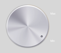
We’ll build a simplified knob control (Figure 25.19). The control starts life at its minimum position, with an internal angle value of 0; it can be rotated clockwise with a single finger as far as its maximum position, with an internal angle value of 5 (radians). To keep things simple, the words “Min” and “Max” appearing in the interface are actually labels; the control just draws the knob, and to rotate it we’ll apply a rotation transform.
Our control is a UIControl subclass, MyKnob. It has a CGFloat angle property, and a CGFloat instance variable _initialAngle that we’ll use internally during rotation. Because a UIControl is a UIView, it can draw itself, which it does with a UIImage included in our app bundle:
- (void) drawRect:(CGRect)rect {
    UIImage* knob = [UIImage imageNamed:@"knob.png"];
    [knob drawInRect:rect];
}
We’ll need a utility function for transforming a touch’s Cartesian coordinates into polar coordinates, giving us the angle to be applied as a rotation to the view:
static CGFloat pToA (UITouch* touch, UIView* self) {
    CGPoint loc = [touch locationInView: self];
    CGPoint c = CGPointMake(CGRectGetMidX(self.bounds),
                            CGRectGetMidY(self.bounds));
    return atan2(loc.y - c.y, loc.x - c.x);
}
Now we’re ready to override the tracking methods. beginTrackingWithTouch:withEvent: simply notes down the angle of the initial touch location. continueTrackingWithTouch:withEvent: uses the difference between the current touch location’s angle and the initial touch location’s angle to apply a transform to the view, and updates the angle property. endTrackingWithTouch:withEvent: triggers the Value Changed control event. So our first draft looks like this:
- (BOOL) beginTrackingWithTouch:(UITouch*)touch withEvent:(UIEvent*)event {
    self->_initialAngle = pToA(touch, self);
    return YES;
}

- (BOOL) continueTrackingWithTouch:(UITouch*)touch withEvent:(UIEvent*)event {
    CGFloat ang = pToA(touch, self);
    ang -= self->_initialAngle;
    CGFloat absoluteAngle = self->_angle + ang;
    self.transform = CGAffineTransformRotate(self.transform, ang);
    self->_angle = absoluteAngle;
    return YES;
}

- (void) endTrackingWithTouch:(UITouch *)touch withEvent:(UIEvent *)event {
    [self sendActionsForControlEvents:UIControlEventValueChanged];
}
This works: we can put a MyKnob into the interface and hook up its Value Changed control event (this can be done in the nib editor), and sure enough, when we run the app, we can rotate the knob and, when our finger lifts from the knob, the Value Changed action handler is called. However, continueTrackingWithTouch:withEvent: needs modification.
First, we need to peg the minimum and maximum rotation at 0 and 5, respectively. For simplicity, we’ll just stop tracking, by returning NO, if the rotation goes below 0 or above 5, fixing the angle at the exceeded limit. However, because we’re no longer tracking, endTracking... will never be called, so we also need to trigger the Value Changed control event. (Doubtless you can come up with a more sophisticated way of pegging the knob at its minimum and maximum, but remember, this is only a simple example.) Second, it might be nice to give the programmer the option to have the Value Changed control event reported continuously as continueTracking... is called repeatedly. So we’ll add a continuous BOOL property and obey it.
Here, then, is our revised continueTracking... implementation:
- (BOOL) continueTrackingWithTouch:(UITouch*)touch withEvent:(UIEvent*)event {
    CGFloat ang = pToA(touch, self);
    ang -= self->_initialAngle;
    CGFloat absoluteAngle = self->_angle + ang;
    if (absoluteAngle < 0) {
        self.transform = CGAffineTransformIdentity;
        self->_angle = 0;
        [self sendActionsForControlEvents:UIControlEventValueChanged];
        return NO;
    }
    if (absoluteAngle > 5) {
        self.transform = CGAffineTransformMakeRotation(5);
        self->_angle = 5;
        [self sendActionsForControlEvents:UIControlEventValueChanged];
        return NO;
    }
    self.transform = CGAffineTransformRotate(self.transform, ang);
    self->_angle = absoluteAngle;
    if (self->continuous)
        [self sendActionsForControlEvents:UIControlEventValueChanged];
    return YES;
}
Finally, we’ll probably want to be able to set the angle programmatically as a way of rotating the knob:
- (void) setAngle: (CGFloat) ang {
    if (ang < 0)
        ang = 0;
    if (ang > 5)
        ang = 5;
    self.transform = CGAffineTransformMakeRotation(ang);
    self->_angle = ang;
}
This is more work than using a gesture recognizer (which is left as an exercise for the reader), but not much, and it gives a sense of what’s involved in creating a custom control.
As you saw in Chapter 19, the three bar types — UINavigationBar, UIToolbar, and UITabBar — are often used in conjunction with a built-in view controller:
- A UINavigationController has a UINavigationBar.
- A UINavigationController has a UIToolbar.
- A UITabBarController has a UITabBar.
You can also use these bar types independently. You are most likely to do that with a UIToolbar, which is often used as an independent bottom bar. On the iPad, it can also be used as a top bar, adopting a role analogous to a menu bar on the desktop. That’s such a common interface, in fact, that certain special automatic behaviors are associated with it; for example, a UISearchBar in a UIToolbar and managed by a UISearchDisplayController will automatically display its search results table in a popover (Chapter 22), which is different from what happens if the UISearchBar is not in a UIToolbar.
This section summarizes the facts about the three bar types and the items that populate them.
A UINavigationBar is populated by UINavigationItems. The UINavigationBar maintains a stack; UINavigationItems are pushed onto and popped off of this stack. Whatever UINavigationItem is currently topmost in the stack (the UINavigationBar’s topItem), in combination with the UINavigationItem just beneath it in the stack (the UINavigationBar’s backItem), determines what appears in the navigation bar:
-
The
title(string) ortitleView(UIView) of thetopItemappears in the center of the navigation bar. -
The
prompt(string) of thetopItemappears at the top of the navigation bar. -
The
rightBarButtonItemandleftBarButtonItemappear at the right and left ends of the navigation bar. These are UIBarButtonItems. A UIBarButtonItem can be a system button, a titled button, an image button, or a container for a UIView. A UIBarButtonItem is not itself a UIView, however. I’ll discuss bar button items further in a moment (and refer also to the discussion in Chapter 19).A UINavigationItem can have multiple right bar button items and multiple left bar button items; its
rightBarButtonItemsandleftBarButtonItemsproperties are arrays (of UIBarButtonItems). The bar button items are displayed from the outside in: that is, the first item in theleftBarButtonItemsis leftmost, while the first item in therightBarButtonItemsis rightmost. Even if there are multiple buttons on a side, you can still speak of that button in the singular: therightBarButtonItemis the first item of therightBarButtonItemsarray, and theleftBarButtonItemis the first item of theleftBarButtonItemsarray. -
The
backBarButtonItemof thebackItemappears at the left end of the navigation bar. It typically points to the left, and is automatically configured so that, when tapped, thetopItemis popped off the stack. If thebackItemhas nobackBarButtonItem, then there is still a back button at the left end of the navigation bar, taking its title from thetitleof thebackItem. However, if thetopItemhas itshidesBackButtonset to YES, the back button is suppressed. Also, unless thetopItemhas itsleftItemsSupplementBackButtonset to YES, the back button is suppressed if thetopItemhas aleftBarButtonItem.
Changes to the navigation bar’s buttons can be animated by sending its topItem any of these messages:
-
setRightBarButtonItem:animated: -
setLeftBarButtonItem:animated: -
setRightBarButtonItems:animated: -
setLeftBarButtonItems:animated: -
setHidesBackButton:animated:
UINavigationItems are pushed and popped with pushNavigationItem:animated: and popNavigationItemAnimated:, or you can set all items on the stack at once with setItems:animated:.
A UINavigationBar can be styled using its barStyle, translucent, and tintColor properties. Possible barStyle values are UIBarStyleDefault and UIBarStyleBlack; setting a tintColor overrides the barStyle. For more extensive customization, you can provide a background image (setBackgroundImage:forBarMetrics:) and you can set the title’s text attributes dictionary (titleTextAttributes). You can also shift the title’s vertical position by calling setTitleVerticalPositionAdjustment:forBarMetrics:.
A bar button item may be instantiated with any of five methods:
-
initWithBarButtonSystemItem:target:action: -
initWithTitle:style:target:action: -
initWithImage:style:target:action: -
initWithImage:landscapeImagePhone:style:target:action: -
initWithCustomView:
The styles are:
-
UIBarButtonItemStyleBordered -
UIBarButtonItemStylePlain(portrayed likeUIBarButtonItemStyleBorderedin a navigation bar) -
UIBarButtonItemStyleDone(only in a navigation bar)
In addition to its title and image (and its landscapeImagePhone), a bar button item inherits from UIBarItem the ability to adjust the image position with imageInsets (and landscapeImagePhoneInsets), plus the enabled and tag properties. Recall from Chapter 19 that you can also set a bar button item’s possibleTitles and width properties, to determine its width.
You can also customize the look of a bar button item. It has a tintColor property, or you can give it a background image; and you can apply a text attributes dictionary to its title. These are the customization methods:
-
setTitleTextAttributes:forState:(inherited from UIBarItem) -
setTitlePositionAdjustment:forBarMetrics: -
setBackgroundImage:forState:barMetrics: -
setBackgroundVerticalPositionAdjustment:forBarMetrics:
An additional method, setBackgroundImage:forState:style:barMetrics:, is new in iOS 6 and adds further specificity to backgroundImageForState:barMetrics:. Thus, the bar button item can have a different background image depending on what style it is assigned. The value of being able to do this will be obvious when using this method in conjunction with the bar button item appearance proxy, discussed later in this chapter.
In addition, these methods apply only if the bar button item is being used as a back button item:
-
setBackButtonTitlePositionAdjustment:forBarMetrics: -
setBackButtonBackgroundImage:forState:barMetrics: -
setBackButtonBackgroundVerticalPositionAdjustment:forBarMetrics:
Figure 19.10 shows how the navigation bar of my Albumen app used to look. When iOS 5 came along, custom colorization became possible, and I jazzed it up a little (Figure 25.20).

When you use a UINavigationBar implicitly as part of a UINavigationController interface, the controller is the navigation bar’s delegate. If you were to use a UINavigationBar on its own, you might want to supply your own delegate. The delegate methods are:
-
navigationBar:shouldPushItem: -
navigationBar:didPushItem: -
navigationBar:shouldPopItem: -
navigationBar:didPopItem:
This simple (and silly) example of a stand-alone UINavigationBar (Figure 25.21) implements the legendary baseball combination trio of Tinker to Evers to Chance (see the relevant Wikipedia article if you don’t know about them):
- (void)viewDidLoad {
    [super viewDidLoad];
    UINavigationItem* ni = [[UINavigationItem alloc] initWithTitle:@"Tinker"];
    UIBarButtonItem* b = [[UIBarButtonItem alloc] initWithTitle:@"Evers"
        style:UIBarButtonItemStyleBordered
        target:self action:@selector(pushNext:)];
    ni.rightBarButtonItem = b;
    self.nav.items = @[ni];
}

- (void) pushNext: (id) sender {
    UIBarButtonItem* oldb = sender;
    NSString* s = oldb.title;
    UINavigationItem* ni = [[UINavigationItem alloc] initWithTitle:s];
    if ([s isEqualToString: @"Evers"]) {
        UIBarButtonItem* b = [[UIBarButtonItem alloc] initWithTitle:@"Chance"
            style:UIBarButtonItemStyleBordered
            target:self action:@selector(pushNext:)];
        ni.rightBarButtonItem = b;
    }
    [self.nav pushNavigationItem:ni animated:YES];
}
Notice the subtle shadow at the bottom of the navigation bar in Figure 25.21, cast on whatever is behind it.
This effect is new in iOS 6, and can be customized with setBackgroundImage:forBarMetrics:, if you have also customized the navigation bar’s background image. You want a very small image (1×3 is a good size) with some transparency, preferably more transparency at the bottom than at the top; the image will be tiled horizontally across the navigation bar’s width. In this way you can harmonize the shadow with your custom background image. The navigation bar’s clipsToBounds must be NO, or the shadow won’t appear.
Another thing in Figure 25.21 that harmonizes with the navigation bar is the color of the status bar. This behavior is new in iOS 6, confined to the iPhone (and iPod touch). The rule is that if there is a navigation bar at the top of the screen — regardless of whether it is part of a navigation interface — the status bar will derive its color from the color at the bottom of the navigation bar. If your interface contains differently customized navigation bars, the status bar will change color in real time to match each one as it appears. This is why, as mentioned in Chapter 9, you must describe your app’s initial navigation bar in your Info.plist if you want the status bar during launch to adopt the color that it will have when launch is over and the navigation bar has actually appeared.
You can prevent this behavior to some extent by setting the shared application’s statusBarStyle. For example, this results in a black status bar, regardless of the navigation bar appearance:
[[UIApplication sharedApplication]setStatusBarStyle:UIStatusBarStyleDefault];
Another trick is to add a second navigation bar in front of the real navigation bar. You can prevent this navigation bar from being visible (and keep the user from interacting with it) by setting its alpha to 0. I like to make the second navigation bar just 1 pixel high for good measure. For example, this code results in a red status bar, overriding the status bar color that would be derived from the real navigation bar:
UINavigationBar* nav =
    [[UINavigationBar alloc] initWithFrame:CGRectMake(0,0,320,1)];
nav.tintColor = [UIColor redColor];
nav.alpha = 0; // prevent visibility
[self.nav.superview addSubview:nav];
The same trick can be used in an app that has no visible navigation bar, as a way of coloring the status bar. But you can’t obtain what used to be the default status bar; its familiar gray gradient is now a distant fond memory.
A UIToolbar is intended to appear at the bottom of the screen; on the iPad, it may appear at the top of the screen. It displays a row of UIBarButtonItems, which are its items. The items are displayed from left to right in the order in which they appear in the items array. You can set the items with animation by calling setItems:animated:. You can use the system bar button items UIBarButtonSystemItemFlexibleSpace and UIBarButtonSystemItemFixedSpace, along with the UIBarButtonItem width property, to position the items within the toolbar.
See the previous section and Chapter 19 for more about creation and customization of UIBarButtonItems. A bar button item’s image, to be used with UIBarButtonItemStylePlain in a toolbar, must be a transparency mask; colors will be ignored — all that matters is the transparency of the various parts of the image. The color for the image will be supplied by default, or you can customize it with the bar button item’s tintColor. For UIBarButtonItemStyleBordered, on the other hand, the image color does matter, and it is the background of the button that will be colored by the tintColor.
A toolbar can be styled using its barStyle, translucent, and tintColor properties. Possible barStyle values are UIBarStyleDefault and UIBarStyleBlack; setting a tintColor overrides the barStyle. Alternatively, you can provide a background image with setBackgroundImage:forToolbarPosition:barMetrics:; the toolbar positions are:
-
UIToolbarPositionAny -
UIToolbarPositionBottom -
UIToolbarPositionTop(not supported in the iPhone)
In Figure 19.5, the toolbar has a UIBarStyleBlack style, its height is taller than normal to accommodate larger bar button items, and it is populated with three tinted bar button items — a UIBarButtonSystemItemCancel bar button item (the tint color tints the button background) and two UIBarButtonItemStylePlain bar button items with transparency mask images (the tint color tints the images).
As with a UINavigationBar (see the previous section), a UIToolbar in iOS 6 has a shadow (if its clipsToBounds is NO).
It normally appears at the top of the toolbar, as a toolbar is expected to be at the bottom of the screen; but on the iPad, where a toolbar at the top of the screen has become standard, the shadow cleverly appears at the bottom of the toolbar in that case. If you’ve customized the toolbar’s background image, you can customize the shadow image as well, with setShadowImage:forToolbarPosition:.
A UITabBar displays UITabBarItems (its items), each consisting of an image and a name, and maintains a current selection among those items (its selectedItem, which is a UITabBarItem, not an index number). To hear about a change of selection, implement tabBar:didSelectItem: in the delegate (UITabBarDelegate). To change the items in an animated fashion, call setItems:animated:.
The look of a tab bar can be customized. You can set its tintColor and backgroundImage. The tintColor is used to color a tab bar item’s image when it is not selected (even if you also set the backgroundImage). The tab bar’s selectedImageTintColor is used to color a tab bar item when it is selected. You can also set the image drawn behind the selected tab bar item to indicate that it’s selected, the selectionIndicatorImage. As with a toolbar (see the previous section), a tab bar in iOS 6 has a shadow, which appears at the top of the tab bar (if its clipsToBounds is NO); if you’ve customized the tab bar’s background image, you can customize the shadow image as well, through its shadowImage property.
A UITabBarItem is created with one of these two methods:
-
initWithTabBarSystemItem:tag: -
initWithTitle:image:tag:
UITabBarItem is a subclass of UIBarItem, so in addition to its title and image it inherits the ability to adjust the image position with imageInsets, plus the enabled and tag properties.
A tab bar item’s image must be a transparency mask; its colors are ignored — only the transparency matters, with tinting applied to the nontransparent areas of the image (the tab bar’s tintColor and selectedImageTintColor). Alternatively, you can call setFinishedSelectedImage:withFinishedUnselectedImage: to supply normal images to be shown when the tab bar item is selected and unselected respectively.
You can also customize the look of a tab bar item’s title. Call setTitleTextAttributes:forState: to apply a text attributes dictionary; and you can adjust the title’s position with the titlePositionAdjustment property.
The user can be permitted to alter the contents of the tab bar, setting its tab bar items from among a larger repertory of tab bar items.
To summon the interface that lets the user do this, call beginCustomizingItems:, passing an array of UITabBarItems that may or may not appear in the tab bar. (To prevent the user from removing an item from the tab bar, include it in the tab bar’s items and don’t include it in the argument passed to beginCustomizingItems:.) A presented view with a Done button appears, behind the tab bar but in front of everything else, displaying the customizable items. The user can then drag an item into the tab bar, replacing an item that’s already there. To hear about the customizing view appearing and disappearing, implement delegate methods:
-
tabBar:willBeginCustomizingItems: -
tabBar:didBeginCustomizingItems: -
tabBar:willEndCustomizingItems:changed: -
tabBar:didEndCustomizingItems:changed:
A UITabBar on its own (outside a UITabBarController) does not provide any automatic access to the user customization interface; it’s up to you. In this (silly) example, we populate a UITabBar with four system tab bar items and a More item; we also populate an instance variable array with those same four system tab bar items, plus four more. When the user taps the More item, we show the user customization interface with all eight tab bar items:
- (void)viewDidLoad {
    [super viewDidLoad];
    NSMutableArray* arr = [NSMutableArray array];
    for (int ix = 1; ix < 8; ix++) {
        UITabBarItem* tbi =
            [[UITabBarItem alloc] initWithTabBarSystemItem:ix tag:ix];
        [arr addObject: tbi];
    }
    self.items = arr; // copy policy
    [arr removeAllObjects];
    [arr addObjectsFromArray: [self.items subarrayWithRange:NSMakeRange(0,4)]];
    UITabBarItem* tbi =
        [[UITabBarItem alloc] initWithTabBarSystemItem:0 tag:0];
    [arr addObject: tbi]; // More button
    tb.items = arr; // tb is the UITabBar
}

- (void)tabBar:(UITabBar *)tabBar didSelectItem:(UITabBarItem *)item {
    NSLog(@"did select item with tag %i", item.tag);
    if (item.tag == 0) {
        // More button
        tabBar.selectedItem = nil;
        [tabBar beginCustomizingItems:self.items];
    }
}
When used in conjunction with a UITabBarController, the customization interface is provided automatically, in an elaborate way. If there are a lot of items, a More item is automatically present, and can be used to access the remaining items in a table view. Here, the user can select any of the excess items, navigating to the corresponding view. Or, the user can switch to the customization interface by tapping the Edit button. (See the iPhone Music app for a familiar example.) Figure 25.22 shows how a More list looks by default.
The way this works is that the automatically provided More item corresponds to a UINavigationController with a root view controller (UIViewController) whose view is a UITableView. Thus, a navigation interface containing this UITableView appears as a tab view when the user taps the More button. When the user selects an item in the table, the corresponding UIViewController is pushed onto the UINavigationController’s stack.
You can access this UINavigationController: it is the UITabBarController’s moreNavigationController. Through it, you can access the root view controller: it is the first item in the UINavigationController’s viewControllers array. And through that, you can access the table view: it is the root view controller’s view. This means you can customize what appears when the user taps the More button! For example, let’s make the navigation bar black, and let’s remove the word More from its title:
UINavigationController* more = self.tabBarController.moreNavigationController;
UIViewController* list = more.viewControllers[0];
list.title = @"";
UIBarButtonItem* b = [UIBarButtonItem new];
b.title = @"Back";
list.navigationItem.backBarButtonItem = b; // so user can navigate back
more.navigationBar.barStyle = UIBarStyleBlack;
We can go even further by supplementing the table view’s data source with a data source of our own, thus proceeding to customize the table itself. This is tricky because we have no internal access to the actual data source, and we mustn’t accidentally disable it from populating the table. Still, it can be done. I’ll start by replacing the table view’s data source with an instance of my own MyDataSource, storing a reference to the original data source object in an instance variable of MyDataSource:
UITableView* tv = (UITableView*)list.view;
MyDataSource* mds = [MyDataSource new];
self.myDataSource = mds; // retain policy
self.myDataSource.originalDataSource = tv.dataSource;
tv.dataSource = self.myDataSource;
Next, I’ll use Objective-C’s automatic message forwarding mechanism (see the Objective-C Runtime Programming Guide) so that MyDataSource acts as a front end for originalDataSource.
MyDataSource will magically appear to respond to any message that originalDataSource responds to, and any message that arrives that MyDataSource can’t handle will be magically forwarded to originalDataSource. This way, the insertion of the MyDataSource instance as data source doesn’t break whatever the original data source does:
- (id)forwardingTargetForSelector:(SEL)aSelector {
    if ([self.originalDataSource respondsToSelector: aSelector])
        return self.originalDataSource;
    return [super forwardingTargetForSelector:aSelector];
}
Finally, we’ll implement the two Big Questions required by the UITableViewDataSource protocol, to quiet the compiler. In both cases, we first pass the message along to originalDataSource (somewhat analogous to calling super); then we add our own customizations as desired. Here, I’ll remove each cell’s disclosure indicator and change its text font:
- (NSInteger)tableView:(UITableView *)tv numberOfRowsInSection:(NSInteger)sec {
    // this is just to quiet the compiler
    return [self.originalDataSource tableView:tv numberOfRowsInSection:sec];
}

- (UITableViewCell *)tableView:(UITableView *)tv
        cellForRowAtIndexPath:(NSIndexPath *)ip {
    UITableViewCell* cell =
        [self.originalDataSource tableView:tv cellForRowAtIndexPath:ip];
    cell.accessoryType = UITableViewCellAccessoryNone;
    cell.textLabel.font = [UIFont systemFontOfSize:14];
    return cell;
}
The outcome is shown in Figure 25.23:
Instead of sending messages that customize the look of an interface object to the object itself, you can send them to an appearance proxy for that object’s class. The appearance proxy then passes that same message along to the actual future instances of that class. You’ll usually configure your appearance proxies very early in the lifetime of the app, and never again. The app delegate’s application:didFinishLaunchingWithOptions:, before the app’s window has been displayed, is the most obvious and common location.
Thus, for example, instead of sending setTitleTextAttributes:forState: to a particular UIBarButtonItem, you could send it to a UIBarButtonItem appearance proxy. All actual UIBarButtonItems from then on would have the text attributes you specified.
This architecture has two chief uses:
-
It simplifies the task of giving your app a consistent overall appearance. Suppose you want all UIBarButtonItems to have a certain title font. Instead of having to remember to send
setTitleTextAttributes:forState:to each UIBarButtonItem your app ever instantiates, you send it once to the appearance proxy and it is sent to those UIBarButtonItems for you. - It provides access to interface objects that might otherwise be difficult to refer to. For example, you don’t get direct access to a search bar’s external Cancel button, but it is a UIBarButtonItem and you can customize it through the UIBarButtonItem appearance proxy.
There are two class methods for obtaining an appearance proxy:
-
appearance - Returns a general appearance proxy for that class.
-
appearanceWhenContainedIn: - The argument is a nil-terminated list (not an array!) of classes, arranged in order of containment from inner to outer. The method you send to the appearance proxy returned from this call will be passed on only to instances of the target class that are actually contained in the way you describe. The notion of what “contained” means is deliberately left vague; basically, it works the way you intuitively expect it to work.
When configuring appearance proxy objects, specificity trumps generality. Thus, you could call appearance to say what should happen for most instances of some class, and call appearanceWhenContainedIn: to say what should happen instead for certain instances of that class. Similarly, longer appearanceWhenContainedIn: chains are more specific than shorter ones.
For example, here’s some code from my Latin flashcard app (myGolden and myPaler are methods defined by a category on UIColor):
[[UIBarButtonItem appearance]
    setTintColor: [UIColor myGolden]]; ❶
[[UIBarButtonItem appearanceWhenContainedIn:
    [UIToolbar class], nil]
        setTintColor: [UIColor myPaler]]; ❷
[[UIBarButtonItem appearanceWhenContainedIn:
    [UIToolbar class], [DrillViewController class], nil]
        setTintColor: [UIColor myGolden]]; ❸
That means:
|
In general, bar button items should be tinted golden. |
|
|
But bar button items in a toolbar are an exception: they should be paler. |
|
|
But bar button items in a toolbar in DrillViewController’s view are an exception to that: they should be golden. |
(If you’re looking at this book’s figures in color, you can see this difference made manifest in Figure 19.3 and Figure 19.5.)
Sometimes, in order to express sufficient specificity, I find myself defining subclasses for no other purpose than to refer to them when obtaining an appearance proxy. For example, here’s some more code from my Latin flashcard app:
[[UINavigationBar appearance] setBackgroundImage:marble2
                                   forBarMetrics:UIBarMetricsDefault];
// counteract the above for the black navigation bar
[[BlackNavigationBar appearance] setBackgroundImage:nil
                                      forBarMetrics:UIBarMetricsDefault];
In that code, BlackNavigationBar is a UINavigationBar subclass that does nothing whatever. Its sole purpose is to tag one navigation bar in my interface so that I can refer it in that code! Thus, I’m able to say, in effect, “All navigation bars in this app should have marble2 as their background image, unless they are instances of BlackNavigationBar.”
The ultimate in specificity is, of course, to customize the look of an instance directly. Thus, for example, if you set one particular UIBarButtonItem’s tintColor property, then setTintColor: sent to a UIBarButtonItem appearance proxy will have no effect on that particular bar button item.
You’ll want to know which messages can be sent to the appearance proxies for which classes. The best way to find out is to look in the header for that class (or a superclass); any appropriate property or method will be tagged UI_APPEARANCE_SELECTOR. For example, here’s how the tintColor property is declared in UIBarButtonItem.h:
@property(nonatomic,retain) UIColor *tintColor NS_AVAILABLE_IOS(5_0)
                                               UI_APPEARANCE_SELECTOR;
You may also be able to deduce this information from the classification of properties and methods in the documentation, but I find the header to be far more reliable and explicit.
The appearance proxy is an id. Therefore, it can be sent any message for which a method signature can be found; if you send it a message that isn’t tagged UI_APPEARANCE_SELECTOR for the class that the proxy represents, the compiler can’t stop you, but you’ll crash at runtime when the message is actually sent. Also, an id has no properties; that’s why we must call setTintColor: in order to set the UIBarButtonItem’s tintColor property. A clever workaround for both problems (from a WWDC 2012 video) is to cast the appearance proxy to the class whose proxy you’re using. For example, instead of saying this:
[[UIBarButtonItem appearance] setTintColor: [UIColor brownColor]];
Say this:
((UIBarButtonItem*)[UIBarButtonItem appearance]).tintColor =
    [UIColor brownColor];