The high-level text classes are NSString and NSAttributedString. Text can be displayed in various ways:
- UILabel
- Displays text, possibly consisting of multiple lines; neither scrollable nor editable.
- UITextField
- Displays a single line of editable text; may have a border, a background image, and overlay views at its right and left end.
- UITextView
- Displays scrollable text, possibly editable; can use data detectors to display tappable links.
- UIWebView
- A scrollable view displaying rendered HTML. A good way to show text that includes images and tappable links. Can also display various additional document types, such as PDF, RTF, and .doc. Discussed in Chapter 24.
- Drawing
-
There are three main ways to draw text directly:
- Core Graphics
- Low-level methods for drawing text (not NSStrings). For drawing in general, see Chapter 15.
- NSString and NSAttributedString
- At a high level, the UIStringDrawing category on NSString and the NSStringDrawing category on NSAttributedString endow strings with the ability to draw themselves, along with metrics methods for learning the dimensions at which a given string will be drawn. Some examples have appeared already in Chapter 12 and Chapter 20.
- Core Text
- The underlying low-level technology behind all string drawing on iOS. Also provides access to advanced font typographical features.
Note
An app can include fonts within its bundle; these will be loaded at launch time if the app lists them in its Info.plist under the “Fonts provided by application” key (UIAppFonts). In this way, your app can use fonts not present by default on the device.
Before iOS 6, controls such as UILabel and UITextView could display text only in a single font and size. If you wanted styled text — that is, text consisting of multiple style runs, with different font, size, color, and other text features in different parts of the text — you were largely out of luck. You could construct an NSAttributedString to express styled text, by dropping down to the lowest level, Core Text; but to display it in the interface you had to use a CATextLayer or have CoreText draw it, which was a lot of work. Workarounds included using a UIWebView or manipulating multiple UILabels. (For example, that’s how the TidBITS News app used to work, as shown in Figure 19.1; the bold headline and the smaller article summary are two different labels.) Editable styled text was virtually impossible to achieve.
Starting in iOS 6, however, NSAttributedString is fully integrated. With it, you can draw styled text directly, or you can hand an attributed string to any built-in interface class that understands it, including UILabel, UITextView, and UIButton.
Note
In general, interface object methods and properties that accept attributed strings stand side by side with their pre-iOS 6 equivalents; the new ones tend to have “attributed” in their name. Thus, you don’t have to use attributed strings. If a UILabel, for example, is to display text in a single font, size, color, and alignment, it might be easiest to use the pre-iOS 6 plain-old-NSString features of UILabel. If you do decide to use attributed strings with an interface object, it is best not to mix in any of the pre-iOS 6 settings; if you’re going to use an attributed string, let it do all the work of dictating text style features.
An NSAttributedString consists of an NSString (its string) plus the attributes, applied in ranges. For example, if the string “one red word” is blue except for the word “red” which is red, and if these are the only changes over the course of the string, then there are three distinct style runs — everything before the word “red,” the word “red” itself, and everything after the word “red.” However, we can apply the attributes in two steps, first making the whole string blue, and then making the word “red” red, just as you would expect.
The attributes are described in dictionaries. Each possible attribute has a predefined name, used as a key in these dictionaries:
-
NSFontAttributeName - A UIFont, including font family, style, and size.
-
NSForegroundColorAttributeName - The text color, a UIColor.
-
NSBackgroundColorAttributeName - The color behind the text, a UIColor. You could use this to highlight a word, for example.
-
NSLigatureAttributeName - An NSNumber wrapping 0 or 1, expressing whether or not you want ligatures used.
-
NSKernAttributeName -
An NSNumber wrapping the floating-point amount of kerning. A negative value brings a glyph closer to the following glyph; a positive value adds space between them. The special value
[NSNull null]turns on inherent autokerning if the font supports it. -
NSStrikethroughStyleAttributeName - An NSNumber wrapping 0 or 1.
-
NSUnderlineStyleAttributeName - An NSNumber wrapping 0 or 1.
-
NSStrokeColorAttributeName - The stroke color, a UIColor.
-
NSStrokeWidthAttributeName - An NSNumber wrapping a float. The stroke width is peculiarly coded. If it isn’t zero, it’s either a positive or negative float (wrapped in an NSNumber). If it’s positive, then the text glyphs are stroked but not filled, giving an outline effect, and the foreground color is used unless the stroke color is defined. If it’s negative, then its absolute value is the width of the stroke, and the glyphs are both filled (with the foreground color) and stroked (with the stroke color).
-
NSShadowAttributeName -
An NSShadow object. An NSShadow is just a glorified struct (what Apple calls a “value object”), combining a
shadowOffset,shadowColor, andshadowBlurRadius. -
NSParagraphStyleAttributeName -
An NSParagraphStyle object. This is basically just a glorified struct, assembling text features that apply properly to paragraphs as a whole, not merely to characters, even if your string consists only of a single paragraph. Here are its most important properties:
-
alignment -
lineBreakMode(only the twoWrappingoptions wrap; the others draw a single line)-
NSLineBreakByWordWrapping -
NSLineBreakByCharWrapping -
NSLineBreakByClipping -
NSLineBreakByTruncatingHead -
NSLineBreakByTruncatingTail -
NSLineBreakByTruncatingMiddle
-
-
firstLineHeadIndent,headIndent(left margin),tailIndent(right margin) -
lineHeightMultiple,maximumLineHeight,minimumLineHeight -
lineSpacing -
paragraphSpacing,paragraphSpacingBefore -
hyphenationFactor(a float between 0 and 1)
-
To construct an NSAttributedString, you can call initWithString:attributes: if the entire string has the same attributes; otherwise, you’ll use its mutable subclass NSMutableAttributedString, which lets you set attributes over a range. To construct an NSParagraphStyle, you’ll use its mutable subclass NSMutableParagraphStyle. (The properties of NSParagraphStyle itself are all read-only, for historical reasons.) It is sufficient to apply a paragraph style to the first character of a paragraph; to put it another way, the paragraph style of the first character of a paragraph dictates how the whole paragraph is rendered. Both NSAttributedString and NSParagraphStyle come with default values for all attributes, so you only have to set the attributes you care about.
We now know enough for an example! I’ll generate the paragraph shown in Figure 23.1. This is a UILabel; its background is white, so you can see its bounds relative to the text. Two words are made extra-bold by stroking in a different color, and the whole paragraph is centered and indented from the edges of the label.
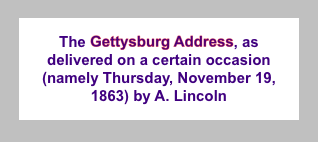
I start by dictating the entire string and the overall style of the text; then I apply the special style to the two stroked words:
NSString* s1 = @"The Gettysburg Address, as delivered on a certain occasion "
    @"(namely Thursday, November 19, 1863) by A. Lincoln";
NSMutableAttributedString* content =
    [[NSMutableAttributedString alloc]
     initWithString:s1
     attributes:
         @{
           NSFontAttributeName:
               [UIFont fontWithName:@"Arial-BoldMT" size:15],
           NSForegroundColorAttributeName:
               [UIColor colorWithRed:0.251 green:0.000 blue:0.502 alpha:1]
         }];
NSRange r = [s1 rangeOfString:@"Gettysburg Address"];
[content addAttributes:
    @{
      NSStrokeColorAttributeName:[UIColor redColor],
      NSStrokeWidthAttributeName: @-2.0
     } range:r];
Now I create the paragraph style and apply it to the first character. Note how the margins are dictated: the tailIndent is negative, to bring the right margin leftward, and the firstLineHeadIndent must be set separately, as the headIndent does not automatically apply to the first line:
NSMutableParagraphStyle* para = [NSMutableParagraphStyle new];
para.headIndent = 10;
para.firstLineHeadIndent = 10;
para.tailIndent = -10;
para.lineBreakMode = NSLineBreakByWordWrapping;
para.alignment = NSTextAlignmentCenter;
para.paragraphSpacing = 15;
[content addAttribute:NSParagraphStyleAttributeName
                value:para range:NSMakeRange(0,1)];
Now I’ll generate the string shown in Figure 23.2. Note the full justification, the automatic hyphenation, and the large initial cap kerned close to the following letter.
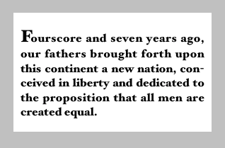
Once again, I start by styling the string as a whole; then I style the first letter. There’s an obvious but important difference between setAttributes: and addAttributes::
NSString* s2 = @"Fourscore and seven years ago, our fathers brought forth "
    @"upon this continent a new nation, conceived in liberty and dedicated "
    @"to the proposition that all men are created equal.";
NSMutableAttributedString* content2 =
    [[NSMutableAttributedString alloc]
     initWithString:s2
     attributes:
         @{
           NSFontAttributeName:
               [UIFont fontWithName:@"HoeflerText-Black" size:16]
         }];
[content2 setAttributes:
    @{
      NSFontAttributeName:[UIFont fontWithName:@"HoeflerText-Black" size:24]
     } range:NSMakeRange(0,1)];
[content2 addAttributes:
    @{
      NSKernAttributeName:@-4
     } range:NSMakeRange(0,1)];
Now I’ll construct the paragraph style and add it to the first character:
NSMutableParagraphStyle* para2 = [NSMutableParagraphStyle new];
para2.headIndent = 10;
para2.firstLineHeadIndent = 10;
para2.tailIndent = -10;
para2.lineBreakMode = NSLineBreakByWordWrapping;
para2.alignment = NSTextAlignmentJustified;
para2.lineHeightMultiple = 1.2;
para2.hyphenationFactor = 1.0;
[content2 addAttribute:NSParagraphStyleAttributeName
                 value:para2 range:NSMakeRange(0,1)];
Now we come to the Really Amazing Part. I can make a single attributed string consisting of both paragraphs, and a single UILabel can portray it (Figure 23.3):
int end = content.length;
[content replaceCharactersInRange:NSMakeRange(end, 0) withString:@"\n"];
[content appendAttributedString:content2];
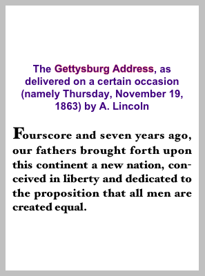
The API for examining and modifying an attributed string invites us to think of style runs as extending over an entire range of characters, but that may be just a convenience. The content of a mutable attributed string may be better envisioned as a sequence of characters, each of which has associated attributes. Thus we can coherently modify just the string part of a mutable attributed string. The key method here is replaceCharactersInRange:withString:, which can be used to replace characters with a plain string or, using a zero range length, to insert a plain string at the start, middle, or end of an attributed string (as demonstrated in the preceding code). The rule is that if we replace characters, the inserted string takes on the attributes of the first replaced character. If we insert characters, the inserted string takes on the attributes of the character preceding the insertion — except that, if we insert at the start, there is no such character, so the inserted string takes on the attributes of the character following the insertion.
You can query an attributed string about its attributes one character at a time — asking either about all attributes at once (attributesAtIndex:effectiveRange:) or about a particular attribute by name (attribute:atIndex:effectiveRange:). The last parameter is a pointer to an NSRange variable, which will be set to the range over which this same attribute value, or set of attribute values, applies:
NSRange range;
NSDictionary* d =
    [content attributesAtIndex:content.length-1 effectiveRange:&range];
Because style runs are an artifice, however, you might not end up with what you would think of as the entire style run. The methods with longestEffectiveRange: in their names, at the cost of some efficiency, do work out the full style run for you. Often, however, you don’t need the entire range, because you’re cycling through ranges, and you want to do that as fast as possible. In this example, I start with the combined two-paragraph attributed string derived in the previous examples, and change all the size 15 material to Arial Bold 20. I explicitly don’t care whether I’m handed longest effective ranges; I just want to cycle efficiently:
[content enumerateAttribute:NSFontAttributeName
    inRange:NSMakeRange(0,content.length)
    options:NSAttributedStringEnumerationLongestEffectiveRangeNotRequired
    usingBlock:^(id value, NSRange range, BOOL *stop)
{
    UIFont* font = value;
    if (font.pointSize == 15)
        [content addAttribute:NSFontAttributeName
                        value:[UIFont fontWithName: @"Arial-BoldMT" size:20]
                        range:range];
}];
You don’t need a UILabel to host an attributed string in the interface; you can draw the attributed string directly, and sometimes this will prove to be a more reliable approach. Just as an NSString can be drawn into a rect with drawInRect:withFont: and related methods, an NSAttributedString can be drawn with drawInRect:. (There’s no need to supply a font parameter, because the font is part of the attributed string!) Here, I draw the attributed string into an image:
UIGraphicsBeginImageContextWithOptions(rect.size, YES, 0);
[[UIColor whiteColor] setFill];
CGContextFillRect(UIGraphicsGetCurrentContext(), rect);
[self.content drawInRect:rect];
UIImage* im = UIGraphicsGetImageFromCurrentImageContext();
UIGraphicsEndImageContext();
That image can then be displayed by an image view, for example. Similarly, you can draw an attributed string directly in a UIView’s drawRect:. That, in fact, is how the current version of the TidBITS News app works (Figure 23.4). Previously, its table cells contained multiple UILabels, which had to be sized individually to fit their content (Chapter 21). Now, each cell is drawn as a single attributed string consisting of the article title and the article summary.
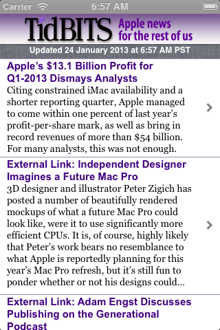
I’ll describe how that string is drawn. The cell’s contentView is completely occupied by a custom UIView class that I call StringDrawer; it has an attributedText property. In tableView:cellForRowAtIndexPath:, I set that property:
cell.drawer.attributedText = [self attributedStringForIndexPath: indexPath];
StringDrawer’s drawRect: draws its attributedText:
- (void)drawRect:(CGRect)rect {
    CGRect r = CGRectOffset(rect, 0, 2); // shoved down a little from top
    [self.attributedText drawWithRect:r
        options:NSStringDrawingTruncatesLastVisibleLine |
                NSStringDrawingUsesLineFragmentOrigin
        context:nil];
}
I want an ellipsis at the end of the second paragraph if the whole thing doesn’t fit in the given rect (as shown in Figure 23.4). This can’t be achieved using NSLineBreakByTruncatingTail, which truncates the first line of the second paragraph.
Therefore, I’m using drawWithRect:options:context:, instead of simple drawInRect:, because it allows me to specify the option NSStringDrawingTruncatesLastVisibleLine. However, I must then also specify NSStringDrawingUsesLineFragmentOrigin; otherwise, the string is drawn with its baseline at the rect origin (so that it appears above that rect) and it doesn’t wrap. The rule is that NSStringDrawingUsesLineFragmentOrigin is the implicit default for simple drawInRect:, but with drawWithRect:options:context: you must specify it explicitly.
To derive the height of the cell, I also measure the attributed string beforehand, in tableView:heightForRowAtIndexPath::
CGRect r =
    [s boundingRectWithSize:CGSizeMake(320,10000)
        options:NSStringDrawingUsesLineFragmentOrigin context:nil];
CGFloat result = r.size.height;
if (result > 200) // set arbitrary limit on cell heights
    result = 200;
Again, the option NSStringDrawingUsesLineFragmentOrigin is crucial; without it, the measured text doesn’t wrap and the returned height will be very small.
The context: parameter of drawWithRect:options:context: and boundingRectWithSize:options:context: lets you attach an instance of NSStringDrawingContext. This simple class has properties that let you permit the text to shrink its size and compress its kerning automatically if doing so would allow it to fit in the given space. (This feature works only if the string consists of a single line — that is, a single paragraph whose line break mode doesn’t have Wrapping in its name.) It also lets you learn what actually happened. If you set an NSStringDrawingContext instance’s minimumScaleFactor (to a positive fraction, such as 0.7) and then draw or measure with this instance as the context: argument, you can then get that instance’s actualScaleFactor to learn how much the drawing engine really did shrink the text size. The minimumTrackingAdjustment (a negative fraction, such as -0.7) and actualTrackingAdjustment work similarly.
Additionally, an NSStringDrawingContext instance tells you where you just drew. With a plain NSString, you derive this information from the return value of the drawing command; for example, drawInRect:withFont: returns a CGSize telling you the size of the drawn string. But drawWithRect:options:context: has no return value. Instead, if you attach an NSStringDrawingContext, its totalBounds property tells you, after you draw, the bounds of the drawn string.
Note
Remember CATextLayer from Chapter 16? Its string property can be an NSAttributedString. Thus, a CATextLayer is another way to get an attributed string drawn into the interface. If the width of the layer is insufficient to display the entire string, we can get truncation behavior with the truncationMode property. If the wrapped property is set to YES, the string will wrap. We can also set the alignment with the alignmentMode property.
UILabel was introduced briefly in Chapter 21 (in Built-In Cell Styles). If you’re configuring a UILabel through a plain NSString, by way of its text property, then you are likely also to set its font, textColor, and textAlignment properties, and possibly its shadowColor and shadowOffset properties. The label’s text can have an alternate highlightedTextColor, to be used when its highlighted property is YES (as happens, for example, when the label is in a selected cell of a table view).
If you’re using an NSAttributedString, then you’ll set the label’s attributedText property, and you’ll probably want to leave those other properties alone; they do still work, but they’re going to change the attributes of your entire attributed string, in ways that you might not intend. Setting the text of a UILabel that has attributedText will basically eliminate the attributes. The highlightedTextColor property does not work on the attributedText.
Note
The nib editor also includes an ingenious interface for letting you set attributes of the text of a label, and of other classes that accept attributed strings in iOS 6; it’s not perfect, however, and isn’t suitable for dealing with lengthy or complex text.
If a UILabel consists of only one line of text (numberOfLines is 1, the default), then if you set its text, any line breaks (@"\n") are treated as spaces; but if you set its attributedText, line breaks are honored and you won’t see whatever follows the first line break.
If a UILabel consists of only one line of text (numberOfLines is 1, the default), then you can elect to permit the text to shrink and compress if this would allow the text to fit when otherwise it wouldn’t. You can turn on adjustsFontSizeToFitWidth and provide a minimumScaleFactor (replacing the now-deprecated minimumFontSize), or you can turn on adjustsLetterSpacingToFitWidth. With plain text, you can turn on both; with attributedText, you can’t (this feels like a bug). If you’re using an attributed string, the label’s (or attributed string’s) line break mode must not have Wrapping in its name. How the text is repositioned when the size shrinks is determined by the label’s baselineAdjustment property.
A UILabel may alternatively consist of multiple lines of text, where numberOfLines is greater than 1, or 0 to indicate no maximum. This matters even if you’re using an attributed string! In Figure 23.3, for example, the full text is shown because I set the label’s numberOfLines to 0.
Line breaking (wrapping) and truncation behavior, which applies to both single-line and multiline labels, is determined by its lineBreakMode. You can get a feel for line break behavior by experimenting in the nib. Your options are:
-
NSLineBreakByWordWrapping - Lines break at word-end. This is the default.
-
NSLineBreakByClipping - Lines break at word-end, but the last line can break in the middle of a word.
-
NSLineBreakByCharWrapping - All lines can break in the middle of a word.
-
NSLineBreakByTruncatingHead
NSLineBreakByTruncatingTail
NSLineBreakByTruncatingMiddle -
Lines break at word-end. But now suppose the text is too long for the label. (This might be because a single-line label isn’t wide enough, or because the
numberOfLinesis insufficient given the label’s width, or because the label isn’t tall enough to display thenumberOfLines.) Then the last line displays an ellipsis at the start, middle, or end respectively, and text is omitted at the point of the ellipsis. Thus, if thelineBreakModeisUILineBreakModeHeadTruncation, the last line is always displayed, and if thelineBreakModeisUILineBreakModeMiddleTruncation, the last words are displayed at the end of the last line — preceded, in both cases, by everything that will fit from the start of the text to the ellipsis.
Warning
The UILabel line break mode names, which replace the now-deprecated UILineBreakMode options, are the same as the NSParagraphStyle line break mode names; but they do not behave the same way. All the UILabel line break modes can wrap an NSString, but an NSAttributedString wraps only if its paragraph style’s line break mode has Wrapping in its name. UILabel will try to wrap and truncate an attributed string the way it wraps and truncates a plain string, but in some cases you will have to help it by setting the label’s lineBreakMode in code, after setting its attributedText. (Thanks to Kyle Sluder for discovering this technique.)
If numberOfLines is larger than the number of lines actually needed, the text is vertically centered in the label. This may be undesirable; you might prefer to shrink (or grow) the label to fit its text. In iOS 5 and before, you couldn’t use sizeToFit to do this, because the default UILabel implementation of sizeToFit was to make the label the right width to contain all its text on a single line. However, in iOS 6 that behavior is completely changed, so that in most simple cases sizeToFit will do exactly the right thing; I suspect that behind the scenes it is just calling boundingRectWithSize:options:context:.
I say “in most simple cases” because there are cases where UILabel’s sizeToFit will misbehave. These happen to be exactly the cases where boundingRectWithSize:options:context: misbehaves. The problem arises particularly with paragraph styles involving margins (headIndent and tailIndent). Take, for example, the label displayed in Figure 23.3. It’s too tall for its content, but if we call sizeToFit it becomes too narrow for its content, presumably because boundingRectWithSize:options:context: ignores the margins. A possible workaround is to call boundingRectWithSize:options:context: and set the width back to the original width, like this:
CGRect rect =
    [self.lab.attributedText boundingRectWithSize:self.lab.bounds.size
     options:NSStringDrawingUsesLineFragmentOrigin context:nil];
// width is wrong so we have to widen it again
rect.size.width = self.lab.bounds.size.width;
rect.size.height += 5; // for good measure
CGRect f = self.lab.bounds;
f.size = rect.size;
self.lab.bounds = f;
But it turns out there’s a better way. Don’t forget about constraints! If we’re using autolayout, a UILabel will attempt to configure its own height and width (its intrinsicContentSize) to fit its contents.
Thus, if the label is left to its own devices, it will set its height correctly for its contents with no code at all. Merely configuring the label — setting its text, changing its font, setting its attributed text, and so forth — automatically invalidates its intrinsic content size and causes that size to be recalculated.
However, the label has two dimensions, so we must clearly give it a hint as to how it should mediate between them. One obvious way is to fix the width absolutely — for example, by an internal width constraint, or by pinning both the left and right edges of the label. In that case, assuming that no constraints prevent it, the label’s height will automatically adjust to accommodate its contents exactly. (If the label does have a height constraint, it will still adjust its own height, provided that the height constraint’s priority is less than its content hugging priority, which is 250.)
An even more flexible approach is to set the label’s preferredMaxLayoutWidth. This is the width at which the label, as its contents increase, will stop growing horizontally to accommodate its contents and start growing vertically instead. (This implies that the contents will wrap, so clearly the numberOfLines can’t be 1.) For example, consider a label containing just a couple of words, whose right edge and top edge are pinned. Thanks to its intrinsic content size, that’s sufficient to position and size the label. Now set the label’s text to be several sentences long. Assuming that no other constraints intervene, and that the label’s numberOfLines is not 1, the label’s width will increase to its preferredMaxLayoutWidth and its height will increase to accommodate its text exactly.
Conversely, you might wish to keep the label’s text the same, but make the label narrower and let it grow in height to accommodate its contents. Again, the key here is the intrinsicContentSize: we set the label’s width and its intrinsicContentSize together. For example, suppose we have an outlet to the label and to its width constraint; then this code makes the label narrower horizontally while letting it grow vertically to keep accommodating its contents:
self.widthConstraint.constant -= 10;
self.theLabel.preferredMaxLayoutWidth = self.widthConstraint.constant;
That’s all very well if we are changing the label’s width explicitly in code, but what if the label’s width is changing automatically in response to its constraints? An obvious example is a label whose left and right are pinned to its superview, and the superview changes size because the interface rotates. The label’s height will not change automatically to fit its contents; we must prompt it. For example, the view controller could respond to layout by setting the label’s preferredMaxLayoutWidth to its new width:
-(void)viewDidLayoutSubviews {
    self.lab.preferredMaxLayoutWidth = self.lab.bounds.size.width;
    [self.view layoutSubviews];
}
Or we could make the label self-adjusting, by subclassing UILabel and overriding layoutSubviews:
-(void)layoutSubviews {
    [super layoutSubviews];
    self.preferredMaxLayoutWidth = self.bounds.size.width;
}
Methods that you can override in a subclass to modify a label’s drawing are drawTextInRect: (an example appeared in Chapter 10) and textRectForBounds:limitedToNumberOfLines:.
A text field portrays just a single line of text (any return characters in its text are treated as spaces); otherwise, it has many of the same properties as a label. So, if you provide it with a plain NSString, it has a text, font, textColor, and textAlignment. It has adjustsFontSizeToFitWidth and minimumFontSize properties, although these don’t work exactly like a label; a text field won’t allow its font size to shrink automatically as small as a label will.
To provide a text field with an attributed string, you set its attributedText. In that case I would suggest that you not set its adjustsFontSizeToFitWidth to YES, as this behaves rather badly; it doesn’t allow any intermediate sizes, but either shrinks the text absolutely or doesn’t; and, if it does shrink it, it will cause your text to appear all in a single font.
Text that is too long for the text field is displayed with an ellipsis at the end. You can change the position of the ellipsis by assigning the text field an attributed string with different truncation behavior, such as NSLineBreakByTruncatingHead. When overly long text is being edited, the text shifts horizontally to show the insertion point. On the whole, though, text that is too long for the text field is probably not a very good idea; the user usually has no arrow keys, as on the desktop, so navigating long text is daunting (the user must select text and stretch the selection into the offscreen part of the text).
Regardless of whether you originally supplied a plain string or an attributed string, if the text field’s allowsEditingTextAttributes is YES, the user, when editing in the text field, can summon a menu toggling the selected text’s bold, italics, or underline features. (Oddly, there’s no way to set this property in a nib.)
A text field has a placeholder property, which is the text that appears faded within the text field when it has no text; the idea is that you can use this to suggest to the user what the text field is for. It has a styled text alternative, attributedPlaceholder.
If a text field’s clearsOnBeginEditing property is YES, it automatically deletes its existing text when the user begins editing within it. New in iOS 6, if a text field’s clearsOnInsertion property is YES, then when editing begins within it, the entire text is selected, but invisibly selected, so that if the user starts typing immediately, the current contents of the text field will be removed.
A text field’s border drawing is determined by its borderStyle property. Your options are:
-
UITextBorderStyleNone - No border.
-
UITextBorderStyleLine - A plain rectangle.
-
UITextBorderStyleBezel - A slightly bezeled rectangle: the top and left sides have a very slight, thin shadow.
-
UITextBorderStyleRoundedRect - A rounded rectangle; the top and left sides have a stronger shadow, so that the text appears markedly recessed behind the border.
A text field can have a background color (because it is a UIView) or a background image (background), possibly along with a second image (disabledBackground) to be displayed when the text field’s enabled property, inherited from UIControl, is NO. The user can’t interact with a disabled text field, but without a disabledBackground image, the user may lack any visual clue to this fact. (A rounded rectangle text field doesn’t display these background images.)
A text field may contain one or two ancillary overlay views, its leftView and rightView, and possibly a Clear button (a gray circle with a white X). The automatic visibility of each of these is determined by the leftViewMode, rightViewMode, and clearViewMode, respectively. The view mode values are:
-
UITextFieldViewModeNever - The view never appears.
-
UITextFieldViewModeWhileEditing - A Clear button appears if there is text in the field and the user is editing. A left or right view appears if there is no text in the field and the user is editing.
-
UITextFieldViewModeUnlessEditing - A Clear button appears if there is text in the field and the user is not editing. A left or right view appears if the user is not editing, or if the user is editing but there is no text in the field.
-
UITextFieldViewModeAlways - A left or right view always appears; a Clear button appears if there is text in the field.
Depending on what sort of view you use, your leftView and rightView may have to be sized manually so as not to overwhelm the text view contents. If a right view and a Clear button appear at the same time, the right view may cover the Clear button unless you reposition it. The positions and sizes of any of the components of the text field can be set in relation to the text field’s bounds by overriding the appropriate method in a subclass:
-
clearButtonRectForBounds: -
leftViewRectForBounds: -
rightViewRectForBounds: -
borderRectForBounds: -
textRectForBounds: -
placeholderRectForBounds: -
editingRectForBounds:
Warning
You should make no assumptions about when or how frequently these methods will be called; the same method might be called several times in quick succession. Also, these methods should all be called with a parameter that is the bounds of the text field, but some are called with a 100×100 bounds; this feels like a bug.
You can also override in a subclass the methods drawTextInRect: and drawPlaceholderInRect:. You should either draw the specified text or call super to draw it; if you do neither, the text won’t appear. Both these methods are called with a parameter whose size is the dimensions of the text field’s text area, but whose origin is {0,0}. In effect what you’ve got is a graphics context for just the text area; any drawing you do outside the given rectangle will be clipped.
A text field’s editing status, as well as the presence or absence of the onscreen simulated keyboard, is intimately tied to its status as the first responder (Chapter 11):
- When a text field is first responder, it is being edited and the keyboard is present.
- When a text field is no longer first responder, it is no longer being edited, and if no other text field (or text view) becomes first responder, the keyboard is not present. The keyboard is not dismissed if one text field takes over first responder status from another.
You can programmatically control a text field’s editing status, as well as the presence or absence of the keyboard, by way of the text field’s first responder status. To make the insertion point appear within a text field and to cause the keyboard to appear, you send becomeFirstResponder to that text field; to make a text field stop being edited and to cause the keyboard to disappear, you send resignFirstResponder to that text field. Actually, resignFirstResponder returns a BOOL, because a responder might return NO to indicate that for some reason it refuses to obey this command. Note also the UIView endEditing: method, which can be sent to the first responder or any superview (including the window) to ask or compel the first responder to resign first responder status.
In a view presented in the UIModalPresentationFormSheet style on the iPad (Chapter 19), the keyboard, by default, does not disappear when a text field resigns first responder status. This is apparently because a form sheet is intended primarily for text input, so the keyboard is felt as accompanying the form as a whole, not individual text fields. Optionally, you can prevent this exceptional behavior: in your UIViewController subclass, override disablesAutomaticKeyboardDismissal to return NO.
Warning
There is no simple way to learn what view is first responder! This is very odd, because a window surely knows what its first responder is — but it won’t tell you. There’s a method isFirstResponder, but you’d have to send it to every view in a window until you find the first responder. One workaround is to store a reference to the first responder yourself, typically in your implementation of the text field delegate’s textFieldDidBeginEditing:. Do not name this reference firstResponder! This name is apparently already in use by Cocoa, and a name collision can cause your app to misbehave. (Can you guess how I know that?)
Once the user has tapped in a text field and the keyboard has automatically appeared, how is the user supposed to get rid of it? This is unlikely to be a problem on the iPad, where the keyboard typically contains a special button that dismisses the keyboard. But on the iPhone, it’s an oddly tricky issue. You would think that the “return” button in the keyboard would dismiss the keyboard; but, of itself, it doesn’t.
One solution is to be the text field’s delegate and to implement a text field delegate method, textFieldShouldReturn:. When the user taps the Return key in the keyboard, we hear about it through this method, and we tell the text field to resign its first responder status, which dismisses the keyboard:
- (BOOL)textFieldShouldReturn: (UITextField*) tf {
    [tf resignFirstResponder];
    return YES;
}
I’ll provide a more self-contained, automatic solution later in this chapter.
The keyboard has a position “docked” at the bottom of the screen. This may cover the text field in which the user wants to type, even if it is first responder. On the iPad, this may not be an issue, because the user can “undock” the keyboard (possibly also splitting and shrinking it) and slide it up and down the screen freely. On the iPhone, you’ll typically want to do something to reveal the text field.
To help with this, you can register for keyboard-related notifications:
-
UIKeyboardWillShowNotification -
UIKeyboardDidShowNotification -
UIKeyboardWillHideNotification -
UIKeyboardDidHideNotification
Those notifications all have to do with the docked position of the keyboard. On the iPhone, keyboard docking and keyboard visibility are equivalent: the keyboard is visible if and only if it is docked. On the iPad, the keyboard is said to “show” if it is being docked, whether that’s because it is appearing from offscreen or because the user is docking it; and it is said to “hide” if it is undocked, whether that’s because it is moving offscreen or because the user is undocking it.
Two additional notifications are sent both when the keyboard enters and leaves the screen and (on the iPad) when the user drags it, splits or unsplits it, and docks or undocks it:
-
UIKeyboardWillChangeFrameNotification -
UIKeyboardDidChangeFrameNotification
The notification’s userInfo dictionary contains information about the keyboard describing what it will do or has done, under these keys:
-
UIKeyboardFrameBeginUserInfoKey -
UIKeyboardFrameEndUserInfoKey -
UIKeyboardAnimationDurationUserInfoKey -
UIKeyboardAnimationCurveUserInfoKey
Thus, to a large extent, you can coordinate your actions with those of the keyboard. In particular, by looking at the UIKeyboardFrameEndUserInfoKey, you know what position the keyboard is moving to; if necessary, you can compare this with the screen bounds to learn whether the keyboard will now be on or off the screen.
(In the case of UIKeyboardWillChangeFrameNotification, however, there won’t be any UIKeyboardFrameEndUserInfoKey when the user starts dragging the keyboard on the iPad, because the runtime doesn’t know where the user will drag the keyboard to. The frame value for the split keyboard on the iPad is the size of the entire keyboard, as if it weren’t split; but its height is shorter than the height of the normal keyboard, so you may be able to deduce that it is split, if you really need to know that.)
Finding a strategy for dealing with the keyboard’s presence depends on the needs of your particular app. It may well be that even on the iPad you can ignore UIKeyboardDidChangeFrameNotification and concern yourself only with the docked position of the keyboard, because, as I mentioned a moment ago, if the keyboard isn’t docked, the user is free to move and split it. To illustrate, therefore, I’ll concentrate on the most universal case, where the keyboard moves into and out of docked position and we detect this with UIKeyboardWillShowNotification and UIKeyboardWillHideNotification. What should we do if, when the keyboard appears, it covers the text field being edited? I’ll describe a couple of basic approaches to get you started.
A natural-looking approach is to slide the entire interface upward as the keyboard appears. To make this easy, you might start with a view hierarchy like this: the root view contains an invisible view that’s the same size as the root view; everything else is contained in that invisible view. The invisible view’s purpose is to host the rest of the interface; if we slide it upward, the whole interface will slide upward.
Here’s an implementation involving constraints. The invisible view, which I’ll called the sliding view, is pinned by constraints at the top and bottom to its superview with a constant of 0, and we have outlets to those constraints. We also have an outlet to the sliding view itself, and we’ve got a property prepared to hold the first responder:
@property (nonatomic, strong)
    IBOutletCollection(NSLayoutConstraint) NSArray* verticalConstraints;
@property (nonatomic, weak) IBOutlet UIView *slidingView;
@property (nonatomic, weak) UIView* fr;
In our view controller’s viewDidLoad, we register for the keyboard notifications:
[super viewDidLoad];
[[NSNotificationCenter defaultCenter] addObserver:self
                                         selector:@selector(keyboardShow:)
                                         name:UIKeyboardWillShowNotification
                                         object:nil];
[[NSNotificationCenter defaultCenter] addObserver:self
                                         selector:@selector(keyboardHide:)
                                         name:UIKeyboardWillHideNotification
                                         object:nil];
We are the delegate of the various text fields in our interface. When one of them starts editing, we keep a reference to it as first responder:
- (void)textFieldDidBeginEditing:(UITextField *)tf {
    self.fr = tf; // keep track of first responder
}
As the keyboard threatens to appear, we examine where its top will be. If the keyboard will cover the text field that’s about to be edited, we animate the sliding view upward to compensate, by changing the constant value of the constraints that pin its top and bottom. Observe that the keyboard’s frame comes to us in window/screen coordinates, so it is necessary to convert it to our sliding view’s coordinates in order to make sense of it:
- (void) keyboardShow: (NSNotification*) n {
    NSDictionary* d = [n userInfo];
    CGRect r = [d[UIKeyboardFrameEndUserInfoKey] CGRectValue];
    r = [self.slidingView convertRect:r fromView:nil];
    CGRect f = self.fr.frame;
    CGFloat y =
        CGRectGetMaxY(f) + r.size.height -
            self.slidingView.bounds.size.height + 5;
    NSNumber* duration = d[UIKeyboardAnimationDurationUserInfoKey];
    if (r.origin.y < CGRectGetMaxY(f)) {
        [UIView animateWithDuration:[duration floatValue] animations:^{
            for (NSLayoutConstraint* con in self.verticalConstraints) {
                con.constant = -y;
            }
            [self.view layoutIfNeeded];
        }];
    }
}
When the keyboard disappears, we reverse the procedure:
- (void) keyboardHide: (NSNotification*) n {
    NSNumber* duration = n.userInfo[UIKeyboardAnimationDurationUserInfoKey];
    [UIView animateWithDuration:[duration floatValue] animations:^{
        for (NSLayoutConstraint* con in self.verticalConstraints) {
            con.constant = 0;
        }
        [self.view layoutIfNeeded];
    }];
}
Sometimes, the interface already knows how to slide — because it’s a scroll view. In that case, we typically won’t move the scroll view; instead, we’ll change the behavior of the scroll view so that it operates coherently within the reduced space left by the keyboard. This is a job for contentInset, whose purpose, you will recall (Chapter 20), is precisely to make it possible for the user to view all of the scroll view’s content even though part of the scroll view is being covered by something. A nice byproduct of this approach is that the scroll view helps us by scrolling automatically when the first responder changes.
This approach is in fact implemented automatically by a UITableViewController.
When a text field inside a table cell is first responder, the table view controller adjusts the table view’s contentInset and scrollIndicatorInsets to compensate for the keyboard. The result is that the entire table view is available within the space between the top of the keyboard and the top of the screen.
Let’s imitate UITableViewController’s behavior with a scroll view containing text fields. In viewDidLoad, we register for keyboard notifications as before. When the keyboard appears, we store the current content offset, content inset, and scroll indicator insets; then we alter them:
- (void) keyboardShow: (NSNotification*) n {
    self->_oldContentInset = self.scrollView.contentInset;
    self->_oldIndicatorInset = self.scrollView.scrollIndicatorInsets;
    self->_oldOffset = self.scrollView.contentOffset;
    NSDictionary* d = [n userInfo];
    CGRect r = [[d objectForKey:UIKeyboardFrameEndUserInfoKey] CGRectValue];
    r = [self.scrollView convertRect:r fromView:nil];
    CGRect f = self.fr.frame;
    CGFloat y =
        CGRectGetMaxY(f) + r.size.height -
            self.scrollView.bounds.size.height + 5;
    if (r.origin.y < CGRectGetMaxY(f))
        [self.scrollView setContentOffset:CGPointMake(0, y) animated:YES];
    UIEdgeInsets insets;
    insets = self.scrollView.contentInset;
    insets.bottom = r.size.height;
    self.scrollView.contentInset = insets;
    insets = self.scrollView.scrollIndicatorInsets;
    insets.bottom = r.size.height;
    self.scrollView.scrollIndicatorInsets = insets;
}
When the keyboard disappears, we restore the saved values; this works best if the insets are restored using delayed performance:
- (void) keyboardHide: (NSNotification*) n {
    [self.scrollView setContentOffset:self->_oldOffset animated:YES];
    [CATransaction setCompletionBlock:^{
        self.scrollView.scrollIndicatorInsets = self->_oldIndicatorInset;
        self.scrollView.contentInset = self->_oldContentInset;
    }];
}
A UITextField implements the UITextInputTraits protocol, which defines properties on the UITextField that you can set to determine how the keyboard will look and how typing in the text field will behave. (These properties can also be set in the nib.) For example, you can set the keyboardType to UIKeyboardTypePhonePad to make the keyboard for this text field consist of digits only. You can set the returnKeyType to determine the text of the Return key (if the keyboard is of a type that has one). You can even supply your own keyboard or other input mechanism by setting the text field’s inputView. You can turn off autocapitalization (autocapitalizationType) or autocorrection (autocorrectionType), make the Return key disable itself if the text field has no content (enablesReturnKeyAutomatically), and make the text field a password field (secureTextEntry).
Note
The user’s choices in the Settings app with regard to certain text input features, such as autocapitalization or autocorrection, take priority over your configuration of these same features for a particular text field.
You can attach an accessory view to the top of the keyboard by setting the text field’s inputAccessoryView. In this example, the accessory view is a UIButton configured in the nib and accessed through an outlet property, buttonView. When editing starts, we configure the keyboard as we store our reference to the text field:
- (void)textFieldDidBeginEditing:(UITextField *)tf {
    self.fr = tf; // keep track of first responder
    tf.inputAccessoryView = self.buttonView;
}
The button is a Next button. When the user taps it, we use it to move editing to the next text field. In this code, I assume that the order of the text fields as subviews of their superview is the desired “tab” order:
- (IBAction)doNextField:(id)sender {
    NSMutableArray* marr = [NSMutableArray array];
    for (UIView* v in self.fr.superview.subviews) {
        if ([v isKindOfClass: [UITextField class]])
            [marr addObject:v];
    }
    NSUInteger ix = [marr indexOfObject:self.fr];
    if (ix == NSNotFound)
        return; // shouldn't happen
    ix++;
    if (ix >= [marr count])
        ix = 0;
    UIView* v = marr[ix];
    [v becomeFirstResponder];
}
The user can control the localization of the keyboard character set in the Settings app, either through a choice of the system’s base language or by enabling additional “international keyboards.” In the latter case, the user can switch among keyboard character sets while the keyboard is showing. But, as far as I can tell, your code can’t make this choice, so you can’t, for example, have a Russian-teaching app in which a certain text field automatically shows the Cyrillic keyboard. You can ask the user to switch keyboards manually, but if you really want a particular keyboard to appear regardless of the user’s settings and behavior, you’ll have to create it yourself and provide it as the inputView.
As editing begins and proceeds in a text field, a sequence of messages is sent to the text field’s delegate. (Some of these are also available as notifications.) Using them, you can customize the text field’s behavior during editing:
-
textFieldShouldBeginEditing: - Return NO to prevent the text field from becoming first responder.
-
textFieldDidBeginEditing:(andUITextFieldTextDidBeginEditingNotification) - The text field has become first responder.
-
textFieldShouldClear: -
Return NO to prevent the operation of the Clear button or of automatic clearing on entry (
clearsOnBeginEditing). -
textFieldShouldReturn: - The user has tapped the Return button in the keyboard. We have already seen that this can be used as a signal to dismiss the keyboard.
-
textField:shouldChangeCharactersInRange:replacementString: -
Sent when the user changes the text in the field by typing or pasting, or by backspacing or cutting (in which case the replacement string will have zero length). Return NO to prevent the proposed change; you can substitute text by changing the text field’s
textdirectly (there is no circularity, as this delegate method is not called when you do that). In this example, the user can enter only lowercase characters:-(BOOL)textField:(UITextField *)textField shouldChangeCharactersInRange:(NSRange)range replacementString:(NSString *)string { NSString* lc = [string lowercaseString]; if ([string isEqualToString:lc]) return YES; textField.text = [textField.text stringByReplacingCharactersInRange:range withString:lc]; return NO; }Another use of this method is to take advantage of a new iOS 6 text field property,
typingAttributes, to set the attributes of the text the user is about to enter. You can also fetch thetypingAttributesto find out what the text styling of newly inserted text would otherwise be (following the same rules I enunciated earlier for insertion of text into an attributed string). Not every attribute can be set this way; for example, trying to set underlining will fail, and indeed will cause thetypingAttributesto be completely ineffectual. I’ll set the user’s text to be red:-(BOOL)textField:(UITextField *)textField shouldChangeCharactersInRange:(NSRange)range replacementString:(NSString *)string { NSDictionary* d = textField.typingAttributes; NSMutableDictionary* md = [d mutableCopy]; [md addEntriesFromDictionary: @{NSForegroundColorAttributeName:[UIColor redColor]}]; textField.typingAttributes = md; return YES; }It is common practice to implement this delegate method as a way of learning that the text has been changed, even if you then always return YES. The
UITextFieldTextDidChangeNotificationcorresponds loosely. This method is not called when the user changes text styling through the Bold, Italics, or Underline menu items. -
textFieldShouldEndEditing: -
Return NO to prevent the text field from resigning first responder (even if you just sent
resignFirstResponderto it). You might do this, for example, because the text is invalid or unacceptable in some way. The user will not know why the text field is refusing to end editing, so the usual thing is to put up an alert (Chapter 26) explaining the problem. -
textFieldDidEndEditing:(andUITextFieldTextDidEndEditingNotification) -
The text field has resigned first responder. See Chapter 21 for an example of using
textFieldDidEndEditing:to fetch the text field’s current text and store it in the model.
A text field is also a control. This means you can attach a target–action pair to any of the events that it reports in order to receive a message when that event occurs (see Chapter 11 and Chapter 25):
- The user can touch and drag, triggering Touch Down and the various Touch Drag events.
- If the user touches in such a way that the text field enters editing mode (and the keyboard appears), Editing Did Begin and Touch Cancel are triggered; if the user causes the text field to enter editing mode in some other way (such as by tabbing into it), Editing Did Begin is triggered without any Touch events.
- As the user edits, Editing Changed is triggered. If the user taps while in editing mode, Touch Down (and possibly Touch Down Repeat) and Touch Cancel are triggered.
- Finally, when editing ends, Editing Did End is triggered; if the user stops editing by tapping Return in the keyboard, Did End on Exit is triggered first.
In general, you’re more likely to treat a text field as a text field (through its delegate messages) than as a control (through its control events). However, the Did End on Exit event message has an interesting property: it provides an alternative way to dismiss the keyboard when the user taps a text field keyboard’s Return button. If there is a Did End on Exit target–action pair for this text field, then if the text field’s delegate does not return NO from textFieldShouldReturn:, the keyboard will be dismissed automatically when the user taps the Return key. (The action handler for Did End on Exit doesn’t actually have to do anything.)
This suggests the following trick for getting automatic keyboard dismissal with no code at all. In the nib, edit the First Responder proxy object in the Attributes inspector, adding a new First Responder Action; let’s call it dummy:. Now hook the Did End on Exit event of the text field to the dummy: action of the First Responder proxy object. That’s it! Because the text field’s Did End on Exit event now has a target–action pair, the text field automatically dismisses its keyboard when the user taps Return; because there is no penalty for not finding a handler for a message sent up the responder chain, the app doesn’t crash even though there is no implementation of dummy: anywhere.
Of course, you can implement that trick in code instead:
[textField addTarget:nil action:@selector(dummy:)
    forControlEvents:UIControlEventEditingDidEndOnExit];
A disabled text field emits no delegate messages or control events.
When the user double-taps or long-presses in a text field, the menu appears. It contains menu items such as Select, Select All, Paste, Copy, Cut, and Suggest; which menu items appear depends on the circumstances.
The menu can be customized, but you’ve no information about the text field’s selection, making it difficult to decide intelligently what menu items should appear or what they should do when chosen. If you still want to alter the menu, the key facts you need to know are these:
-
You can add menu items to the menu through the singleton global shared UIMenuController object. Its
menuItemsproperty is an array of custom menu items — that is, menu items that may appear in addition to those that the system puts there. A menu item is a UIMenuItem, which is simply a title (which appears in the menu) plus an action selector. The action will be called, nil-targeted (Chapter 11), thus sending it up the responder chain, when the user taps the menu item (and, by default, the menu will be dismissed). -
The actions for the standard menu items are nil-targeted, so they percolate up the responder chain, and you can interfere with their behavior by implementing their actions. Many of the selectors are listed in the UIResponderStandardEditActions informal protocol. Commonly used standard actions are:
-
cut: -
copy: -
select: -
selectAll: -
paste: -
delete: -
_promptForReplace: -
_define: -
_showTextStyleOptions: -
toggleBoldface: -
toggleItalics: -
toggleUnderline:
-
-
You govern the presence or absence of any menu item by implementing the UIResponder method
canPerformAction:withSender:in the responder chain.
As an example, we’ll devise a text field in which the standard menu is completely replaced by our own menu, which contains a single menu item, Expand. I’m imagining here, for instance, a text field where the user can type a U.S. state two-letter abbreviation (such as “CA”) and can then summon the menu and tap Expand to get the state’s full name (such as “California”). We’ll implement this by means of a UITextField subclass.
At some point before the user can tap in an instance of our UITextField subclass, we modify the global menu; we could do this in the app delegate as the app starts up, for example:
UIMenuItem *mi = [[UIMenuItem alloc] initWithTitle:@"Expand"
                                            action:@selector(expand:)];
UIMenuController *mc = [UIMenuController sharedMenuController];
mc.menuItems = @[mi];
In our UITextField subclass, we implement canPerformAction:withSender: to govern the contents of the menu. The placement of this implementation is crucial. By putting it here, we guarantee that this implementation will be called when an instance of this subclass is first responder, but at no other time. Therefore, every other text field (or any other object that displays a menu) will behave normally, displaying Cut or Select All or whatever’s appropriate; only an instance of our subclass will have the special menu, displaying only Expand:
- (BOOL) canPerformAction:(SEL)action withSender: (id) sender {
    if (action == @selector(expand:))
        return ([self.text length] == 2); // could be more intelligent here
    return NO;
}
When the user chooses the Expand menu item, the expand: message is sent up the responder chain. We catch it in our UITextField subclass and obey it. Proceeding to match abbreviations with state names is left as an exercise for the reader:
- (void) expand: (id) sender {
    NSString* s = self.text;
    // ... alter s here ...
    self.text = s;
}
To demonstrate interference with the standard menu items, we’ll modify the example to allow the Copy menu item to appear if it wants to:
- (BOOL) canPerformAction:(SEL)action withSender:(id)sender {
    if (action == @selector(expand:))
        return ([self.text length] == 2);
    if (action == @selector(copy:))
        return [super canPerformAction:action withSender:sender];
    return NO;
}
Now we’ll implement copy: and modify its behavior. First we call super to get standard copying behavior; then we modify what’s now on the pasteboard:
- (void) copy: (id) sender {
    [super copy: sender];
    UIPasteboard* pb = [UIPasteboard generalPasteboard];
    NSString* s = pb.string;
    // ... alter s here ....
    pb.string = s;
}
A text view is sort of a scrollable, multiline version of a text field (UITextField, with which it should not be confused). It is a scroll view subclass (UIScrollView, Chapter 20), and thus has (by default) no border; it is not a control. Nevertheless, it has many close similarities to a text field. It has text, font, textColor, and textAlignment properties; it can be editable or not, according to its editable property. (You might use a scrollable noneditable text view instead of a UILabel, so as not to be limited to a fixed number of lines of text in a given height.) As with a text field, iOS 6 brings to a text view the attributedText, allowsEditingTextAttributes, and typingAttributes properties, as well as clearsOnInsertion.
An editable text view governs its keyboard just as a text field does: when it is first responder, it is being edited and shows the keyboard, and it implements the UITextInput protocol and has inputView and inputAccessoryView properties. Its menu works the same way as a text field’s as well.
A thing to watch out for when replacing a UITextView’s attributedText is that aspects of its previous attributedText may contaminate the new attributed string. For example:
NSAttributedString* s1 =
    [[NSAttributedString alloc] initWithString:@"Hello there!"
     attributes:@{NSForegroundColorAttributeName:[UIColor redColor]}];
NSAttributedString* s2 = [[NSAttributedString alloc] initWithString:@"Howdy"];
self.tv.attributedText = s1;
self.tv.attributedText = s2;
The result is that the text view says “Howdy” in red. This is clearly wrong behavior; if you do the same thing with a UILabel, the label says “Howdy” in black. Apparently, setting the text view’s attributedText the first time also changes its textColor, and this color is then allowed to impose itself when you set the text view’s attributedText the second time, presumably because you didn’t explicitly set the second attributed string’s color. A good workaround is to reset the text view’s properties:
self.tv.attributedText = s1;
self.tv.text = nil;
self.tv.font = nil;
self.tv.textColor = nil;
self.tv.textAlignment = NSTextAlignmentLeft;
self.tv.attributedText = s2;
One big difference, from the programmer’s point of view, between a text view and a text field is that a text view gives you information about, and control of, its selection: it has a selectedRange property which you can get and set, and it adds a scrollRangeToVisible: method so that you can scroll in terms of a range of its text. The selectedRange is useful especially if the text view is first responder, because the selection is then meaningful and visible, but it does work (invisibly) even if the text view is not first responder.
A text view also has a dataDetectorTypes property; this, if the text view is not editable, allows text of certain types (presumably located using NSDataDetector, see Chapter 10) to be rendered as tappable links.
A text view’s delegate messages (UITextViewDelegate protocol) and notifications are quite parallel to those of a text field. The big differences are:
-
There’s a
textViewDidChange:delegate message (and an accompanyingUITextViewTextDidChangeNotification), whereas a text field has its Editing Changed control event (and notification). -
There’s a
textViewDidChangeSelection:delegate message, whereas a text field is uninformative about the selection.
A text view’s contentSize is maintained for you, automatically, as the text changes. You can track changes to the content size (in textViewDidChange:, for example). A common reason for doing so is to implement a self-sizing text view, that is, a text view that adjusts its height automatically to embrace the amount of text it contains.. In this example, we have an outlet to the text view’s internal height constraint:
- (void)textViewDidChange:(UITextView *)textView {
    self.heightConstraint.constant = textView.contentSize.height;
}
A self-sizing text view works best if the text view is not user-scrollable (scrollEnabled is NO). If it is user-scrollable, it might scroll itself as the user enters text, and you might then have to struggle to prevent it from doing so:
- (void)scrollViewDidScroll:(UIScrollView *)scrollView {
    scrollView.contentOffset = CGPointZero;
}
Dismissing the keyboard for a text view works differently than for a text field. Because a text view is multiline, the Return key is meaningful for character entry; you aren’t likely to want to misuse it as a way of dismissing the keyboard, and you don’t get a special delegate message for it. On the iPad, the virtual keyboard may contain a button that dismisses the keyboard. On the iPhone, the interface might well consist of a text view and the keyboard, so that instead of dismissing the keyboard, the user dismisses the entire interface. For example, in the Mail app on the iPhone, when the user is composing a message, the keyboard is present the whole time. In the Notes app, a note alternates between being read fullscreen and being edited with the keyboard present; in the latter case, a Done button is provided to dismiss the keyboard. If there’s no good place to put a Done button in the interface, you could attach an accessory view to the keyboard itself.
In an interface where the text view occupies more or less the whole screen, the easiest way to deal with the keyboard is to adjust the text view’s contentInset, as we did with a scroll view in the previous section. Here’s a fairly straightforward implementation; the text view will helpfully scroll to the insertion point automatically after the keyboard appears:
-(void)viewDidLoad {
    [[NSNotificationCenter defaultCenter] addObserver:self
        selector:@selector(keyboardShow:)
        name:UIKeyboardWillShowNotification object:nil];
    [[NSNotificationCenter defaultCenter] addObserver:self
        selector:@selector(keyboardHide:)
        name:UIKeyboardWillHideNotification object:nil];
}

- (IBAction)doDone:(id)sender {
    [self.view endEditing:NO];
}

- (void) keyboardShow: (NSNotification*) n {
    NSDictionary* d = [n userInfo];
    CGRect r = [d[UIKeyboardFrameEndUserInfoKey] CGRectValue];
    self.tv.contentInset = UIEdgeInsetsMake(0,0,r.size.height,0);
    self.tv.scrollIndicatorInsets = UIEdgeInsetsMake(0,0,r.size.height,0);
}

- (void) keyboardHide: (NSNotification*) n {
    NSDictionary* d = [n userInfo];
    NSNumber* curve = d[UIKeyboardAnimationCurveUserInfoKey];
    NSNumber* duration = d[UIKeyboardAnimationDurationUserInfoKey];
    [UIView animateWithDuration:duration.floatValue delay:0
                        options:curve.integerValue << 16
                     animations:
     ^{
         [self.tv setContentOffset:CGPointZero];
     } completion:^(BOOL finished) {
         self.tv.contentInset = UIEdgeInsetsZero;
         self.tv.scrollIndicatorInsets = UIEdgeInsetsZero;
     }];
}
Underlying all text drawing on iOS is Core Text. Before iOS 6, Core Text was the only way to draw styled text on iOS; now that an NSAttributedString can be drawn directly, or handed to an built-in interface object for it to draw, you may have less need of Core Text. Nevertheless, Core Text can still do some things you can’t do in any other way, and it is sitting there under the hood, so you may as well be aware of it. It is implemented by the Core Text framework; to utilize it, your app must link to CoreText.framework, and your code must import <CoreText/CoreText.h>. It uses C, not Objective-C, and it’s rather verbose, but getting started with it is not difficult.
A good example of the sort of thing Core Text can do that can’t be done any other way is to convert between fonts within a font family. Under CoreText, a font is a CTFont (a CTFontRef), a type which is unfortunately not bridged to UIFont. In this example, I’ll create an attributed string using only Core Text calls. You can use an NSAttributed string or its Core Foundation counterpart, CFAttributedString; they, at least, are toll-free bridged. The Core Text attribute names are listed in Apple’s Core Text String Attributes Reference, along with their value types.
I’ll start with a mutable attributed string:
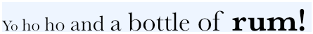
NSString* s = @"Yo ho ho and a bottle of rum!";
NSMutableAttributedString* mas =
    [[NSMutableAttributedString alloc] initWithString:s];
Now I’ll apply some attributes, using Core Text calls exclusively. I’ll cycle through the words of the string; to each word I’ll apply a slightly larger size of the same font. The name supplied when creating a CTFont must be a PostScript name; a free app, Typefaces, is helpful for learning all the fonts on a device along with their PostScript names:
__block CGFloat f = 18.0;
CTFontRef basefont = CTFontCreateWithName((CFStringRef)@"Baskerville", f, nil);
[s enumerateSubstringsInRange:NSMakeRange(0, [s length])
                      options:NSStringEnumerationByWords
                   usingBlock:
 ^(NSString *substring, NSRange substringRange, NSRange encRange, BOOL *stop) {
     f += 3.5;
     CTFontRef font2 = CTFontCreateCopyWithAttributes(basefont, f, nil, nil);
     NSDictionary* d2 =
         @{(NSString*)kCTFontAttributeName: CFBridgingRelease(font2)};
     [mas addAttributes:d2 range:encRange];
 }];
Finally, I’ll make the last word bold. The easiest way to obtain the range of the last word is to cycle through the words backward and stop after the first one (by setting the incoming BOOL, stop, by indirection). Boldness is a font trait; we must obtain a bold variant of the original font. The font we started with, Baskerville, has such a variant, so this will work:
[s enumerateSubstringsInRange:NSMakeRange(0, [s length])
                      options: (NSStringEnumerationByWords |
                                NSStringEnumerationReverse)
                   usingBlock:
 ^(NSString *substring, NSRange substringRange, NSRange encRange, BOOL *stop) {
     CTFontRef font2 =
         CTFontCreateCopyWithSymbolicTraits (
             basefont, f, nil, kCTFontBoldTrait, kCTFontBoldTrait);
     NSDictionary* d2 =
         @{(NSString*)kCTFontAttributeName: CFBridgingRelease(font2)};
     [mas addAttributes:d2 range:encRange];
     *stop = YES; // do just once, last word
 }];
Finally, let’s not forget to complete our memory management:
CFRelease(basefont);
(And did you notice the cool use of ARC’s CFBridgingRelease? Recall from Chapter 12 that this is a way of crossing the bridge from a CFTypeRef to an Objective-C object and, at the same time, giving ARC responsibility for completing the memory management that we started by calling a Create function.)
You’re probably wondering why I seem to ask for the bold variant (kCTFontBoldTrait) twice. The first time (the fourth argument in the call to CTFontCreateCopyWithSymbolicTraits) I’m providing a bitmask. The second time (the fifth argument) I’m providing a second bitmask that says which bits of the first bitmask are meaningful. For example, suppose I’m starting with a font that might or might not be italic, and I want to obtain its bold variant — meaning that if it is italic, I want a bold italic font. It isn’t enough to supply a bitmask whose value is kCTFontBoldTrait, because this appears to switch boldness on and everything else off. Thus, the second bitmask says, “Only this one bit is important; leave all other attributes alone.” By the same token, to get a nonbold variant of a font that might be bold, you’d supply 0 as the fourth argument and kCTFontBoldTrait as the fifth argument.
Core Text can also draw into a graphics context. Text will be drawn upside-down unless we flip the graphics context’s coordinate system. Positioning the drawing is up to us.
If the string is a single line we can draw it directly into a graphics context with a CTLineRef. The following code, in a custom UIView subclass, draws the attributed string we created a moment ago (Figure 23.5):
- (void)drawRect:(CGRect)rect {
    if (!self.text)
        return;
    CGContextRef ctx = UIGraphicsGetCurrentContext();
    // flip context
    CGContextSaveGState(ctx);
    CGContextTranslateCTM(ctx, 0, self.bounds.size.height);
    CGContextScaleCTM(ctx, 1.0, -1.0);
    CTLineRef line =
        CTLineCreateWithAttributedString(
            (__bridge CFAttributedStringRef)self.text);
    CGContextSetTextPosition(ctx, 1, 3);
    CTLineDraw(line, ctx);
    CFRelease(line);
    CGContextRestoreGState(ctx);
}
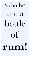
If we want our string to be drawn wrapped, we must use a CTFramesetter. The framesetter requires a frame into which to draw; this is expressed as a CGPath, but don’t get all excited about the possibility of drawing wrapped into some interesting shape, such as an ellipse, because on iOS the path must describe a rectangle:
- (void)drawRect:(CGRect)rect {
    if (!self.text)
        return;
    CGContextRef ctx = UIGraphicsGetCurrentContext();
    // flip context
    CGContextSaveGState(ctx);
    CGContextTranslateCTM(ctx, 0, self.bounds.size.height);
    CGContextScaleCTM(ctx, 1.0, -1.0);
    CTFramesetterRef fs =
        CTFramesetterCreateWithAttributedString(
            (__bridge CFAttributedStringRef)self.text);
    CGMutablePathRef path = CGPathCreateMutable();
    CGPathAddRect(path, nil, rect);
    // range (0,0) means "the whole string"
    CTFrameRef f = CTFramesetterCreateFrame(fs, CFRangeMake(0, 0), path, nil);
    CTFrameDraw(f, ctx);
    CGPathRelease(path);
    CFRelease(f);
    CFRelease(fs);
    CGContextRestoreGState(ctx);
}
That code wraps, but the text is left-aligned. Paragraph-level behaviors such as alignment and truncation can be expressed as part of the attributed string itself by applying a CTParagraphStyle. Paragraph styles can also include first-line indent, tab stops, line height, spacing, line break mode, and more. To center our text (which results in a drawing that looks like Figure 23.6), we apply a centered style before drawing it:
NSMutableAttributedString* mas = [self.text mutableCopy];
NSString* s = [mas string];
CTTextAlignment centerValue = kCTCenterTextAlignment;
CTParagraphStyleSetting center =
{kCTParagraphStyleSpecifierAlignment, sizeof(centerValue), ¢erValue};
CTParagraphStyleSetting pss[1] = {center};
CTParagraphStyleRef ps = CTParagraphStyleCreate(pss, 1);
[mas addAttribute:(NSString*)kCTParagraphStyleAttributeName
value:CFBridgingRelease(ps)
range:NSMakeRange(0, [s length])];
self.text = mas;
Core Text can also access font typographical features that can’t be accessed in any other way, such as the built-in ability of Didot and Hoefler Text to render themselves in small caps. As an example, we’ll draw the names of the 50 U.S. states in small caps, centered, in two columns on an iPad (Figure 23.7).
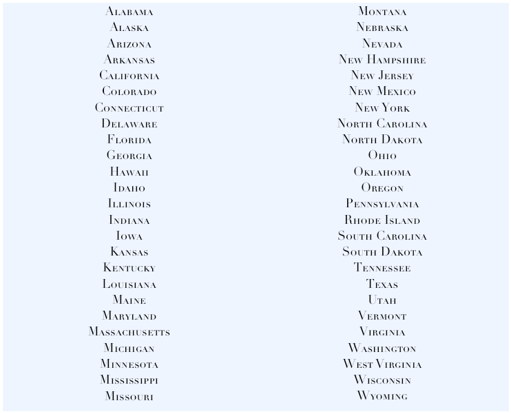
As we create the NSAttributedString, we use a convenience function, CTFontDescriptorCreateCopyWithFeature, to access Didot’s small caps variant. I had to log the result of CTFontCopyFeatures to learn how to access this variant of this font (there is also old documentation of font features at http://developer.apple.com/fonts/registry). We apply a centered style, as before:
NSString* path =
[[NSBundle mainBundle] pathForResource:@"states" ofType:@"txt"];
NSString* s =
[NSString stringWithContentsOfFile:path
encoding:NSUTF8StringEncoding error:nil];
CTFontRef font = CTFontCreateWithName((CFStringRef)@"Didot", 18, nil);
CTFontDescriptorRef fontdesc1 = CTFontCopyFontDescriptor(font);
// names come from SFNTLayoutTypes.h (iOS 6 new feature)
CTFontDescriptorRef fontdesc2 =
CTFontDescriptorCreateCopyWithFeature(fontdesc1,
(__bridge CFNumberRef)@(kLetterCaseType),
(__bridge CFNumberRef)@(kSmallCapsSelector));
CTFontRef basefont = CTFontCreateWithFontDescriptor(fontdesc2, 0, nil);
NSDictionary* d =
@{(NSString*)kCTFontAttributeName: CFBridgingRelease(basefont)};
NSMutableAttributedString* mas =
[[NSMutableAttributedString alloc] initWithString:s attributes:d];
CTTextAlignment centerValue = kCTCenterTextAlignment;
CTParagraphStyleSetting center =
{kCTParagraphStyleSpecifierAlignment, sizeof(centerValue), ¢erValue};
CTParagraphStyleSetting pss[1] = {center};
CTParagraphStyleRef ps = CTParagraphStyleCreate(pss, 1);
[mas addAttribute:(NSString*)kCTParagraphStyleAttributeName
value:CFBridgingRelease(ps)
range:NSMakeRange(0, [s length])];
CFRelease(font); CFRelease(fontdesc1); CFRelease(fontdesc2);
The two-column arrangement is achieved by drawing into two frames. In our drawRect: code, after flipping the context as before (not shown), we draw the entire text into the first frame and then use CTFrameGetVisibleStringRange to learn how much of the text actually fits into it; this tells us where in the attributed string to start drawing into the second frame:
CGRect r1 = rect;
r1.size.width /= 2.0; // column 1
CGRect r2 = r1;
r2.origin.x += r2.size.width; // column 2
CTFramesetterRef fs =
    CTFramesetterCreateWithAttributedString(
        (__bridge CFAttributedStringRef)self.text);
// draw column 1
CGMutablePathRef path = CGPathCreateMutable();
CGPathAddRect(path, nil, r1);
CTFrameRef f = CTFramesetterCreateFrame(fs, CFRangeMake(0, 0), path, nil);
CTFrameDraw(f, ctx);
CGPathRelease(path);
CFRange drawnRange = CTFrameGetVisibleStringRange(f);
CFRelease(f);
// draw column 2
path = CGPathCreateMutable();
CGPathAddRect(path, nil, r2);
f = CTFramesetterCreateFrame(fs,
        CFRangeMake(drawnRange.location + drawnRange.length, 0), path, nil);
CTFrameDraw(f, ctx);
CGPathRelease(path);
CFRelease(f);
CFRelease(fs);
The result is Figure 23.7. But now let’s go further. A frame is itself composed of CTLines describing how each line of text was laid out. To demonstrate, let’s turn our two-column list of states into an interactive interface: when the user taps the name of a state, we’ll fetch that name, and we’ll briefly draw a rectangle around the name to provide feedback (Figure 23.8).

We have two NSMutableArray properties, theLines and theBounds. We initialize them to empty arrays at the start of our drawRect:, and each time we call CTFrameDraw we also call a utility method:
[self appendLinesAndBoundsOfFrame:f context:ctx];
In appendLinesAndBoundsOfFrame:context: we save the CTLines of the frame into theLines; we also calculate the drawn bounds of each line and save it into theBounds:
- (void) appendLinesAndBoundsOfFrame:(CTFrameRef)f context:(CGContextRef)ctx{
    CGAffineTransform t1 =
        CGAffineTransformMakeTranslation(0, self.bounds.size.height);
    CGAffineTransform t2 = CGAffineTransformMakeScale(1, -1);
    CGAffineTransform t = CGAffineTransformConcat(t2, t1);
    CGPathRef p = CTFrameGetPath(f);
    CGRect r = CGPathGetBoundingBox(p); // this is the frame bounds
    NSArray* lines = (__bridge NSArray*)CTFrameGetLines(f);
    [self.theLines addObjectsFromArray:lines];
    CGPoint origins[[lines count]];
    CTFrameGetLineOrigins(f, CFRangeMake(0,0), origins);
    for (int i = 0; i < [lines count]; i++) {
        CTLineRef aLine = (__bridge CTLineRef)lines[i];
        CGRect b = CTLineGetImageBounds((CTLineRef)aLine, ctx);
        // the line origin plus the image bounds size is the bounds we want
        CGRect b2 = { origins[i], b.size };
        // but it is expressed in terms of the frame, so we must compensate
        b2.origin.x += r.origin.x;
        b2.origin.y += r.origin.y;
        // we must also compensate for the flippedness of the graphics context
        b2 = CGRectApplyAffineTransform(b2, t);
        [self.theBounds addObject: [NSValue valueWithCGRect:b2]];
    }
}
We have attached a UITapGestureRecognizer to our view; when the user taps, we cycle through the saved bounds to see if any of them contains the tap point. If it does, we fetch the name of the state, and we draw a rectangle around it:
- (void) tapped: (UITapGestureRecognizer*) tap {
    CGPoint loc = [tap locationInView:self];
    for (int i = 0; i < [self.theBounds count]; i++) {
        CGRect rect = [self.theBounds[i] CGRectValue];
        if (CGRectContainsPoint(rect, loc)) {
            // draw rectangle for feedback
            CALayer* lay = [CALayer layer];
            lay.frame = CGRectInset(rect, -5, -5);
            lay.borderWidth = 2;
            [self.layer addSublayer: lay];
            dispatch_time_t popTime =
                dispatch_time(DISPATCH_TIME_NOW, 0.3 * NSEC_PER_SEC);
            dispatch_after(popTime, dispatch_get_main_queue(), ^(void){
                [lay removeFromSuperlayer];
            });
            // fetch the drawn string tapped on
            CTLineRef theLine =
                (__bridge CTLineRef)[self.theLines[i];
            CFRange range = CTLineGetStringRange(theLine);
            CFStringRef s = CFStringCreateWithSubstring(
                nil, (__bridge CFStringRef)[self.text string], range);
            // ... could do something useful with string here ...
            NSLog(@"tapped %@", s);
            CFRelease(s);
            break;
        }
    }
}
If we needed to, we could even learn what character the user tapped by going down to the level of glyph runs (CTRun) and glyphs (CTGlyph). We have barely scratched the surface of what Core Text can do. Read Apple’s Core Text Programming Guide for further information.