I’m gonna ask you the three big questions. — Go ahead. — Who made you? — You did. — Who owns the biggest piece of you? — You do. — What would happen if I dropped you? — I’d go right down the drain.
A table view (UITableView) is a scrolling interface (a vertically scrolling UIScrollView, Chapter 20) for presenting a single column of rectangular cells (UITableViewCell, a UIView subclass). It is a keystone of Apple’s strategy for making the small iPhone screen useful and powerful, and has three main purposes:
- Presentation of information
- The cells typically contain text, which the user can read. The cells are usually quite small, in order to maximize the number of them that appear on the screen at once, so this text is often condensed, truncated, or otherwise simplified.
- Selection
- A table view can be used to provide the user with a column of choices. The user chooses by tapping a cell, which selects the cell; the app responds appropriately to that choice.
- Navigation
- The appropriate response to the user’s choosing a cell is often navigation to another interface. This might be done, for example, through a presented view controller or a navigation interface (Chapter 19). An extremely common configuration is a master–detail interface, in which the master view is (or contains) a table view, often at the root of a navigation interface; the user taps a listing in the table to navigate to the details for that choice. This is one reason why truncation of text in a table view is acceptable: the detail view contains the full information.
In addition to its column of cells, a table view can be extended by a number of other features that make it even more useful and flexible:
- A table can start with a header view at the top and end with a footer view at the bottom.
- The cells can be clumped into sections. Each section can have a header and footer, and these remain visible as long as the section itself occupies the screen, giving the user a clue as to where we are within the table. Moreover, a section index can be provided, in the form of an overlay column of abbreviated section titles, which the user can tap to jump to the start of a section, thus making a long table tractable.
- A table can have a “grouped” format. This is often used for presenting small numbers of related cells.
- Tables can be editable: the user can be permitted to insert, delete, and reorder cells.
Figure 21.1 illustrates four variations of the table view:
- Apple’s Music app lists song titles and artists for a given album in truncated form in a table view within a navigation interface which is itself within a tab bar interface; tapping an album in a table of album titles summons the list of songs within that album, and tapping a song in that list plays it.
- An app of mine lists Latin words and their definitions in alphabetical order, divided into sections by first letter, with section headers and a section index.
- Apple’s Settings app uses table cells in a grouped format with a header, within a navigation interface, to display a switch and a list of Bluetooth devices; tapping a device name searches for it, while tapping the disclosure button navigates to reveal more information about it.
- Apple’s Music app allows a custom playlist to be edited, with interface for deleting and rearranging cells.
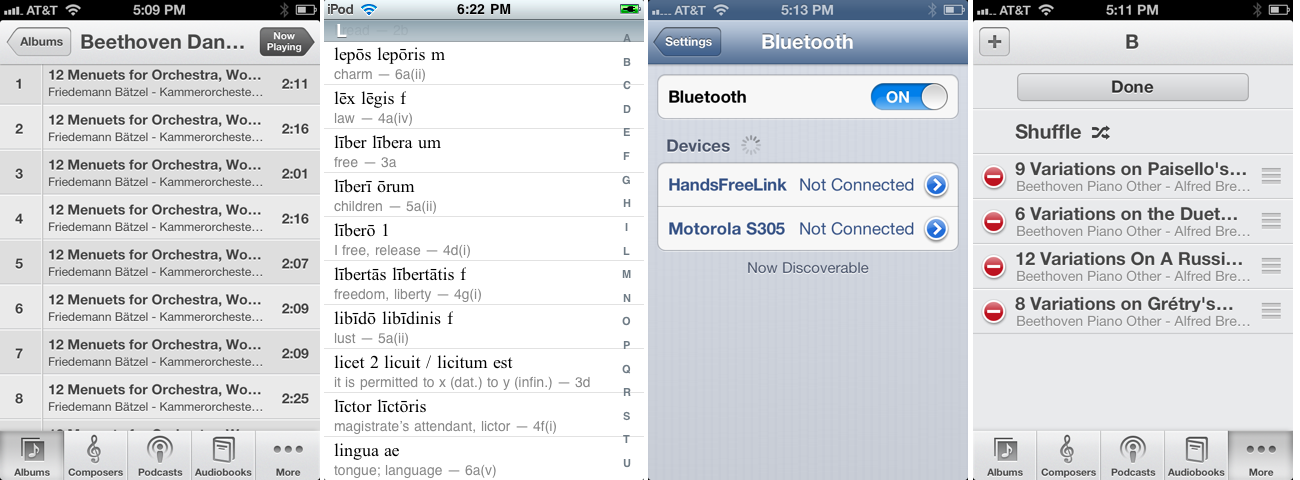
Table cells, too, can be extremely flexible. Some basic table cell formats are provided, such as a text label along with a small image view, but you are free to design your own table cell as you would any other view. There are also some standard interface items that are commonly used in a table cell, such as a checkmark to indicate selection or a right-pointing chevron to indicate that tapping the cell navigates to a detail view.
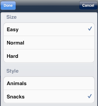
It would be difficult to overestimate the importance of table views. An iOS app without a table view somewhere in its interface would be a rare thing, especially on the small iPhone screen. I’ve written apps consisting almost entirely of table views. Indeed, it is not uncommon to use a table view even in situations that have nothing particularly table-like about them, simply because it is so convenient. For example, in one of my apps I want the user to be able to choose between three levels of difficulty. In a desktop application I’d probably use radio buttons; but there are no radio buttons among the standard iOS interface objects. Instead, I use a grouped table so small that it doesn’t even scroll. This gives me a section header, three tappable cells, and a checkmark indicating the current choice (Figure 21.2).
There is a UIViewController subclass, UITableViewController, dedicated to the presentation of a table view. You never really need to use a UITableViewController; it’s a convenience, but it doesn’t do anything that you couldn’t do yourself by other means. Here’s some of what using a UITableViewController gives you:
-
UITableViewController’s
initWithStyle:creates the table view with a plain or grouped format. - The view controller is automatically made the table view’s delegate and data source, unless you specify otherwise.
-
The table view is made the view controller’s
tableView. It is also, of course, the view controller’sview, but thetableViewproperty is typed as a UITableView, so you can send table view messages to it without typecasting.
This chapter also discusses collection views (UICollectionView), new in iOS 6. A collection view is a generalization of a table view allowing cells to be laid out and scrolled very flexibly.
Beginners may be surprised to learn that a table view’s structure and contents are not configured in advance. Rather, you supply the table view with a data source and a delegate (which will often be the same object; see Chapter 11), and the table view turns to these in real time, as the app runs, whenever it needs a piece of information about its structure and contents.
This architecture is actually part of a brilliant strategy to conserve resources. Imagine a long table consisting of thousands of rows. It must appear, therefore, to consist of thousands of cells as the user scrolls. But a cell is a UIView and is memory-intensive; to maintain thousands of cells internally would put a terrible strain on memory. Therefore, the table typically maintains only as many cells as are showing simultaneously at any one moment (about ten, let’s say). As the user scrolls, the table grabs a cell that is no longer showing on the screen and is therefore no longer needed, and hands it back to you and asks you to configure it as the cell that is about to be scrolled into view. Cells are thus reused to minimize the number of actual cells in existence at any one moment.
Therefore your code must be prepared, on demand, to supply the table with pieces of requested data. Of these, the most important is the table cell to be slotted into a given position. A position in the table is specified by means of an index path (NSIndexPath), a class used here to combine a section number with a row number, and is often referred to simply as a row of the table. Your data source object may at any moment be sent the message tableView:cellForRowAtIndexPath:, and must respond by returning the UITableViewCell to be displayed at that row of the table. And you must return it fast: the user is scrolling now, so the table needs the next cell now.
In this section, then, I’ll discuss what you’re going to be supplying — the table view cell. After that, I’ll talk about how you supply it.
Note
A table view whose cell contents are known beforehand, such as the one shown in Figure 21.2, can in fact be configured in advance, by designing the table’s view controller in a storyboard. I’ll discuss how to do that later in this chapter.
To create a cell using one of the built-in cell styles, call initWithStyle:reuseIdentifier:. The reuseIdentifier is what allows cells previously assigned to rows that are now longer showing to be reused for cells that are; it will usually be the same for all cells in a table. Your choices of cell style are:
-
UITableViewCellStyleDefault -
The cell has a UILabel (its
textLabel), with an optional UIImageView (itsimageView) at the left. If there is no image, the label occupies the entire width of the cell. -
UITableViewCellStyleValue1 -
The cell has two UILabels (its
textLabeland itsdetailTextLabel), side by side, with an optional UIImageView (itsimageView) at the left. The first label is left-aligned; the second label is right-aligned. If the first label’s text is too long, the second label won’t appear. -
UITableViewCellStyleValue2 -
The cell has two UILabels (its
textLabeland itsdetailTextLabel), side by side. No UIImageView will appear. The first label is right-aligned; the second label is left-aligned. The label sizes are fixed, and the text of either will be truncated if it’s too long. -
UITableViewCellStyleSubtitle -
The cell has two UILabels (its
textLabeland itsdetailTextLabel), one above the other, with an optional UIImageView (itsimageView) at the left.
To experiment with the built-in cell styles, do this.
- Make a new iPhone project from the Empty Application project template.
- Choose File → New → File and ask for a Cocoa Touch Objective-C class.
- Make it a UITableViewController subclass called RootViewController. “With XIB for user interface” should be checked, so that Xcode will hook up the table view in the nib correctly.
- Create the files.
To get our table view into the interface, import "RootViewController.h" into AppDelegate.m, and add this line to AppDelegate’s application:didFinishLaunchingWithOptions::
self.window.rootViewController = [RootViewController new];
Now modify the RootViewController class (which comes with a lot of templated code), as in Example 21.1.
Example 21.1. The world’s simplest table
- (NSInteger)numberOfSectionsInTableView:(UITableView *)tableView {
    return 1; ❶
}

- (NSInteger)tableView:(UITableView *)tableView
        numberOfRowsInSection:(NSInteger)section {
    return 20; ❷
}

- (UITableViewCell *)tableView:(UITableView *)tableView
         cellForRowAtIndexPath:(NSIndexPath *)indexPath {
    static NSString *CellIdentifier = @"Cell";
    UITableViewCell *cell =
        [tableView dequeueReusableCellWithIdentifier:CellIdentifier];
    if (cell == nil) {
        cell =
            [[UITableViewCell alloc] initWithStyle:UITableViewCellStyleDefault
                                   reuseIdentifier:CellIdentifier]; ❸
        ❹
    }
    cell.textLabel.text = @"Howdy there"; ❺
    return cell;
}
The idea is to start by generating a single cell in a built-in cell style and then to examine and experiment with its appearance by tweaking the code and running the app. The key parts of the code are:
|
Our table will have one section. |
|
|
Our table will consist of 20 rows. We’re going to make our cell without regard to what row it is slotted into; so all 20 rows will be identical. But having multiple rows will give us a sense of how our cell looks when placed next to other cells. |
|
|
This is where you specify the built-in table cell style you want to experiment with. Change |
|
|
At this point in the code you can modify characteristics of the cell ( |
|
|
We now have the cell to be used for this row of the table, so at this point in the code you can modify characteristics of the cell ( |
Build and run the app. Behold your table. Now you can start experimenting.
The flexibility of the built-in styles is based mostly on the flexibility of UILabels. Not everything can be customized, because after you return the cell some further configuration takes place, which may override your settings. For example, the size and position of the cell’s subviews are not up to you. (I’ll explain how to get around that, a little later.) But you get a remarkable degree of freedom. Here are some basic UILabel properties for you to play with (and I’ll talk much more about UILabels in Chapter 23):
-
text - The string shown in the label.
-
textColor,highlightedTextColor -
The color of the text. The
highlightedTextColorapplies when the cell is selected (tap on a cell to select it); if you don’t set it, the label may choose its own variant of thetextColorwhen the cell is highlighted. -
textAlignment -
How the text is aligned; some possible choices are
NSTextAlignmentLeft,NSTextAlignmentCenter, andNSTextAlignmentRight. -
numberOfLines -
The maximum number of lines of text to appear in the label. Text that is long but permitted to wrap, or that contains explicit linefeed characters, can appear completely in the label if the label is tall enough and the number of permitted lines is sufficient.
0means there’s no maximum.
-
font -
The label’s font. You could reduce the font size as a way of fitting more text into the label. A font name includes its style. For example:
cell.textLabel.font = [UIFont fontWithName:@"Helvetica-Bold" size:12.0];
-
shadowColor,shadowOffset - The text shadow. Adding a little shadow can increase clarity and emphasis for large text.
The image view’s frame can’t be changed, but you can inset its apparent size by supplying a smaller image and setting the image view’s contentMode to UIViewContentModeCenter. It’s probably a good idea in any case, for performance reasons, to supply images at their drawn size and resolution rather than making the drawing system scale them for you (see the last section of Chapter 20). For example:
UIImage* im = [UIImage imageNamed:@"pic.png"];
UIGraphicsBeginImageContextWithOptions(CGSizeMake(36,36), YES, 0);
[im drawInRect:CGRectMake(0,0,36,36)];
UIImage* im2 = UIGraphicsGetImageFromCurrentImageContext();
UIGraphicsEndImageContext();
cell.imageView.image = im2;
cell.imageView.contentMode = UIViewContentModeCenter;
The cell itself also has some properties you can play with:
-
accessoryType -
A built-in type of accessory view, which appears at the cell’s right end. For example:
cell.accessoryType = UITableViewCellAccessoryDisclosureIndicator;
-
accessoryView -
Your own UIView, which appears at the cell’s right end (overriding the
accessoryType). For example:UIButton* b = [UIButton buttonWithType:UIButtonTypeRoundedRect]; [b setTitle:@"Tap Me" forState:UIControlStateNormal]; [b sizeToFit]; // ... also assign button a target and action ... cell.accessoryView = b;
-
indentationLevel,indentationWidth -
These properties give the cell a left margin, useful for suggesting a hierarchy among cells. You can also set a cell’s indentation level in real time, with respect to the table row into which it is slotted, by implementing the delegate’s
tableView:indentationLevelForRowAtIndexPath:method. -
selectionStyle -
How the background looks when the cell is selected. The default is a blue gradient (
UITableViewCellSelectionStyleBlue), or you can chooseUITableViewCellSelectionStyleGray(gray gradient) orUITableViewCellSelectionStyleNone. -
backgroundColor
backgroundView
selectedBackgroundView -
What’s behind everything else drawn in the cell. The
selectedBackgroundViewis drawn in front of thebackgroundView(if any) when the cell is selected, and will appear instead of whatever theselectionStyledictates. ThebackgroundColoris behind thebackgroundView. (Thus, if both theselectedBackgroundViewand thebackgroundViewhave some transparency, both of them and thebackgroundColorcan appear composited together when the cell is selected.)There is no need to set the frame of the
backgroundViewandselectedBackgroundView; they will be resized automatically to fit the cell. -
multipleSelectionBackgroundView -
If defined (not nil), and if the table’s
allowsMultipleSelection(or, if editing,allowsMultipleSelectionDuringEditing) is YES, used instead of theselectedBackgroundViewwhen the cell is selected.
Applying a backgroundView or a backgroundColor can be tricky, because:
-
The cell’s default interface elements, such as the
textLabel, automatically adopt the cell’s background color as their own background color when the cell is not selected. Thus, they will appear to “punch a hole” through thebackgroundView, revealing the background color behind it. (This problem doesn’t arise for a selected cell, because when the cell is selected the cell’s interface elements automatically switch to a transparent background, allowing theselectionStyleorselectedBackgroundViewto show through.) The solution, if you want thebackgroundViewto appear behind the interface elements, is to set thebackgroundColorof the interface elements to a color with some transparency, possibly[UIColor clearColor]. -
The table’s cells automatically take on the same
backgroundColoras the table itself, and getting them to stop doing this is not easy. The problem is thattableView:cellForRowAtIndexPath:is too soon; when you set a cell’sbackgroundColorhere, your command is obeyed, but then the cell’s background color reverts to the table’s background color as the cell’s ownsetSelected:animated:is called automatically and the cell does various things to its own appearance. One solution is to implement a delegate method,tableView:willDisplayCell:forRowAtIndexPath:, and set thebackgroundColorthere. Alternatively, don’t even try to give a cell abackgroundColor; instead, give it a coloredbackgroundView.
In this example, we set the backgroundView to display an image with some transparency at the outside edges, so that the backgroundColor shows behind it. We set the selectedBackgroundView to an almost transparent dark rectangle, to darken that image when the cell is selected. And we give the textLabel a clear background color so that the rest of our work shows through (Figure 21.3):
UIImageView* v = [UIImageView new];
v.contentMode = UIViewContentModeScaleToFill;
v.image = [UIImage imageNamed:@"linen.png"];
cell.backgroundView = v;
UIView* v2 = [UIView new];
v2.backgroundColor = [UIColor colorWithWhite:0.2 alpha:0.1];
cell.selectedBackgroundView = v2;
cell.textLabel.backgroundColor = [UIColor clearColor];
I’d put that code in the spot numbered 4 in Example 21.1. These features are to be true of every cell ever displayed in the table, and they need to be configured just once for every cell as it first comes into existence. There’s no need to waste time doing the same thing all over again when an existing cell is reused.
Finally, there are a few properties of the table view itself worth playing with:
-
rowHeight -
The height of a cell. A taller cell is, among other things, a way to accommodate more text. You can also change this value in the nib file; the table view’s row height appears in the Size inspector. The cell’s subviews have their autoresizing set so as to compensate correctly. You can also set a cell’s height in real time by implementing the delegate’s
tableView:heightForRowAtIndexPath:method; thus a table’s cells may differ from one another in height (more about that later in this chapter). -
separatorColor,separatorStyle -
These can also be set in the nib. The choices of separator style are:
-
UITableViewCellSeparatorStyleNone(plain style table only) -
UITableViewCellSeparatorStyleSingleLine -
UITableViewCellSeparatorStyleSingleLineEtched(grouped style table only)
Oddly, the separator style names are associated with UITableViewCell even though the separator style itself is a UITableView property.
-
-
backgroundColor,backgroundView -
What’s behind all the cells of the table; this may be seen if the cells have transparency, or if the user bounces the cells beyond their limit. I’ve already mentioned that cells will, by default, take on the
backgroundColorof their table. ThebackgroundViewis drawn on top of thebackgroundColor. -
tableHeaderView,tableFooterView - Views to be shown before the first row and after the last row, respectively. Their background color is, by default, the background color of the table, but you can change that. The user can, if you like, interact with the views (and their subviews). You can alter these views dynamically during the lifetime of the app. If you change the height of one of them, you must set the corresponding table view property afresh so that the table view learns what has happened.
iOS 6 introduces a new way of obtaining a cell in tableView:cellForRowAtIndexPath:. Instead of calling dequeueReusableCellWithIdentifier: to obtain the cell, you call dequeueReusableCellWithIdentifier:forIndexPath:, passing along as the second argument the same indexPath: value that you already received. As far as I can tell, however, the indexPath: parameter does nothing whatever, except to distinguish the two methods from one another!
The reason for calling this new method is twofold:
- The result is never nil
-
The value that is returned by
dequeueReusableCellWithIdentifier:forIndexPath:is never nil. If there is a free reusable cell with the given identifier, it is returned. If there isn’t, a new one is created for you. Thus there is no need to check whether the resulting cell is nil and create a new one if it is, as we did at step 3 of Example 21.1. - The identifier is consistent
-
A danger with
dequeueReusableCellWithIdentifier:is that you may accidentally pass an incorrect reuse identifier, or nil, and end up not reusing cells. WithdequeueReusableCellWithIdentifier:forIndexPath:, that can’t happen.The way such accidents are prevented is this: before you call
dequeueReusableCellWithIdentifier:forIndexPath:for the first time, you must register with the table itself. You do this by callingregisterClass:forCellReuseIdentifier:. This associates a class (which must be UITableViewCell or a subclass thereof) with a string identifier. The specification of the class is howdequeueReusableCellWithIdentifier:forIndexPath:knows what class to instantiate when it creates a new cell for you. The only cell types you can obtain are those for which you’ve registered in this way; if you pass a bad identifier, the app will crash (with a helpful log message).
This is a very elegant mechanism, but it raises some questions:
-
When should I call
registerClass:forCellReuseIdentifier:? -
Call it early, before the table view starts generating cells.
viewDidLoadis a good place. - How do I specify a built-in table cell style?
-
We are no longer calling
initWithStyle:reuseIdentifier:, so where do we make our choice of built-in cell style? Well, by default, the cell style will beUITableViewCellStyleDefault, so if that’s what you were after, the problem is solved. Otherwise, you subclass UITableViewCell and overrideinitWithStyle:reuseIdentifier:to substitute the cell style you’re after (and pass along the reuse identifier you were handed). - How do I know whether the returned cell is new or reused?
-
In step 4 of Example 21.1, if the returned cell was nil, we created it and then gave it features that it would need to be assigned only once. For example, if every cell is to have a gray gradient background, there is no point giving every cell returned by
dequeueReusableCellWithIdentifier:forIndexPath:a gray gradient background; the reused cells already have one. Now, however, no cell is nil. So how will we know which ones need to be given a gray gradient background. It’s easy: they are the ones without a gray gradient background! In other words, it’s true that you can’t check for nil to decide whether this cell needs to be given its initial one-time features, but surely you’ll be able to think of something else to check for.
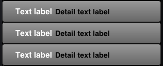
Here’s a complete example, also illustrating heavy customization of a table view cell’s background and apparent shape. It’s a UITableViewCellStyleValue2 cell (Figure 21.4), and I register a UITableViewCell subclass (MyCell) in order to get it. I draw the cell’s background view as a gray gradient, using its layer properties (Chapter 16) to give it a border with rounded corners. My GradientView class is just a UIView whose layerClass is CAGradientLayer, and because MyCell and GradientView are so minimal, and are used only by RootViewController, I’ve put them into the RootViewController implementation file:
@interface MyCell:UITableViewCell
@end
@implementation MyCell
-(id)initWithStyle:(UITableViewCellStyle)style
   reuseIdentifier:(NSString *)reuseIdentifier {
    self = [super initWithStyle:UITableViewCellStyleValue2
                reuseIdentifier:reuseIdentifier];
    return self;
}
@end

@interface GradientView:UIView
@end
@implementation GradientView
+(Class)layerClass { return [CAGradientLayer class]; }
@end
@implementation RootViewController
-(void)viewDidLoad {
    [super viewDidLoad];
    [self.tableView registerClass:[MyCell class]
           forCellReuseIdentifier:@"Cell"];
}

- (NSInteger)numberOfSectionsInTableView:(UITableView *)tableView {
    return 1;
}

- (NSInteger)tableView:(UITableView *)tableView
        numberOfRowsInSection:(NSInteger)section {
    return 20;
}

- (UITableViewCell *)tableView:(UITableView *)tableView
        cellForRowAtIndexPath:(NSIndexPath *)indexPath {
    UITableViewCell *cell =
        [tableView dequeueReusableCellWithIdentifier:@"Cell"
                                        forIndexPath:indexPath];
    if (cell.backgroundView == nil) { // do one-time configurations
        UIView* v = [UIView new];
        v.backgroundColor = [UIColor blackColor];
        UIView* v2 = [GradientView new];
        CAGradientLayer* lay = (CAGradientLayer*)v2.layer;
        lay.colors = @[(id)[UIColor colorWithWhite:0.6 alpha:1].CGColor,
        (id)([UIColor colorWithWhite:0.4 alpha:1].CGColor)];
        lay.borderWidth = 1;
        lay.borderColor = [UIColor blackColor].CGColor;
        lay.cornerRadius = 5;
        [v addSubview:v2];

        v2.autoresizingMask = UIViewAutoresizingFlexibleHeight |
                              UIViewAutoresizingFlexibleWidth;
        cell.backgroundView = v;
        cell.textLabel.font = [UIFont fontWithName:@"Helvetica-Bold" size:16];
        cell.textLabel.textColor = [UIColor whiteColor];
        cell.textLabel.backgroundColor = [UIColor clearColor];
        cell.detailTextLabel.backgroundColor = [UIColor clearColor];
    }
    cell.textLabel.text = @"Text label";
    cell.detailTextLabel.text = @"Detail text label";
    return cell;
}
@end
I’m going to adopt dequeueReusableCellWithIdentifier:forIndexPath: from here on. It isn’t backwards-compatible with iOS 5 and before, but it’s a great new feature. Also, it’s consistent with other ways of generating custom cells, as I’ll explain in the next section.
The built-in cell styles give the beginner a leg up in getting started with table views, but there is nothing sacred about them, and sooner or later you’ll probably want to go beyond them and put yourself in charge of how a table’s cells look and what subviews they contain. There are four possible approaches:
-
Supply a UITableViewCell subclass and override
layoutSubviewsto alter the frames of the built-in subviews. The built-in subviews are actually subviews of the cell’scontentView. ThecontentViewis the superview for the cell’s subviews, exclusive of things like theaccessoryView; so by confining your changes to subviews of thecontentView, you allow the cell to continue working correctly. -
In
tableView:cellForRowAtIndexPath:, add subviews to each cell’scontentViewas the cell is created. This approach can be combined with the previous one, or you can ignore the built-in subviews and use your own exclusively. As long as the built-in subviews for a particular built-in cell style are not referenced, they are never created or inserted into the cell, so you don’t need to remove them if you don’t want to use them. -
Design the cell in a nib, and load that nib in
tableView:cellForRowAtIndexPath:each time a cell needs to be created. - Design the cell in a storyboard.
I’ll illustrate each approach.
You can’t directly change the frame of a built-in cell style subview in tableView:cellForRowAtIndexPath: or tableView:willDisplayCell:forRowAtIndexPath:, because after your changes, the cell’s layoutSubviews comes along and overrides them. The workaround is to override the cell’s layoutSubviews! This is a straightforward solution if your main objection to a built-in style is the frame of an existing subview.
To illustrate, let’s modify a UITableViewCellStyleDefault cell so that the image is at the right end instead of the left end (Figure 21.5). We’ll make a UITableViewCell subclass, MyCell, remembering to register MyCell with the table view, so that dequeueReusableCellWithIdentifier:forIndexPath: produces a MyCell instance; here is MyCell’s layoutSubviews:
- (void) layoutSubviews {
    [super layoutSubviews];
    CGRect cvb = self.contentView.bounds;
    CGRect imf = self.imageView.frame;
    imf.origin.x = cvb.size.width - imf.size.width;
    self.imageView.frame = imf;
    CGRect tf = self.textLabel.frame;
    tf.origin.x = 5;
    self.textLabel.frame = tf;
}
In using this technique, I find it easier to move the subviews using their frame, rather than with constraints. Otherwise, the runtime (which still thinks it owns these subviews) tries to fight us.
Instead of modifying the existing default subviews, you can add completely new views to each UITableViewCell’s content view. This has some great advantages over the preceding technique. We won’t be fighting the runtime, so we can make our changes in tableView:cellForRowAtIndexPath:, and we can assign a frame or constraints. Here are some things to keep in mind:
- The new views must be added when we instantiate a new cell, but not when we reuse a cell (because a reused cell already has them).
-
We must never send
addSubview:to the cell itself — only to itscontentView(or some subview thereof). -
We should assign the new views an appropriate
autoresizingMaskor constraints, because the cell’s content view might be resized. - Each new view should be assigned a tag so that it can be referred to elsewhere.
I’ll rewrite the previous example (Figure 21.5) to use this technique. We are no longer using a UITableViewCell subclass; the registered cell class is UITableViewCell itself:
- (UITableViewCell *)tableView:(UITableView *)tableView
        cellForRowAtIndexPath:(NSIndexPath *)indexPath {
    UITableViewCell *cell =
        [tableView dequeueReusableCellWithIdentifier:@"Cell"
                                        forIndexPath:indexPath];
    if (cell.backgroundView == nil) {
        // ... add background view as before ...
        //  now insert our own views into the contentView
        UIImageView* iv = [UIImageView new];
        iv.tag = 1;
        [cell.contentView addSubview:iv];
        UILabel* lab = [UILabel new];
        lab.tag = 2;
        [cell.contentView addSubview:lab];
        // we can use autolayout to lay them out
        NSDictionary* d = NSDictionaryOfVariableBindings(iv, lab);
        iv.translatesAutoresizingMaskIntoConstraints = NO;
        lab.translatesAutoresizingMaskIntoConstraints = NO;
        // image view is vertically centered
        [cell.contentView addConstraint:
         [NSLayoutConstraint
          constraintWithItem:iv attribute:NSLayoutAttributeCenterY
          relatedBy:0
          toItem:cell.contentView attribute:NSLayoutAttributeCenterY
          multiplier:1 constant:0]];
        // it's a square
        [cell.contentView addConstraint:
         [NSLayoutConstraint
          constraintWithItem:iv attribute:NSLayoutAttributeWidth
          relatedBy:0
          toItem:iv attribute:NSLayoutAttributeHeight
          multiplier:1 constant:0]];
        // label has height pinned to superview
        [cell.contentView addConstraints:
         [NSLayoutConstraint
          constraintsWithVisualFormat:@"V:|[lab]|"
          options:0 metrics:nil views:d]];
        // horizontal margins
        [cell.contentView addConstraints:
         [NSLayoutConstraint
          constraintsWithVisualFormat:@"H:|-5-[lab]-10-[iv]-5-|"
          options:0 metrics:nil views:d]];
    }
    UILabel* lab = (UILabel*)[cell viewWithTag: 2];
    // ... set up lab here ...
    UIImageView* iv = (UIImageView*)[cell viewWithTag: 1];
    // ... set up iv here ...
    return cell;
}
Note how we can refer to the label and the image view, even when we’re handed an existing cell for reuse, because we had the foresight to give them tags.
Using our own cell subviews instead of the built-in cell style subviews has some clear advantages; we no longer have to perform an elaborate dance to escape from the restrictions imposed by the runtime. Still, the verbosity of this code is somewhat overwhelming. We can avoid this by designing the cell in a nib.
In designing a cell in a nib, we start by creating a nib file that will consist, in effect, solely of this one cell. In Xcode, we create a new iOS User Interface View nib file. Let’s call it MyCell.xib. In the nib editor, delete the existing View and replace it with a Table View Cell from the Object library.
The cell’s design window shows a standard-sized cell; you can resize it as desired, but the actual size of the cell in the interface will be dictated by the table view’s width and its rowHeight. The cell’s style can be specified in the Style pop-up menu of the Attributes inspector, and this gives you the default subviews, locked in their standard positions; for example, if you choose Basic, the textLabel appears, and if you specify an image in the Image combo box, the imageView appears.
For purposes of the example, let’s set the Style pop-up menu to Custom and start with a blank slate. We’ll implement, from scratch, the same subviews we’ve already implemented in the preceding two examples: a UILabel on the left side of the cell, and a UIImageView on the right side. Just as when we add subviews in code, we should set each subview’s autoresizing behavior or constraints, and give each subview a tag. The difference is that we now do both those tasks in the nib, not in code. Now, in tableView:cellForRowAtIndexPath:, we’ll be able to refer to the label and the image view using viewWithTag:, exactly as in the previous example:
UILabel* lab = (UILabel*)[cell viewWithTag: 2];
// ... set up lab here ...
UIImageView* iv = (UIImageView*)[cell viewWithTag: 1];
// ... set up iv here ...
return cell;
The only remaining question is how to load the cell from the nib. This the Really Cool Part. When we register with the table view, which we’re currently doing in viewDidLoad, instead of calling registerClass:forCellReuseIdentifier:, we call registerNib:forCellReuseIdentifier:. To specify the nib, call UINib’s class method nibWithNibName:bundle:, like this:
[self.tableView registerNib:[UINib nibWithNibName:@"MyCell" bundle:nil]
     forCellReuseIdentifier:@"Cell"];
That’s all there is to it! In tableView:cellForRowAtIndexPath:, when we call dequeueReusableCellWithIdentifier:forIndexPath:, if the table has no free reusable cell already in existence, the nib will automatically be loaded and the cell will be instantiated from it and returned to us.
You may wonder how that’s possible, when we haven’t specified a File’s Owner class or added an outlet from the File’s Owner to the table cell in the nib. The answer is that the nib conforms to a specific format. The UINib instance method instantiateWithOwner:options: (mentioned in Chapter 7) can load a nib with a nil owner; regardless, it returns an NSArray of the nib’s instantiated top-level objects. This nib is expected to have exactly one top-level object, and that top-level object is expected to be a UITableViewCell; that being so, the cell can easily be extracted from the resulting NSArray, as it is the array’s only element. Our nib meets those expectations! Problem solved.
The advantages of this approach should be immediately obvious. Most or all of what we were previously doing in code to configure each newly instantiated cell can now be done in the nib: the label is positioned and configured with a clear background color, its font and text color is set, and so forth. As a result, that code can be deleted.
Some code, unfortunately, is tricky to delete. Suppose, for example, that we want to give our cell a backgroundView. The cell in the nib has a backgroundView outlet, so we are tempted to drag a view into the canvas and configure that outlet. But if this new view is at the top level of the nib, our nib no longer conforms to the expected format — it has two top-level objects — and our app will crash (with a helpful message in the log).
This seems an unnecessary restriction; why can’t the nib-loader examine the top-level objects and discover the one that’s a UITableViewCell? There are workarounds in some cases — you might be able to put the background view inside the cell — but in other cases you’ll just have to go on using code to add the backgroundView.
As I’ve already mentioned, we are referring to the cell’s subviews in code by way of viewWithTag:. If you would prefer to use names, simply provide a UITableViewCell subclass with outlet properties, and configure the nib file accordingly:
-
Create the files for a UITableViewCell subclass; let’s call it MyCell. Give the class two outlet properties:
@property (nonatomic, weak) IBOutlet UILabel* theLabel;
@property (nonatomic, weal) IBOutlet UIImageView* theImageView;
- In the table view cell nib, change the class of the cell to MyCell, and link up the outlets from the cell to the respective subviews.
The result is that in our implementation of tableView:cellForRowAtIndexPath:, once we’ve cast the cell to a MyCell (which will require importing "MyCell.h"), the compiler will let us use the property names to access the subviews:
MyCell* theCell = (MyCell*)cell;
UILabel* lab = theCell.theLabel;
// ... set up lab here ...
UIImageView* iv = theCell.theImageView;
// ... set up iv here ...
return cell;
If we’re using a UITableViewController subclass, its table view’s cells can be designed in a storyboard. In the storyboard editor, the UITableViewController comes with a table view. In the Attributes inspector, you set the table view’s Content pop-up menu to Dynamic Prototypes, and use the Prototype Cells field to say how many different cell types there are to be — that is, how many different cell identifiers your table view controller’s code will be using. In our case (and in most cases) this is 1. The table view in the storyboard editor displays as many table view cells as the Prototype Cells field dictates. Again, in our case that means there’s one table view cell.
The prototype cell in the storyboard effectively corresponds to the table view cell in the nib file discussed in the previous section. Just about everything that’s true of the cell in the nib file is true of the cell in the storyboard. There’s a Style pop-menu. For a Custom cell, you can drag interface objects as subviews into the cell. To refer to those subviews in code, you can assign them tags in the storyboard; alternatively, make a UITableViewCell subclass with outlet properties, specify the prototype cell’s class as that subclass, and configure the outlets in the storyboard.
There is one big difference in how you manage the instantiation of the cell from a storyboard. You don’t call registerClass:forCellReuseIdentifier: or registerNib:forCellReuseIdentifier:. You don’t register with the table view at all! Instead, you enter the identifier string directly into the storyboard, in the cell’s Identifier field in its Attributes inspector. That way, when you call dequeueReusableCellWithIdentifier:forIndexPath:, the runtime knows what prototype cell to load from the storyboard if a new cell needs to be instantiated.
As a final example of generating a cell, I’ll obtain Figure 21.5 from a storyboard. I’ve placed and configured the label and the image view in the storyboard. I’ve defined a MyCell class with outlet properties theLabel and theImageView, and I’ve configured the prototype cell in the storyboard accordingly. To generate the cell’s background view, I’ve created a UIView subclass, MyGradientBackView, consisting of this familiar-looking code:
@interface GradientView:UIView
@end
@implementation GradientView
+(Class)layerClass { return [CAGradientLayer class]; }
@end

@implementation MyGradientBackView
- (void) awakeFromNib {
    [super awakeFromNib];
    self.backgroundColor = [UIColor blackColor];
    UIView* v2 = [GradientView new];
    CAGradientLayer* lay = (CAGradientLayer*)v2.layer;
    lay.colors = @[(id)[UIColor colorWithWhite:0.6 alpha:1].CGColor,
    (id)([UIColor colorWithWhite:0.4 alpha:1].CGColor)];
    lay.borderWidth = 1;
    lay.borderColor = [UIColor blackColor].CGColor;
    lay.cornerRadius = 5;
    [self addSubview:v2];
    v2.frame = self.bounds;
    v2.autoresizingMask = UIViewAutoresizingFlexibleHeight |
                          UIViewAutoresizingFlexibleWidth;
}
@end
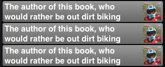
I’ve dragged a generic UIView into the prototype cell in the storyboard, set its class to MyGradientBackView, and hooked the cell’s backgroundView outlet to it. The cell’s Identifier in the storyboard is @"Cell". Here is the entire implementation of my root view controller:
- (NSInteger)numberOfSectionsInTableView:(UITableView *)tableView {
    return 1;
}
- (NSInteger)tableView:(UITableView *)tableView
        numberOfRowsInSection:(NSInteger)section {
    return 20;
}
- (UITableViewCell *)tableView:(UITableView *)tableView
         cellForRowAtIndexPath:(NSIndexPath *)indexPath {
    MyCell *cell =
        (MyCell*)[tableView dequeueReusableCellWithIdentifier:@"Cell"
                                                 forIndexPath:indexPath];
    cell.theLabel.text =
        @"The author of this book, who would rather be out dirt biking";
    UIImage* im = [UIImage imageNamed:@"moi.png"];
    UIGraphicsBeginImageContextWithOptions(CGSizeMake(36,36), YES, 0.0);
    [im drawInRect:CGRectMake(0,0,36,36)];
    UIImage* im2 = UIGraphicsGetImageFromCurrentImageContext();
    UIGraphicsEndImageContext();
    cell.theImageView.image = im2;
    return cell;
}
There is no need to perform any one-time configuration on newly instantiated cells; they are completely configured in the nib. There is no need to register with the table view. And I can refer to the cell’s subviews using property names. In effect, all the code having to do with the form of the cells has been eliminated. We are left only with code having to do with the content of the table view itself — the actual data that it is intended to display. So far, we have bypassed this issue entirely; we are using a fixed number of table rows, and every cell displays the same content. Displaying real data is the subject of the next section.
The structure and content of the actual data portrayed in a table view comes from the data source, an object pointed to by the table view’s dataSource property and adopting the UITableViewDataSource protocol. The data source is thus the heart and soul of the table. What surprises beginners is that the data source operates not by setting the table view’s structure and content, but by responding on demand. The data source, qua data source, consists of a set of methods that the table view will call when it needs information. This architecture has important consequences for how you write your code, which can be summarized by these simple guidelines:
- Be ready
- Your data source cannot know when or how often any of these methods will be called, so it must be prepared to answer any question at any time.
- Be fast
- The table view is asking for data in real time; the user is probably scrolling through the table right now. So you mustn’t gum up the works; you must be ready to supply responses just as fast as you possibly can. (If you can’t supply a piece of data fast enough, you may have to skip it, supply a placeholder, and insert the data into the table later. This, however, may involve you in threading issues that I don’t want to get into here. I’ll give an example in Chapter 37.)
- Be consistent
- There are multiple data source methods, and you cannot know which one will be called at a given moment. So you must make sure your responses are mutually consistent at any moment. For example, a common beginner error is forgetting to take into account, in your data source methods, the possibility that the data might not be ready yet.
This may sound daunting, but you’ll be fine as long as you maintain an unswerving adherence to the principles of model–view–controller (Chapter 13). How and when you accumulate the actual data, and how that data is structured, is a model concern. Acting as a data source is a controller concern. So you can acquire and arrange your data whenever and however you like, just so long as when the table view actually turns to you and asks what to do, you can lay your hands on the relevant data rapidly and consistently. You’ll want to design the model in such a way that the controller can access any desired piece of data more or less instantly.
Another source of confusion for beginners is that methods are rather oddly distributed between the data source and the delegate, an object pointed to by the table view’s delegate property and adopting the UITableViewDelegate protocol; in some cases, one may seem to be doing the job of the other. This is not usually a cause of any real difficulty, because the object serving as data source will probably also be the object serving as delegate. Nevertheless, it is rather inconvenient when you’re consulting the documentation; you’ll probably want to keep the data source and delegate documentation pages open simultaneously as you work.
Note
If a table view’s contents are known beforehand, you can design the entire table, including the contents of individual cells, in a storyboard. This could be a reason for using a storyboard, even if your app has no main storyboard. I’ll give an example later in this chapter.
Like Katherine Hepburn in Pat and Mike, the basis of your success (as a data source) is your ability, at any time, to answer the Three Big Questions. The questions the table view will ask you are a little different from the questions Mike asks Pat, but the principle is the same: know the answers, and be able to recite them at any moment. Here they are:
- How many sections does this table have?
-
The table will call
numberOfSectionsInTableView:; respond with an integer. In theory you can sometimes omit this method, as the default response is1, which is often correct. However, I never omit it; for one thing, returning0is a good way to say that the table has no data, and will prevent the table view from asking any other questions. - How many rows does this section have?
-
The table will call
tableView:numberOfRowsInSection:. The table supplies a section number — the first section is numbered0— and you respond with an integer. In a table with only one section, of course, there is probably no need to examine the incoming section number. - What cell goes in this row of this section?
-
The table will call
tableView:cellForRowAtIndexPath:. The index path is expressed as an NSIndexPath; this is a sophisticated and powerful class, but you don’t actually have to know anything about it, because UITableView provides a category on it that adds two read-only properties —sectionandrow. Using these, you extract the requested section number and row number, and return a fully configured UITableViewCell, ready for display in the table view. The first row of a section is numbered0.
I have nothing particular to say about precisely how you’re going to fulfill these obligations. It all depends on your data model and what your table is trying to portray. The important thing is to remember that you’re going to be receiving an NSIndexPath specifying a section and a row, and you need to be able to lay your hands on the data corresponding to that slot now and configure the cell now. So construct your model, and your algorithm for consulting it in the Three Big Questions, accordingly.
For example, suppose our table is to list the names of the Pep Boys. Our data model might be an NSArray of string names. Our table has only one section. So our code might look like this:
- (NSInteger)numberOfSectionsInTableView:(UITableView *)tableView {
    if (!pep) // data not ready?
        return 0;
    return 1;
}
- (NSInteger)tableView:(UITableView *)tableView
        numberOfRowsInSection:(NSInteger)section {
    return [self.pep count];
}
- (UITableViewCell *)tableView:(UITableView *)tableView
         cellForRowAtIndexPath:(NSIndexPath *)indexPath {
    MyCell *cell =
        (MyCell*)[tableView dequeueReusableCellWithIdentifier:@"Cell"
                                                 forIndexPath:indexPath];
    cell.theLabel.text = (self.pep)[indexPath.row];
    return cell;
}
At this point you may be feeling some exasperation. You want to object: “But that’s trivial!” Exactly so! Your access to the data model should be trivial. That’s the sign of a data model that’s well designed for access by your table view’s data source. Your implementation of tableView:cellForRowAtIndexPath: might have some interesting work to do in order to configure the form of the cell, but accessing the actual data should be simple and boring.
For example, consider Figure 19.1. The actual code that fetches the data is trivial:
FPItem* item = self.parsedData.items[indexPath.row];
NSString* title = item.title;
NSString* blurb = item.blurbOfItem;
That’s all there is to it. And the reason why that’s all there is to it is that I’ve structured the data model to be ready for access in exactly this way. However, there then follow about thirty lines of code formatting the layout of the text within the cell. The format is elaborate; accessing the data is not.
Another important aspect of tableView:cellForRowAtIndexPath: is that, as I’ve already illustrated, your strategy will probably be to keep memory usage at a minimum by reusing cells.
Once a cell is no longer visible on the screen, it can be slotted into a row that is visible — with its portrayed data appropriately modified, of course! — so that no more than the number of simultaneously visible cells need to exist at any given moment. A table view is ready to implement this strategy for you; all you have to do is call dequeueReusableCellWithIdentifier:forIndexPath:. For any given identifier, you’ll be handed either a newly minted cell or a reused cell that previously appeared in the table view but is now no longer needed because it has scrolled out of view. The table view can maintain more than one cache of reusable cells; this could be useful if your table view contains more than one type of cell (where the meaning of the concept “type of cell” is pretty much up to you). This why you must name each cache, by attaching an identifier string to any cell that can be reused. All the examples in this chapter (and in this book, and in fact in every UITableView I’ve ever created) use just one cache and just one identifier.
To prove to yourself the efficiency of the cell-caching architecture, do something to differentiate newly instantiated cells from reused cells, and count the newly instantiated cells, like this:
- (NSInteger)numberOfSectionsInTableView:(UITableView *)tableView {
    return 1;
}

- (NSInteger)tableView:(UITableView *)tableView
        numberOfRowsInSection:(NSInteger)section {
    return 100;
}

- (UITableViewCell *)tableView:(UITableView *)tableView
         cellForRowAtIndexPath:(NSIndexPath *)indexPath {
    MyCell* cell =
        (MyCell*)[tableView dequeueReusableCellWithIdentifier:@"Cell"
                                                 forIndexPath:indexPath];
    if (!cell.backgroundView) {
        cell.backgroundView = [UIView new]
        NSLog(@"creating a new cell");
    }
    UILabel* lab = cell.theLabel;
    lab.text = [NSString stringWithFormat:@"This is row %i of section %i",
                indexPath.row, indexPath.section];
    return cell;
}
When we run this code and scroll through the table, every cell is numbered correctly, so there appear to be 100 cells. But the log messages show us that only 11 distinct cells are ever actually created.
If your tableView:cellForRowAtIndexPath: code configures the form of newly instantiated cells once (stage 4 in Example 21.1), you have to distinguish whether this cell is a newly instantiated cell; the whole idea is to avoid reconfiguring a reused cell. But when you provide a cell’s final individual configuration (stage 5 in Example 21.1), you do not know or care whether the cell is new or reused. Therefore, you should always configure everything about the cell that might need configuring. If you fail to do this, and if the cell is reused, you might be surprised when some aspect of the cell is left over from its previous use; similarly, if you fail to do this, and if the cell is new, you might be surprised when some aspect of the cell isn’t configured at all.
For example, in one of my apps that lists article titles in a table, there is a little loudspeaker icon that should appear in the cell only if there is a recording associated with this article. So I initially wrote this code:
if (item.enclosures && [item.enclosures count])
    cell.speaker.hidden = NO;
This turned out to be a mistake, because when a cell was reused, it had a visible loudspeaker icon if, in a previous incarnation, it had ever had a visible loudspeaker icon. The solution was to rewrite the logic to cover all possibilities, like this:
cell.speaker.hidden = !(item.enclosures && [item.enclosures count]);
You do get a sort of second bite of the cherry: there’s a delegate method, tableView:willDisplayCell:forRowAtIndexPath:, that is called for every cell just before it appears in the table. This is absolutely the last minute to configure a cell. But don’t misuse this method. You’re functioning as the delegate here, not the data source; you may set the final details of the cell’s appearance — as I mentioned earlier, this is a good place to set a cell’s background color if you don’t want it to come from the table’s background color — but you shouldn’t be consulting the data model at this point.
New in iOS 6 is an additional delegate method, tableView:didEndDisplayingCell:forRowAtIndexPath:. This tells you that the cell no longer appears in the interface and has become free for reuse. You could take advantage of this to tear down any resource-heavy customization of the cell (I’ll give an example in Chapter 37), or simply to prepare it somehow for subsequent reuse. (A UITableViewCell has a prepareForReuse method, but you’d need a subclass to override it, and in any case it arrives when the cell is about to be reused, whereas tableView:didEndDisplayingCell:forRowAtIndexPath: arrives much earlier, as soon as the cell is no longer being used.)
Your table data can be expressed as divided into sections. You might clump your data into sections for various reasons (and doubtless there are other reasons beyond these):
- You want to supply section headers (or footers, or both). This can clarify the presentation of your data by dividing the rows into groups. Also, a section header or footer can contain custom views, so it’s a place where you might put additional information or functional interface (such as a button the user can tap).
- You want to make navigation of the table easier by supplying an index down the right side. You can’t have an index without sections.
- You want to facilitate programmatic rearrangement of the table. For example, it’s very easy to hide or move an entire section at once, possibly with animation.
Note
Don’t confuse the section headers and footers with the header and footer of the table as a whole. The latter are view properties of the table view itself and are set through its properties tableHeaderView and tableFooterView, discussed earlier in this chapter.
The number of sections is determined by your reply to numberOfSectionsInTableView:. For each section, the table view will consult your data source and delegate to learn whether this section has a header or a footer, or both, or neither (the default).
The UITableViewHeaderFooterView class, new in iOS 6, is a UIView subclass intended specifically for use as the view of a header or footer; much like a table cell, it is reusable. It has the following properties:
-
textLabel - Label (UILabel) for displaying the text of the header or footer.
Warning
An additional label, the detailTextLabel, appears to be broken. I have never been able to make it appear. I suggest you just ignore it.
-
contentView -
A subview, the size of the header or footer. You can add subviews to it. If you do, you probably should not use the built-in
textLabel; thetextLabelis not inside thecontentViewand in a sense doesn’t belong to you. -
tintColor -
The label has, by default, a distinctive gradient. If the
tintColoris nil, this gradient is gray; setting thetintColorlets you change that. -
backgroundColor -
You’re not supposed to set the header or footer’s
backgroundColor; instead, set thebackgroundColorof itscontentView. This overrides thetintColor, removing the gradient. -
backgroundView -
Any view you want to assign. The
contentViewis in front of thebackgroundView, so an opaquecontentView.backgroundColorwill completely obscure thebackgroundView.
You can supply a header or footer in two ways:
- Header or footer string
-
You implement the data source method
tableView:titleForHeaderInSection:ortableView:titleForFooterInSection:(or both). Return nil to indicate that the given section has no header (or footer). Return a string to use it as the section’s header (or footer).Starting in iOS 6, the header or footer view itself is a UITableViewHeaderFooterView. It is reused (there will be only as many as needed for simultaneous display on the screen). By default, it has the gray gradient tint. The string you supply becomes its
textLabel.text. - Header or footer view
-
You implement the delegate method
tableView:viewForHeaderInSection:ortableView:viewForFooterInSection:(or both). The view you supply is used as the entire header or footer and is automatically resized to the table’s width and the section header or footer height. If the view you supply has subviews, be sure to set proper autoresizing or constraints, so that they’ll be positioned and sized appropriately when the view itself is resized.You are not required to return a UITableViewHeaderFooterView, but you will probably want to, in order to take advantage of reusability. To do so, the procedure is much like making a cell reusable. You register beforehand with the table view by calling
registerClass:forHeaderFooterViewReuseIdentifier:. To supply the reusable view, send the table viewdequeueReusableHeaderFooterViewWithIdentifier:; the result will be either a newly instantiated view or a reused view. You can then configure this view as desired.
Warning
The documentation lists a second way of registering a header or footer view for reuse — registerNib:forHeaderFooterViewReuseIdentifier:. Unfortunately, the nib editor’s Object library doesn’t include a UITableViewHeaderFooterView! This makes registerNib:forHeaderFooterViewReuseIdentifier: pretty much useless, because there’s no way to configure the view correctly in the nib.
Note
It is possible to implement both viewFor... and titleFor.... In that case, viewFor... is called first, and if it returns a UITableViewHeaderFooterView, titleFor... will set its textLabel.text.
In addition, two pairs of delegate methods permit you to perform final configurations on your header or footer views:
-
tableView:willDisplayHeaderView:forSection:
tableView:willDisplayFooterView:forSection: -
You can perform further configuration here, if desired. A useful possibility is to generate the default UITableViewHeaderFooterView by implementing
titleFor...and then tweak its form slightly here. These delegate methods are new in iOS 6, and are matched bytableView:didEndDisplayingHeaderView:forSection:andtableView:didEndDisplayingFooterView:forSection:. -
tableView:heightForHeaderInSection:
tableView:heightForFooterInSection: -
The runtime resizes your header or footer before displaying it. Its width will be the table view’s width; this is how you tell the runtime the height. The heights are the table view’s
sectionHeaderHeightandsectionFooterHeight(22 by default) if you don’t implement these methods; if you do implement these methods and you want to return the height as set by the table view, returnUITableViewAutomaticDimension.
Some lovely effects can be created by modifying a header or footer view, especially because they are further forward than the table cells. For example, a header with transparency shows the table cells as they scroll behind it; a header with a shadow casts that shadow on the adjacent table cell.
A table that is to have section headers or footers (or both) may require some advance planning in the formation of its data model. Just as with a table cell, a section title must be readily available so that it can be supplied quickly in real time. A structure that I commonly use is a pair of parallel arrays: an array of strings containing the section names, and an array of subarrays containing the data for each section.
For example, suppose we intend to display the names of all 50 US states in alphabetical order as the rows of a table view, and that we wish to divide the table into sections according to the first letter of each state’s name. I’ll prepare the data model by walking through the list of state names, creating a new section name and a new subarray when I encounter a new first letter:
NSString* s =
    [NSString stringWithContentsOfFile:
        [[NSBundle mainBundle] pathForResource:@"states" ofType:@"txt"]
                                      encoding:NSUTF8StringEncoding error:nil];
NSArray* states = [s componentsSeparatedByString:@"\n"];
self.sectionNames = [NSMutableArray array];
self.sectionData = [NSMutableArray array];
NSString* previous = @"";
for (NSString* aState in states) {
    // get the first letter
    NSString* c = [aState substringToIndex:1];
    // only add a letter to sectionNames when it's a different letter
    if (![c isEqualToString: previous]) {
        previous = c;
        [self.sectionNames addObject: [c uppercaseString]];
        // and in that case, also add a new subarray to our array of subarrays
        NSMutableArray* oneSection = [NSMutableArray array];
        [self.sectionData addObject: oneSection];
    }
    [[self.sectionData lastObject] addObject: aState];
}
The value of this preparatory dance is evident when we are bombarded with questions from the table view about cells and headers; supplying the answers is trivial:
- (NSInteger)numberOfSectionsInTableView:(UITableView *)tableView {
    return [self.sectionNames count];
}

- (NSInteger)tableView:(UITableView *)tableView
        numberOfRowsInSection:(NSInteger)section {
    return [(self.sectionData)[section] count];
}

- (UITableViewCell *)tableView:(UITableView *)tableView
         cellForRowAtIndexPath:(NSIndexPath *)indexPath {
    UITableViewCell *cell =
        [tableView dequeueReusableCellWithIdentifier:@"Cell"
                                        forIndexPath:indexPath];
    NSString* s = self.sectionData[indexPath.section][indexPath.row];
    cell.textLabel.text = s;
    return cell;
}

- (NSString *)tableView:(UITableView *)tableView
        titleForHeaderInSection:(NSInteger)section {
    return self.sectionNames[section];
}
Let’s modify that example to illustrate customization of a header view. I’ve already registered my header identifier in viewDidLoad:
[self.tableView registerClass:[UITableViewHeaderFooterView class]
     forHeaderFooterViewReuseIdentifier:@"Header"];
Now, instead of tableView:titleForHeaderInSection:, I’ll implement tableView:viewForHeaderInSection:. For completely new views, I’ll place my own label and an image view inside the contentView and give them their basic configuration; then I’ll perform individual configuration on all views, new or reused, very much like tableView:cellForRowAtIndexPath::
- (UIView *)tableView:(UITableView *)tableView
        viewForHeaderInSection:(NSInteger)section {
    UITableViewHeaderFooterView* h =
        [tableView dequeueReusableHeaderFooterViewWithIdentifier:@"Header"];
    if (![h.tintColor isEqual: [UIColor redColor]]) {
        h.tintColor = [UIColor redColor];
        UILabel* lab = [UILabel new];
        lab.tag = 1;
        lab.font = [UIFont fontWithName:@"Georgia-Bold" size:22];
        lab.textColor = [UIColor greenColor];
        lab.backgroundColor = [UIColor clearColor];
        [h.contentView addSubview:lab];
        UIImageView* v = [UIImageView new];
        v.tag = 2;
        v.backgroundColor = [UIColor blackColor];
        v.image = [UIImage imageNamed:@"us_flag_small.gif"];
        [h.contentView addSubview:v];
        lab.translatesAutoresizingMaskIntoConstraints = NO;
        v.translatesAutoresizingMaskIntoConstraints = NO;
        [h.contentView addConstraints:
         [NSLayoutConstraint
          constraintsWithVisualFormat:@"H:|-5-[lab(25)]-10-[v(40)]"
          options:0 metrics:nil views:@{@"v":v, @"lab":lab}]];
        [h.contentView addConstraints:
         [NSLayoutConstraint
          constraintsWithVisualFormat:@"V:|[v]|"
           options:0 metrics:nil views:@{@"v":v}]];
        [h.contentView addConstraints:
         [NSLayoutConstraint
          constraintsWithVisualFormat:@"V:|[lab]|"
           options:0 metrics:nil views:@{@"lab":lab}]];
    }
    UILabel* lab = (UILabel*)[h.contentView viewWithTag:1];
    lab.text = self.sectionNames[section];
    return h;
}
If your table view has the plain style, you can add an index down the right side of the table, which the user can tap to jump to the start of a section — helpful for navigating long tables. To generate the index, implement the data source method sectionIndexTitlesForTableView:, returning an NSArray of string titles to appear as entries in the index. This works even if there are no section headers. The index will appear only if the number of rows exceeds the table view’s sectionIndexMinimumDisplayRowCount property value; the default is 0 (not NSIntegerMax as claimed by the documentation), so the index is always displayed by default. You will want the index entries to be short — preferably just one character — because they will be partially obscuring the right edge of the table; plus, each cell’s content view will shrink to compensate, so you’re sacrificing some cell real estate.
For our list of state names, that’s trivial, as it should be:
- (NSArray *)sectionIndexTitlesForTableView:(UITableView *)tableView {
    return self.sectionNames;
}
Before iOS 6, there was no official way to modify the index’s appearance (such as the color of its entries). New in iOS 6, you can set the table view’s sectionIndexColor and sectionIndexTrackingBackgroundColor (the color that appears behind the index while the user’s finger is sliding over it).
Normally, there will be a one-to-one correspondence between the index entries and the sections; when the user taps an index entry, the table jumps to the start of the corresponding section. However, under certain circumstances you may want to customize this correspondence. For example, suppose there are 40 sections, but there isn’t room to display 40 index entries comfortably on the iPhone. The index will automatically curtail itself, omitting some index entries and inserting bullets to suggest the omission, but you might prefer to take charge of the situation by supplying a shorter index. In such a case, implement the data source method tableView:sectionForSectionIndexTitle:atIndex:, returning the index of the section to jump to for this section index. Both the section index title and its index are passed in, so you can use whichever is convenient.
Apple’s documentation elaborates heavily on the details of implementing the model behind a table with an index and suggests that you rely on a class called UILocalizedIndexedCollation. This class is effectively a way of generating an ordered list of letters of the alphabet, with methods for helping to sort an array of strings and separate it into sections. This might be useful if you need your app to be localized, because the notion of the alphabet and its order changes automatically depending on the user’s preferred language. But this notion is also fixed; you can’t readily use a UILocalizedIndexCollation to implement your own sort order. For example, UILocalizedIndexCollation was of no use to me in writing my Greek and Latin vocabulary apps, in which the Greek words must be sorted, sectioned, and indexed according to the Greek alphabet, and the Latin words use a reduced version of the English alphabet (no initial J, K, or V through Z). Thus I’ve never actually bothered to use UILocalizedIndexedCollation.
The table view has no direct connection to the underlying data. If you want the table view display to change because the underlying data have changed, you have to cause the table view to refresh itself; basically, you’re requesting that the Three Big Questions be asked all over again. At first blush, this seems inefficient (“regenerate all the data??”); but it isn’t. Remember, in a table that caches reusable cells, there are no cells of interest other than those actually showing in the table at this moment. Thus, having worked out the layout of the table through the section header and footer heights and row heights, the table has to regenerate only those cells that are actually visible.
You can cause the table data to be refreshed using any of several methods:
-
reloadData - The table view will ask the Three Big Questions all over again, including section headers and footers, and index entries.
-
reloadRowsAtIndexPaths:withRowAnimation: -
The table view will ask the Three Big Questions all over again, including section headers and footers, but not index entries. The first parameter is an array of index paths; to form an index path, use the NSIndexPath class method
indexPathForRow:inSection:. -
reloadSections:withRowAnimation: - The table view will ask the Three Big Questions all over again, including section headers and footers, but not index entries. The first parameter is an NSIndexSet (see Chapter 10).
The second two methods can perform animations that cue the user as to what’s changing. The withRowAnimation: parameter is one of the following:
-
UITableViewRowAnimationFade - The old fades into the new.
-
UITableViewRowAnimationRight
UITableViewRowAnimationLeft
UITableViewRowAnimationTop
UITableViewRowAnimationBottom - The old slides out in the stated direction, and is replaced from the opposite direction.
-
UITableViewRowAnimationNone - No animation.
-
UITableViewRowAnimationMiddle - Hard to describe; it’s a sort of venetian blind effect on each cell individually.
-
UITableViewRowAnimationAutomatic - The table view just “does the right thing”. This is especially useful for grouped style tables, because if you pick the wrong animation, the display can look very funny as it proceeds.
If all you need to do is to refresh the index, call reloadSectionIndexTitles; this calls the data source’s sectionIndexTitlesForTableView:.
It is also possible to access and alter a table’s individual cells directly. This can be a far more lightweight approach to refreshing the table, plus you can supply your own animation within the cell as it alters its appearance. To do this, you need direct access to the cell you want to change. You’ll probably want to make sure the cell is visible within the table view’s bounds; if you’re taking proper advantage of the table’s reusable cell caching mechanism, nonvisible cells don’t really exist (except as potential cells waiting in the reuse cache), and there’s no point changing them, as they’ll be changed when they are scrolled into view, through the usual call to tableView:cellForRowAtIndexPath:. Here are some UITableView methods that mediate between cells, rows, and visibility:
-
visibleCells - An array of the cells actually showing within the table’s bounds.
-
indexPathsForVisibleRows - An array of the rows actually showing within the table’s bounds.
-
cellForRowAtIndexPath: - Returns a UITableViewCell if the table is maintaining a cell for the given row (typically because this is a visible row); otherwise, returns nil.
-
indexPathForCell: - Given a cell obtained from the table view, returns the row into which it is slotted.
It is important to bear in mind that the cells are not the data (view is not model). If you change the content of a cell manually, make sure that you have also changed the model corresponding to it, so that the row will appear correctly if its data is reloaded later.
By the same token, you can get access to the views constituting headers and footers, by calling headerViewForSection: or footerViewForSection: (new in iOS 6). Thus you could modify a view directly. There is no method for learning what header or footer views are visible, but you should assume that if a section is returned by indexPathsForVisibleRows, its header or footer might be visible.
Note
If you just need the table view laid out freshly without reloading any cells, send it beginUpdates immediately followed by endUpdates. This fetches the section header and footer titles or views, their heights, and the row heights, and is useful as a way of alerting the table that any of those things have changed. This is a misuse of an updates block; the real use of such a block is discussed later in this chapter. But Apple takes advantage of this trick in the Table View Animations and Gestures example, in which a pinch gesture is used to change a table’s row height in real time; so it must be legal.
iOS 6 introduces a new standard interface object for allowing the user to ask that a table view be refreshed — the UIRefreshControl. It is located at the top of the table view (above the table header view, if there is one), and is normally offscreen. To request a refresh, the user scrolls the table view downward to reveal the refresh control and holds there long enough to indicate that this scrolling is deliberate. The refresh control then acknowledges visually that it is refreshing, and remains visible until refreshing is complete. (This interface architecture, known as pull to refresh, was invented by Loren Brichter for the Twitter app and has become widespread in various clever implementations; with the UIRefreshControl, Apple is imitating and sanctioning this interface for the first time.)
Oddly, a UIRefreshControl is a property, not of a table view, but of a UITableViewController (its refreshControl). It is a control (UIControl, Chapter 25), so it has an action message, emitted for its UIControlEventValueChanged. You can give a table view controller a refresh control in the nib editor, but hooking up its action doesn’t work, so you have to do it in code:
-(void)viewDidLoad {
    [super viewDidLoad];
    [self.refreshControl addTarget:self action:@selector(doRefresh:)
                  forControlEvents:UIControlEventValueChanged];
}
Once a refresh control’s action message has fired, the control remains visible and indicates by animation (similar to an activity indicator) that it is refreshing until you send it the endRefreshing message. You can initiate a refresh animation in code with beginRefreshing, but this does not fire the action message or display the refresh control; to display it, scroll the table view:
[self.tableView setContentOffset:CGPointMake(0,-44) animated:YES];
[self.refreshControl beginRefreshing];
// ... now actually do refresh, and later send endRefreshing
A refresh control also has a tintColor and an attributedString, which is displayed as a label below the activity indicator (on attributed strings, see Chapter 23). I use a refresh control and take advantage of its attributed string in the current version of the TidBITS News app to tell the user when the table was last refreshed (and then I scroll the table view just enough to reveal the label):
NSString* s = [df stringFromDate: [NSDate date]]; // df is an NSDateFormatter
self.refreshControl.attributedTitle =
    [[NSAttributedString alloc] initWithString:s
        attributes: @{NSForegroundColorAttributeName:[UIColor whiteColor]}];
[self.tableView setContentOffset:CGPointMake(0,-21) animated:YES];
Most tables have rows that are all the same height, as set by the table view’s rowHeight. However, the delegate’s tableView:heightForRowAtIndexPath: can be used to make different rows different heights. You can see this in the TidBITS News app; look at Figure 19.1, where the first cell is shorter than the second cell (because the headline is one line instead of two).
Here are some things to remember when implementing a table whose rows can have different heights:
- Avoid performance limits
- Variable row heights work best if the table is short and simple (not too many rows). The table view must effectively lay out the entire table in order to load the data and in order at any moment to know the size and offset of the scrolling content. With a table consisting of a large number of rows, this can become too much information for the table to manipulate fast enough as the user scrolls.
- Lay out subviews correctly
-
As a cell is reused, its height may be changed, because the new row into which it is to be slotted is a different height from the old row. Similarly, if the cell comes from a nib, its height in the table view may be changed from its height in the nib. This will expose any weaknesses in your practice for laying out subviews. For example, a mistake in the
autoresizingMaskvalue of subviews can result in display errors that would not have been exposed if all the rows were the same height. You may have to resort to manual layout (implementinglayoutSubviewsin a UITableViewCell subclass); alternatively, constraints can be a big help here. - Plan ahead
- You (the delegate) are going to be asked for all the heights of all the rows well before you (the data source) are called upon to provide the data for any individual rows. You will want to provide this information quickly and accurately. So you will have to plan how the data will appear in every row before actually causing the data to appear in any row.
This can be a little tricky, because you have to figure out how much room your interface objects will occupy given the contents they’ll actually have when they appear in the table. For example, I face this problem in my Albumen app, in a table where each cell displays a song’s title (in a label) and the song’s artist (in another label). These labels will be displayed one above the other; I want each of them to be just tall enough to contain its content, and the cell to be just tall enough to contain the labels plus some reasonable spacing. What we need is a way to ask a UILabel, “How tall would you be if you contained this text?”
Fortunately there’s a way to do that — two ways, actually. We could send a UILabel the sizeThatFits: message, handing it a size that represents its actual maximum width and an excessively tall height. Equivalently, we could send the label’s string the sizeWithFont:constrainedToSize: message; this works because we are guaranteed that a UILabel will draw its text the same way that text would draw itself. It happens that I use the latter method.
I start with a utility method, labelHeightsForRow:, that calculates the heights of both labels given their text and font. Note that this method must be able to consult the data model, to learn what the text will be for each label, and it must know in advance the width and font of each label:
- (NSArray*) labelHeightsForRow: (NSInteger) row {
    NSString* title = (self.titles)[row];
    NSString* artist = (self.artists)[row];
    // values used in next two lines have been cached as ivars at load time
    CGSize tsz = [title sizeWithFont:self.titleFont
                  constrainedToSize:CGSizeMake(_tw, 4000)];
    CGSize asz = [artist sizeWithFont:self.artistFont
                  constrainedToSize:CGSizeMake(_aw, 4000)];
    return @[@(tsz.height), @(asz.height)];
}
My tableView:heightForRowAtIndexPath: implementation can then call labelHeightsForRow:, using those heights, along with some #defined spacer values, to work out the total height of any requested cell:
- (CGFloat)tableView:(UITableView *)tableView
        heightForRowAtIndexPath:(NSIndexPath *)indexPath {
    NSArray* arr = [self labelHeightsForRow: indexPath.row];
    return ([arr[0] floatValue] + [arr[1] floatValue] +
            _topspace + _midspace + _thirdrow + _midspace + _bottomspace);
}
My tableView:willDisplayCell:forRowAtIndexPath: implementation calls labelHeightsForRow: again, using those same calculated heights again and the same #defined spacer values again; the difference is that this time it actually lays out all the subviews of the content view:
- (void) tableView:(UITableView *)tableView
        willDisplayCell:(UITableViewCell *)cell
        forRowAtIndexPath:(NSIndexPath *)indexPath {
    // work out heights of views 1 and 2, origin.y of views 1, 2, 3, 4
    CGRect f = cell.frame;
    f.size.height =
        [self tableView: tableView heightForRowAtIndexPath: indexPath];
    cell.frame = f;
    NSArray* arr = [self labelHeightsForRow: indexPath.row];
    //
    CGRect f1 = [cell viewWithTag: 1].frame;
    f1.size.height = [arr[0] floatValue];
    f1.origin.y = _topspace;
    [cell viewWithTag: 1].frame = f1;
    //
    CGRect f2 = [cell viewWithTag: 2].frame;
    f2.size.height = [arr[1] floatValue];
    f2.origin.y = f1.origin.y + f1.size.height + _midspace;
    [cell viewWithTag: 2].frame = f2;
    // ... and so on ...
}
This works, but there’s something depressing about all that painstakingly calculated layout. When autolayout and constraints came along, I was filled with hope. Instead of calculating the heights myself, surely I could fill a cell with its actual values and let the autolayout system work out the cell’s height based on its internal constraints. The key method here is systemLayoutSizeFittingSize:; sent to a view, it tells the view to adopt the given size, to the extent that its internal constraints will allow.
So here’s my new strategy. I have a new utility method setUpCell:forIndexPath: that assigns all labels in my cell their actual values for the given row. I know that tableView:heightForRowAtIndexPath: will be called first, so the first time it’s called, I call my utility method for all the cells in the table. For each cell, I thus populate the labels; I then use autolayout to get the height of each resulting cell; and I store those heights in an array, from which I can instantly draw the answer to all subsequent calls to tableView:heightForRowAtIndexPath::
- (CGFloat)tableView:(UITableView *)tableView
        heightForRowAtIndexPath:(NSIndexPath *)indexPath {
    if (!self.heights) {
        // first time! determine all heights once for all
        NSMutableArray* marr = [NSMutableArray array];
        NSArray* objects = [[UINib nibWithNibName:@"TrackCell" bundle:nil]
                            instantiateWithOwner:nil options:nil];
        UITableViewCell* cell = objects[0];
        NSInteger u = [self.titles count];
        for (NSInteger i = 0; i < u; i++) {
            [self setUpCell:cell forIndexPath:
                [NSIndexPath indexPathForRow:i inSection:0]];
            CGSize sz = [cell
                systemLayoutSizeFittingSize:UILayoutFittingCompressedSize];
            [marr addObject: @(sz.height)];
        };
        self.heights = marr;
    }
    return [self.heights[indexPath.row] floatValue];
}
In tableView:cellForRowAtIndexPath:, I call setUpCell:forIndexPath: again, secure in the knowledge that the cell height, the label contents, and the constraints will work exactly the same way as before. This is far more satisfying, but unfortunately the use of systemLayoutSizeFittingSize: makes this approach noticeably slower than the old manual layout way.
A table view cell has a normal state, a highlighted state (according to its highlighted property), and a selected state (according to its selected property). It is possible to change these states directly (possibly with animation, using setHighlighted:animated: or setSelected:animated:), but you don’t want to act behind the table’s back, so you are more likely to manage selection through the table view, letting the table view manage and track the state of its cells.
These two states are closely related. In particular, when a cell is selected, it propagates the highlighted state down through its subviews by setting each subview’s highlighted property if it has one. That is why a UILabel’s highlightedTextColor applies when the cell is selected. Similarly, a UIImageView (such as the cell’s imageView) can have a highlightedImage that is shown when the cell is selected, and a UIControl (such as a UIButton) takes on its highlighted state when the cell is selected.
One of the chief purposes of your table view is likely to be to let the user select a cell. This will be possible, provided you have not set the value of the table view’s allowsSelection property to NO. The user taps a normal cell, and the cell switches to its selected state. As we’ve already seen, this will usually mean that the cell is redrawn with a blue (or gray) background view, but you can change this. If the user taps an already selected cell, by default it stays selected.
Table views can permit the user to select multiple cells simultaneously. Set the table view’s allowsMultipleSelection property to YES. If the user taps an already selected cell, by default it is deselected.
Your code can also learn and manage the selection through these UITableView instance methods:
-
indexPathForSelectedRow
indexPathsForSelectedRows -
These methods report the currently selected row(s), or nil if there is no selection. Don’t accidentally call the wrong one. For example, calling
indexPathForSelectedRowwhen the table view allows multiple selection gives a result that will have you scratching your head in confusion. (As usual, I speak from experience.) -
selectRowAtIndexPath:animated:scrollPosition: -
The animation involves fading in the selection, but the user may not see this unless the selected row is already visible. The last parameter dictates whether and how the table view should scroll to reveal the newly selected row:
-
UITableViewScrollPositionTop -
UITableViewScrollPositionMiddle -
UITableViewScrollPositionBottom -
UITableViewScrollPositionNone
For the first three options, the table view scrolls (with animation, if the second parameter is YES) so that the selected row is at the specified position among the visible cells. For
UITableViewScrollPositionNone, the table view does not scroll; if the selected row is not already visible, it does not become visible. -
-
deselectRowAtIndexPath:animated: -
Deselects the given row (if it is selected); the optional animation involves fading out the selection. No automatic scrolling takes place. To deselect all currently selected rows, call
selectRowAtIndexPath:animated:scrollPosition:with a nil index path.
Note
Reloading a cell’s data also deselects that cell.
Response to user selection is through the table view’s delegate:
-
tableView:shouldHighlightRowAtIndexPath:(new in iOS 6) -
tableView:didHighlightRowAtIndexPath:(new in iOS 6) -
tableView:didUnhighlightRowAtIndexPath:(new in iOS 6) -
tableView:willSelectRowAtIndexPath: -
tableView:didSelectRowAtIndexPath: -
tableView:willDeselectRowAtIndexPath: -
tableView:didDeselectRowAtIndexPath:
Despite their names, the two “will” methods are actually “should” methods and expect a return value: return nil to prevent the selection (or deselection) from taking place; return the index path handed in as argument to permit the selection (or deselection), or a different index path to cause a different cell to be selected (or deselected). The new “highlight” methods are more sensibly named, and they arrive first, so you can return NO from tableView:shouldHighlightRowAtIndexPath: to prevent a cell from being selected.
When the user taps a cell, the cell passes through a complete “highlight” cycle before starting the “select” methods, like this (assuming that all stages are permitted to happen normally):
- The user’s finger goes down. The cell highlights, which propagates to its subviews.
- There is a redraw moment. Thus, the user will see the cell as highlighted, regardless of what happens next.
- The user lifts the finger. The cell unhighlights, which also propagates to its subviews. But the user doesn’t see this, because the next redraw moment hasn’t come yet.
- The cell is selected; the cell is now not highlighted, but it manually propagates highlighting down to its subviews anyway.
- There’s another redraw moment. The user now sees the cell as highlighted.
When tableView:willSelectRowAtIndexPath: is called because the user taps a cell, and if this table view permits only single cell selection, tableView:willDeselectRowAtIndexPath: will be called subsequently for any previously selected cells.
Here’s an example of implementing tableView:willSelectRowAtIndexPath:. The default behavior for allowsSelection (not multiple selection) is that the user can select by tapping, and the cell remains selected; if the user taps a selected row, the selection does not change. We can alter this so that tapping a selected row deselects it:
- (NSIndexPath*) tableView:(UITableView*)tv
        willSelectRowAtIndexPath:(NSIndexPath*)ip {
    if ([tv cellForRowAtIndexPath:ip].selected) {
        [tv deselectRowAtIndexPath:ip animated:NO];
        return nil;
    }
    return ip;
}
An extremely common response to user selection is navigation. A master–detail architecture is typical: the table view lists things the user can see in more detail, and a tap replaces the table view with the detailed view of the selected thing. Very often the table view will be in a navigation interface, and you will respond to user selection by creating the detail view and pushing it onto the navigation controller’s stack. This interface is so common that Xcode’s Master–Detail Application project template implements it for you — and in a storyboard, if a segue emanates from a UITableViewCell, the storyboard assumes that you want the segue to be triggered when the user selects a cell.
For example, here’s the code from my Albumen app that navigates from the list of albums to the list of songs in the album that the user has tapped:
- (void) tableView:(UITableView *)tableView
        didSelectRowAtIndexPath:(NSIndexPath *)indexPath {
    TracksViewController *t =
        [[TracksViewController alloc]
            initWithMediaItemCollection:(self.albums)[indexPath.row]];
    [self.navigationController pushViewController:t animated:YES];
}
If you’re using a UITableViewController, then by default, whenever the table view appears, the selection is cleared automatically in viewWillAppear: (unless you disable this by setting the table view controller’s clearsSelectionOnViewWillAppear to NO), and the scroll indicators are flashed in viewDidAppear:. I sometimes prefer to set clearsSelectionOnViewWillAppear to NO and implement deselection in viewDidAppear:; the effect is that when the user returns to the table, the row is still momentarily selected before it deselects itself:
- (void) viewDidAppear:(BOOL)animated {
    // deselect selected row
    [tableView selectRowAtIndexPath:nil animated:NO
        scrollPosition:UITableViewScrollPositionNone];
    [super viewDidAppear:animated];
}
By convention, if selecting a table view cell causes navigation, the cell should be given an accessoryType of UITableViewCellAccessoryDisclosureIndicator. This is a plain gray right-pointing chevron at the right end of the cell. The chevron itself doesn’t respond to user interaction; it’s just a visual cue that we’ll “move to the right” if the user taps the cell.
An alternative accessoryType is UITableViewCellAccessoryDetailDisclosureButton. It is a button and does respond to user interaction, through your implementation of the table view delegate’s tableView:accessoryButtonTappedForRowWithIndexPath:. The button has a right-pointing chevron, so once again you’d be likely to respond by navigating; in this case, however, you would probably use the button instead of selection as a way of letting the user navigate. A common convention is that selecting the cell as a whole does one thing and tapping the disclosure button does something else (involving navigation to the right). For example, in Apple’s Phone app, tapping a contact’s listing in the Recents table places a call to that contact, but tapping the disclosure button switches to that contact’s detail view.
Another use of cell selection is to implement a choice among cells, where a section of a table effectively functions as an iOS alternative to Mac OS X radio buttons. The table view usually has the grouped format. An accessoryType of UITableViewCellAccessoryCheckmark is typically used to indicate the current choice. Implementing radio-button behavior is up to you.
As an example, I’ll implement the interface shown in Figure 21.2. The table view has the grouped style, with two sections. The first section, with a “Size” header, has three mutually exclusive choices: “Easy,” “Normal,” and “Hard.” The second section, with a “Style” header, has two choices: “Animals” or “Snacks.”
This is a static table; its contents are known beforehand and won’t change. This means we can design the entire table, including the headers and the cells, in a storyboard. This requires that a UITableViewController subclass be instantiated from a storyboard. It’s worth doing this, even if your app doesn’t have a main storyboard, just to take advantage of the ability to design a static table without code! In the storyboard editor, you select the table and set its Content pop-up menu in the Attributes inspector to Static Cells. Then you can construct the entire table, including section header and footer text, and the content of each cell (Figure 21.6).
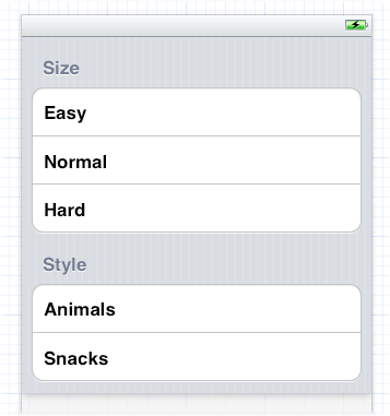
Even though each cell is designed initially in the storyboard, I can still implement tableView:cellForRowAtIndexPath: to call super and add further functionality. In this case, that’s how I’ll add the checkmarks. The user defaults are storing the current choice in each of the two categories; there’s a @"Size" preference and a @"Style" preference, each consisting of a string denoting the title of the chosen cell:
- (UITableViewCell *)tableView:(UITableView *)tv
         cellForRowAtIndexPath:(NSIndexPath *)indexPath {
    UITableViewCell* cell =
        [super tableView:tv cellForRowAtIndexPath:indexPath];
    NSUserDefaults* ud = [NSUserDefaults standardUserDefaults];
    cell.accessoryType = UITableViewCellAccessoryNone;
    if ([[ud valueForKey:@"Style"] isEqualToString:cell.textLabel.text] ||
        [[ud valueForKey:@"Size"] isEqualToString:cell.textLabel.text])
        cell.accessoryType = UITableViewCellAccessoryCheckmark;
    return cell;
}
When the user taps a cell, the cell is selected. I want the user to see that selection momentarily, as feedback, but then I want to remove that selection and adjust the checkmarks so that that cell is the only one checked in its section. The selection will be visible until the user’s finger is lifted, so I can take care of everything in tableView:didSelectRowAtIndexPath:; I set the user defaults, and then I reload the table view’s data to remove the selection and adjust the checkmarks:
- (void)tableView:(UITableView *)tv
        didSelectRowAtIndexPath:(NSIndexPath *)indexPath {
    NSUserDefaults* ud = [NSUserDefaults standardUserDefaults];
    NSString* setting = [tv cellForRowAtIndexPath:indexPath].textLabel.text;
    NSString* header =
        [self tableView:tv titleForHeaderInSection:indexPath.section];
    [ud setValue:setting forKey:header];
    [tv reloadData]; // deselect all cells, reassign checkmark as needed
}
A UITableView is a UIScrollView, so everything you already know about scroll views is applicable (Chapter 20). In addition, a table view supplies two convenience scrolling methods:
-
scrollToRowAtIndexPath:atScrollPosition:animated: -
scrollToNearestSelectedRowAtScrollPosition:animated:
The scrollPosition parameter is as for selectRowAtIndexPath:..., discussed earlier in this chapter.
The following UITableView methods mediate between the table’s bounds coordinates on the one hand and table structure on the other:
-
indexPathForRowAtPoint: -
indexPathsForRowsInRect: -
rectForSection: -
rectForRowAtIndexPath: -
rectForFooterInSection: -
rectForHeaderInSection:
The table’s header and footer are views, so their coordinates are given by their frames.
If a UITableView participates in state saving and restoration, the restoration mechanism would like to restore the selection and the scroll position. However, it would prefer not to do this on the basis of mere numbers — the table view’s contentOffset, or a row number — because what is meaningful in a table is not a number but the data being displayed. There is a possibility that when the app is relaunched, the underlying data may have been rearranged somehow; and the restoration mechanism would like to do the right thing nevertheless.
The problem is that the state saving and restoration mechanism doesn’t know anything about the relationship between the table cells and the underlying data. So you have to tell it. You adopt the UIDataSourceModelAssociation protocol and implement two methods:
-
modelIdentifierForElementAtIndexPath:inView: - Based on the index path, you return some string that you will later be able to use to identify uniquely this bit of model data.
-
indexPathForElementWithModelIdentifier:inView: - Based on the unique identifier you provided earlier, you return the index path at which this bit of model data is displayed in the table now.
Devising a system of unique identification and incorporating it into your data model is up to you. In the TidBITS News app, for example, it happens that my bits of data come from a parsed RSS feed and have a guid property that is a global unique identifier. So implementing the first method is easy:
- (NSString *) modelIdentifierForElementAtIndexPath:(NSIndexPath *)idx
                                             inView:(UIView *)view {
    FPItem* item = self.parsedData.items[idx.row];
    return item.guid;
}
Implementing the second method is a little more work; I walk the data model looking for the object whose guid matches the identifier in question, and construct its index path:
- (NSIndexPath*) indexPathForElementWithModelIdentifier:(NSString *)identifier
                                                 inView:(UIView *)view {
    __block NSIndexPath* path = nil;
    [self.parsedData.items
        enumerateObjectsUsingBlock:^(FPItem* item, NSUInteger idx, BOOL *stop)
    {
        if ([item.guid isEqualToString:identifier]) {
            path = [NSIndexPath indexPathForRow:idx inSection:0];
            *stop = YES;
        }
    }];
    return path;
}
It is crucial, when the app is relaunched, that the table should have data before that method is called, so I call reloadData in my implementation of decodeRestorableStateWithCoder:.
A table view is a common way to present the results of a search performed through a search field (a UISearchBar; see Chapter 25). This is such a standard interface, in fact, that a class is provided, UISearchDisplayController, to mediate between the search field where the user enters a search term and the table view listing the results of the search. The UISearchDisplayController needs the following things:
- A search bar
-
A UISearchBar in the interface. This will be the UISearchDisplayController’s
searchBar. - A view controller
-
The view controller managing the view in the interface over which the search results are to appear. This will be the UISearchDisplayController’s
searchContentsController. - A results table view
-
The table view in which the search results will be presented. This will be the UISearchDisplayController’s
searchResultsTableView. It can already exist, or the UISearchDisplayController will create it. - A data source and delegate for the results table view
-
The UISearchDisplayController’s
searchResultsDataSourceandsearchResultsDelegate. They will control the data and structure of the search results table. They are commonly the same object, as for any table view; moreover, they are commonly the view controller. - A delegate
- An optional object adopting the UISearchDisplayDelegate protocol. It will be notified of events relating to the display of results. It, too, is commonly the view controller.
Moreover, the UISearchBar itself can also have a delegate, and this, too, is commonly the view controller.
A UISearchDisplayController’s searchContentsController needn’t be a UITableViewController, and the data that the user is searching needn’t be the content of an existing table view. But they frequently are! That’s because the mental connection between a table and a search is a natural one; when the search results are presented as a table view, the user feels that the search field is effectively filtering the contents of the original table view. A single object may thus be playing all of the following roles:
- The searchable table view’s view controller
- The searchable table view’s data source
- The searchable table view’s delegate
- The view controller for the view over which the search results will appear
- The search results table view’s data source
- The search results table view’s delegate
- The UISearchDisplayController’s delegate
- The UISearchBar’s delegate
A common point of confusion among beginners, when using this architecture, is to suppose that the search bar is filtering the original table. It isn’t. The search bar and the UISearchDisplayController know nothing of your table. What’s being searched is just some data — whatever data you care to search. The fact that this may be the model data for your table is purely secondary. Moreover, there are two distinct tables: yours (the original table view) and the UISearchDisplayController’s (the search results table view). You own the former, just as you would if no search were involved; you probably have a view controller that manages it, very likely a UITableViewController whose tableView is this table. But the search results table is a completely different table; you do not have a view controller managing it (the UISearchDisplayController does), and in particular it is not your UITableViewController’s tableView. However, if you wish, you can make it look as if these are the same table, by configuring the two tables and their cells the same way — typically, with the same code.
To illustrate, we will implement a table view that is searchable through a UISearchBar and that displays the results of that search in a second table view managed by a UISearchDisplayController.
The first question is how to make the search field appear along with the table view. Apple’s own apps, such as the Contacts app, have popularized an interface in which the search field is the table view’s header view. Indeed, this is such a common arrangement that the nib editor’s Object library contains an object called Search Bar and Search Display Controller; if you drag this onto a UITableView in the nib editor, the search field becomes the table’s header view and a UISearchDisplayController is created for you automatically, with all properties hooked up appropriately through outlets, much as I just described. In our example, however, we’ll create the UISearchDisplayController and the UISearchBar in code.
Another feature of Apple’s standard interface is that the search field isn’t initially showing. To implement this, we’ll scroll to the first actual row of data when the table view appears.
We’re going to start with a table managed by a UITableViewController. In this view controller’s viewDidLoad, we create the search bar and slot it in as the table’s header view; we then load the data and scroll the header view out of sight. We also create the UISearchDisplayController and tie it to the search bar — and to ourselves (the UITableViewController) as the UISearchDisplayController’s controller, delegate, search table data source, and search table delegate, as well as making ourselves the UISearchBar delegate. We also retain the UISearchDisplayController by assigning it to a property, so that it doesn’t vanish in a puff of smoke before we can use it:
[super viewDidLoad];
[self.tableView registerClass:[UITableViewCell class]
       forCellReuseIdentifier:@"Cell"];
UISearchBar* b = [UISearchBar new];
[b sizeToFit];
b.delegate = self;
[self.tableView setTableHeaderView:b];
[self.tableView reloadData];
[self.tableView
    scrollToRowAtIndexPath:[NSIndexPath indexPathForRow:0 inSection:0]
    atScrollPosition:UITableViewScrollPositionTop animated:NO];
UISearchDisplayController* c =
    [[UISearchDisplayController alloc] initWithSearchBar:b
                                      contentsController:self];
self.sbc = c; // retain the UISearchDisplayController
c.delegate = self;
c.searchResultsDataSource = self;
c.searchResultsDelegate = self;
When the user initially taps in the search field, the UISearchDisplayController automatically constructs a new interface along with a nice animation. This indicates to the user that the search field is ready to receive input; when the user proceeds to enter characters into the search field, the UISearchDisplayController is ready to display its own search results table view in this interface. The UISearchBar has a Cancel button that the user can tap to dismiss the interface created by the UISearchDisplayController.
As the UISearchDisplayController’s table view comes into existence, we get a delegate message. We can take advantage of this to register with this new table for cell reusability:
- (void)searchDisplayController:(UISearchDisplayController *)controller
        didLoadSearchResultsTableView:(UITableView *)tableView {
    [tableView registerClass:[UITableViewCell class]
      forCellReuseIdentifier:@"Cell"];
}
This is also the place to perform any other initial configurations on the UISearchDisplayController’s table view. For example, if my viewDidLoad is setting my table view’s separator style to UITableViewCellSeparatorStyleNone, and if I want the two tables to look identical, this would be the place to set the UISearchDisplayController’s table view’s separator style to UITableViewCellSeparatorStyleNone as well.
Populating the search results table in response to what the user does in the UISearchBar is up to us. The UITableViewController is both data source and delegate for the original table view, as well as data source and delegate for the search results table. This means that our search is already almost working, because the search results table will automatically have the same data and structure as the original table! Our only additional task, beyond what our code already does, is to check whether the table view that’s talking to us is the search results table view (this will be the UISearchDisplayController’s searchResultsTableView) and, if it is, to limit our returned data with respect to the search bar’s text. The strategy for doing this should be fairly obvious if we are maintaining our source data in a sensible model.
Let’s say, for the sake of simplicity, that our original table is displaying the names of the 50 United States, which it is getting from an array of strings called states:
- (NSInteger)numberOfSectionsInTableView:(UITableView *)tableView {
    return 1;
}

- (NSInteger)tableView:(UITableView *)tableView
        numberOfRowsInSection:(NSInteger)section {
    NSArray* model = self.states;
    return [model count];
}

// Customize the appearance of table view cells.
- (UITableViewCell *)tableView:(UITableView *)tableView
        cellForRowAtIndexPath:(NSIndexPath *)indexPath {
    UITableViewCell *cell =
        [tableView dequeueReusableCellWithIdentifier:@"Cell"
                                        forIndexPath:indexPath];
    NSArray* model = self.states;
    cell.textLabel.text = model[indexPath.row];
    return cell;
}
To make this work with a UISearchDisplayController, the only needed change is this: Each time we speak of the NSArray called model, we must decide whether it should be self.states, as now, or whether it should be a different array that is filtered with respect to the current search — let’s call it self.filteredStates. There are two occurrences of this line:
NSArray* model = self.states;
They are now to be replaced by this:
NSArray* model =
    (tableView == self.sbc.searchResultsTableView) ?
    self.filteredStates : self.states;
The only remaining question is when and how this filteredStates array should be calculated. An excellent approach, given our small and readily available data set, is to generate a new set of search results every time the user types in the search field, effectively implementing a “live” search (Figure 21.7). We are informed of the user typing through a UISearchBar delegate method, searchBar:textDidChange:, so we implement this to filter the list of states. There is no need to reload the search results table’s data, as by default the UISearchDisplayController will do that automatically:
- (void)searchBar:(UISearchBar *)searchBar
        textDidChange:(NSString *)searchText {
    NSPredicate* p = [NSPredicate predicateWithBlock:
     ^BOOL(id obj, NSDictionary *d) {
         NSString* s = obj;
         return ([s rangeOfString:searchText
             options:NSCaseInsensitiveSearch].location != NSNotFound);
     }];
    self.filteredStates = [self.states filteredArrayUsingPredicate:p];
}
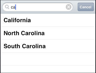
A UISearchBar can also display scope buttons, letting the user alter the meaning of the search. If you add these, then of course you must take them into account when filtering the model data. For example, let’s have two scope buttons, “Starts With” and “Contains”:
UISearchBar* b = [UISearchBar new];
[b sizeToFit];
b.scopeButtonTitles = @[@"Starts With", @"Contains"];
// ...
Our filtering routine must now take the state of the scope buttons into account. Moreover, the search results table view will reload when the user changes the scope (which we can detect in another UISearchBar delegate method, searchBar:selectedScopeButtonIndexDidChange:), so if we’re doing a live search, we must respond by filtering the data then as well. To prevent repetition, we’ll abstract the filtering routine into a method of its own:
- (void) filterData {
    NSPredicate* p = [NSPredicate predicateWithBlock:
     ^BOOL(id obj, NSDictionary *d) {
         NSString* s = obj;
         NSStringCompareOptions options = NSCaseInsensitiveSearch;
         if (self.sbc.searchBar.selectedScopeButtonIndex == 0)
             options |= NSAnchoredSearch;
         return ([s rangeOfString:self.sbc.searchBar.text
             options:options].location != NSNotFound);
     }];
    self.filteredStates = [self.states filteredArrayUsingPredicate:p];
}

- (void)searchBar:(UISearchBar *)searchBar
        textDidChange:(NSString *)searchText {
    [self filterData];
}

- (void)searchBar:(UISearchBar *)searchBar
        selectedScopeButtonIndexDidChange:(NSInteger)selectedScope {
    [self filterData];
}
Our search bar is initially scrolled out of sight. Let’s make it easier for the user to discover its existence and summon it. In an indexed list — one with sections and an index running down the right side — a “magnifying glass” search symbol can be made to appear in the index by including UITableViewIndexSearch (usually as the first item) in the string array returned from sectionIndexTitlesForTableView:. Presume once again that the section names are to be used as index entries and are in an array called sectionNames:
- (NSArray *)sectionIndexTitlesForTableView:(UITableView *)tableView {
    return [@[UITableViewIndexSearch]
        arrayByAddingObjectsFromArray:self.sectionNames];
}
You’ll also need to implement tableView:sectionForSectionIndexTitle:atIndex:, because now the correspondence between index entries and sections is off by one. If the user taps the magnifying glass in the index, you scroll to reveal the search field (and you’ll also have to return a bogus section number, but there is no penalty for that):
- (NSInteger)tableView:(UITableView *)tableView
        sectionForSectionIndexTitle:(NSString *)title
                            atIndex:(NSInteger)index {
    if (index == 0)
        [tableView scrollRectToVisible:tableView.tableHeaderView.frame
                              animated:NO];
    return index-1;
}
Here’s one final tweak. Whenever the search results table becomes empty (because the search bar is nonempty and filteredStates is nil), the words “No Results” appear superimposed on it. I find this incredibly obnoxious, and I can’t believe that after all these years Apple still hasn’t granted programmers an official way to remove or customize it. Here’s an unofficial way:
-(BOOL)searchDisplayController:(UISearchDisplayController *)controller
        shouldReloadTableForSearchString:(NSString *)searchString {
    dispatch_async(dispatch_get_main_queue(), ^(void){
        for (UIView* v in self.sbc.searchResultsTableView.subviews) {
            if ([v isKindOfClass: [UILabel class]] &&
                    [[(UILabel*)v text] isEqualToString:@"No Results"]) {
                [(UILabel*)v setText: @""];
                break;
            }
        }
    });
    return YES;
}
Note
A UISearchBar has many properties through which its appearance can be configured; I’ll discuss them in Chapter 25. Both the UISearchBar and UISearchDisplayController send their delegate numerous messages that you can take advantage of to customize behavior; consult the documentation. A UISearchBar in a UIToolbar on the iPad can display its results in a popover; I’ll talk about that in Chapter 22.
A table view cell has a normal state and an editing state, according to its editing property. The editing state is typically indicated visually by one or more of the following:
- Editing controls
- At least one editing control will usually appear, such as a minus button (for deletion) at the left side.
- Shrinkage
-
The content of the cell will usually shrink to allow room for an editing control. You can prevent a cell in a grouped-style table from shifting its left end rightward in editing mode by setting its
shouldIndentWhileEditingto NO, or with the table delegate’stableView:shouldIndentWhileEditingRowAtIndexPath:. - Changing accessory view
-
The cell’s accessory view will change automatically in accordance with its
editingAccessoryTypeoreditingAccessoryView. If you assign neither, so that they are nil, the cell’s accessory view will vanish when in editing mode.
As with selection, you could set a cell’s editing property directly (or use setEditing:animated: to get animation), but you are more likely to let the table view manage editability. Table view editability is controlled through the table view’s editing property, usually by sending the table the setEditing:animated: message. The table is then responsible for putting its cells into edit mode.
Note
A cell in edit mode can also be selected by the user if the table view’s allowsSelectionDuringEditing or allowsMultipleSelectionDuringEditing is YES. But this would be unusual.
Putting the table into edit mode is usually left up to the user. A typical interface would be an Edit button that the user can tap. In a navigation interface, we might have our view controller supply the button as the navigation item’s right button:
UIBarButtonItem* bbi =
    [[UIBarButtonItem alloc]
        initWithBarButtonSystemItem:UIBarButtonSystemItemEdit
                             target:self action:@selector(doEdit:)];
self.navigationItem.rightBarButtonItem = bbi;
Our action handler will be responsible for putting the table into edit mode, so in its simplest form it might look like this:
- (void) doEdit: (id) sender {
    [self.tableView setEditing:YES animated:YES];
}
But that does not solve the problem of getting out of editing mode. The standard solution is to have the Edit button replace itself by a Done button:
- (void) doEdit: (id) sender {
    int which;
    if (![self.tableView isEditing]) {
        [self.tableView setEditing:YES animated:YES];
        which = UIBarButtonSystemItemDone;
    } else {
        [self.tableView setEditing:NO animated:YES];
        which = UIBarButtonSystemItemEdit;
    }
    UIBarButtonItem* bbi = [[UIBarButtonItem alloc]
        initWithBarButtonSystemItem:which
                             target:self action:@selector(doEdit:)];
    self.navigationItem.rightBarButtonItem = bbi;
}
However, it turns out that all of this is completely unnecessary if we want standard behavior, as it’s already implemented for us! A UIViewController supplies an editButtonItem that calls the UIViewController’s setEditing:animated: when tapped, tracks whether we’re in edit mode with the UIViewController’s editing property, and changes its own title accordingly. Moreover, a UITableViewController’s implementation of setEditing:animated: is to call setEditing:animated: on its table view. Thus, if we’re using a UITableViewController, we get all of that behavior for free just by inserting the editButtonItem into our interface:
self.navigationItem.rightBarButtonItem = self.editButtonItem;
When the table view enters edit mode, it consults its data source and delegate about the editability of individual rows:
-
tableView:canEditRowAtIndexPath:to the data source - The default is YES. The data source can return NO to prevent the given row from entering edit mode.
-
tableView:editingStyleForRowAtIndexPath:to the delegate -
Each standard editing style corresponds to a control that will appear in the cell. The choices are:
-
UITableViewCellEditingStyleDelete - The cell shows a minus button at its left end. The user can tap this to summon a Delete button, which the user can then tap to confirm the deletion. This is the default.
-
UITableViewCellEditingStyleInsert - The cell shows a plus button at its left end; this is usually taken to be an insert button.
-
UITableViewCellEditingStyleNone - No editing control appears.
-
If the user taps an insert button (the plus button) or a delete button (the Delete button that appears after the user taps the minus button), the data source is sent the tableView:commitEditingStyle:forRowAtIndexPath: message and is responsible for obeying it. In your response, you will probably want to alter the structure of the table, and UITableView methods for doing this are provided:
-
insertRowsAtIndexPaths:withRowAnimation: -
deleteRowsAtIndexPaths:withRowAnimation: -
insertSections:withRowAnimation: -
deleteSections:withRowAnimation: -
moveSection:toSection: -
moveRowAtIndexPath:toIndexPath:
The row animations here are effectively the same ones discussed earlier in connection with refreshing table data; “left” for an insertion means to slide in from the left, and for a deletion it means to slide out to the left, and so on. The two “move” methods provide animation with no provision for customizing it.
If you’re issuing more than one of these commands, you can combine them by surrounding them with beginUpdates and endUpdates, forming an updates block. An updates block combines not just the animations but the requested changes themselves. This relieves you from having to worry about how a command is affected by earlier commands in the same updates block; indeed, order of commands within an updates block doesn’t really matter.
For example, if you delete row 1 of a certain section and then (in a separate command) delete row 2 of the same section, you delete two successive rows, just as you would expect; the notion “2” does not change its meaning because you deleted an earlier row first, because you didn’t delete an earlier row first — the updates block combines the commands for you, interpreting both index paths with respect to the state of the table before any changes are made. If you perform insertions and deletions together in one animation, the deletions are performed first, regardless of the order of your commands, and the insertion row and section numbers refer to the state of the table after the deletions.
An updates block can also include reloadRows... and reloadSections... commands (but not reloadData).
I need hardly emphasize once again (but I will anyway) that view is not model. It is one thing to rearrange the appearance of the table, another to alter the underlying data. It is up to you to make certain you do both together. Do not, even for a moment, permit the data and the view to get out of synch with each other. If you delete a row, remove from the model the datum that it represents. The runtime will try to help you with error messages if you forget to do this, but in the end the responsibility is yours. I’ll give examples as we proceed.
Deletion of table items is the default, so there’s not much for us to do in order to implement it. If our view controller is a UITableViewController and we’ve displayed the Edit button as its navigation item’s right button, everything happens automatically: the user taps the Edit button, the view controller’s setEditing:animated: is called, the table view’s setEditing:animated: is called, and the cells all show the minus button at the left end. The user can then tap a minus button; a Delete button appears at the cell’s right end. You can customize the Delete button’s title with the table delegate method tableView:titleForDeleteConfirmationButtonForRowAtIndexPath:.
What is not automatic is the actual response to the Delete button. For that, we need to implement tableView:commitEditingStyle:forRowAtIndexPath:. Typically, you’ll remove the corresponding entry from the underlying model data, and you’ll call deleteRowsAtIndexPaths:withRowAnimation: or deleteSections:withRowAnimation: to update the appearance of the table. As I said a moment ago, you must delete the row or section in such a way as to keep the table display coordinated with the model’s structure. Otherwise, the app may crash (with an extremely helpful error message).
To illustrate, let’s suppose once again that the underlying model is a pair of parallel arrays, an array of strings (sectionNames) and an array of arrays (sectionData). These arrays must now be mutable. Our approach will be in two stages:
- Deal with the model data. We’ll delete the requested row; if this empties the section array, we’ll also delete that section array and the corresponding section name.
-
Deal with the table’s appearance. If we deleted the section array, we’ll call
deleteSections:withRowAnimation:(and reload the section index if there is one); otherwise, we’ll calldeleteRowsAtIndexPaths:withRowAnimation::
- (void)tableView:(UITableView *)tableView
        commitEditingStyle:(UITableViewCellEditingStyle)editingStyle
         forRowAtIndexPath:(NSIndexPath *)ip {
    [self.sectionData[ip.section] removeObjectAtIndex:ip.row];
    if ([self.sectionData[ip.section] count] == 0) {
        [self.sectionData removeObjectAtIndex: ip.section];
        [self.sectionNames removeObjectAtIndex: ip.section];
        [tableView deleteSections:[NSIndexSet indexSetWithIndex: ip.section]
                 withRowAnimation:UITableViewRowAnimationAutomatic];
        [tableView reloadSectionIndexTitles];
    } else {
        [tableView deleteRowsAtIndexPaths:@[ip]
                         withRowAnimation:UITableViewRowAnimationAutomatic];
    }
}
The user can also delete a row by swiping it to summon its Delete button without having explicitly entered edit mode; no other row is editable, and no other editing controls are shown. This feature is implemented “for free” by virtue of our having supplied an implementation of tableView:commitEditingStyle:forRowAtIndexPath:. If you’re like me, your first response will be: “Thanks for the free functionality, Apple, and now how do I turn this off?” Because the Edit button is already using the UIViewController’s editing property to track edit mode, we can take advantage of this and refuse to let any cells be edited unless the view controller is in edit mode:
- (UITableViewCellEditingStyle)tableView:(UITableView *)aTableView
        editingStyleForRowAtIndexPath:(NSIndexPath *)indexPath {
    return self.editing ?
        UITableViewCellEditingStyleDelete : UITableViewCellEditingStyleNone;
}
A table item might have content that the user can edit directly, such as a UITextField (Chapter 23). Because the user is working in the view, you need a way to reflect the user’s changes into the model. This will probably involve putting yourself in contact with the interface objects where the user does the editing.
To illustrate, I’ll implement a table view cell with a text field that is editable when the cell is in editing mode. Imagine an app that maintains a list of names and phone numbers. A name and phone number are displayed as a grouped-style table, and they become editable when the user taps the Edit button (Figure 21.8).
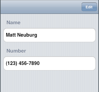
A UITextField is editable if its enabled is YES. To tie this to the cell’s editing state, it is probably simplest to implement a custom UITableViewCell class. I’ll call it MyCell, and I’ll design it in the nib, giving it a single UITextField that’s pointed to through a property called textField. In the code for MyCell, we override didTransitionToState:, as follows:
- (void) didTransitionToState:(UITableViewCellStateMask)state {
    [super didTransitionToState:state];
    if (state == UITableViewCellStateEditingMask) {
        self.textField.enabled = YES;
    }
    if (state == UITableViewCellStateDefaultMask) {
        self.textField.enabled = NO;
    }
}
In the table’s data source, we make ourselves the text field’s delegate when we create and configure the cell:
- (UITableViewCell *)tableView:(UITableView *)tableView
         cellForRowAtIndexPath:(NSIndexPath *)indexPath {
     MyCell* cell =
         (MyCell*)[tableView dequeueReusableCellWithIdentifier:@"Cell"
                                                  forIndexPath:indexPath];
     if (indexPath.section == 0)
         cell.textField.text = self.name;
     if (indexPath.section == 1) {
         cell.textField.text = self.numbers[indexPath.row];
         cell.textField.keyboardType = UIKeyboardTypeNumbersAndPunctuation;
     }
     cell.textField.delegate = self;
     return cell;
}
We are the UITextField’s delegate, so we are responsible for implementing the Return button in the keyboard to dismiss the keyboard:
- (BOOL)textFieldShouldReturn:(UITextField *)tf {
    [tf endEditing:YES];
    return NO;
}
When a text field stops editing, we are its delegate, so we can hear about it in textFieldDidEndEditing:. We work out which cell it belongs to, and update the model accordingly:
- (void)textFieldDidEndEditing:(UITextField *)tf {
    // some cell's text field has finished editing; which cell?
    UIView* v = tf;
    do {
        v = v.superview;
    } while (![v isKindOfClass: [UITableViewCell class]]);
    MyCell* cell = (MyCell*)v;
    // update data model to match
    NSIndexPath* ip = [self.tableView indexPathForCell:cell];
    if (ip.section == 1)
        self.numbers[ip.row] = cell.textField.text;
    else if (ip.section == 0)
        self.name = cell.textField.text;
}
You are unlikely to attach a plus (insert) button to every row. A more likely interface is that when a table is edited, every row has a minus button except the last row, which has a plus button; this shows the user that a new row can be inserted at the end of the table.
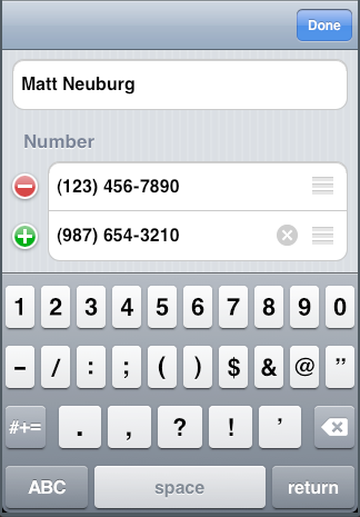
Let’s implement this for phone numbers in our name-and-phone-number app, allowing the user to give a person any quantity of phone numbers (Figure 21.9):
- (UITableViewCellEditingStyle)tableView:(UITableView *)tableView
           editingStyleForRowAtIndexPath:(NSIndexPath *)indexPath {
    if (indexPath.section == 1) {
        NSInteger ct =
            [self tableView:tableView numberOfRowsInSection:indexPath.section];
        if (ct-1 == indexPath.row)
            return UITableViewCellEditingStyleInsert;
        return UITableViewCellEditingStyleDelete;
    }
    return UITableViewCellEditingStyleNone;
}
The person’s name has no editing control (a person must have exactly one name), so we prevent it from indenting in edit mode:
- (BOOL)tableView:(UITableView *)tableView
        shouldIndentWhileEditingRowAtIndexPath:(NSIndexPath *)indexPath {
    if (indexPath.section == 1)
        return YES;
    return NO;
}
When the user taps an editing control, we must respond. We immediately force our text fields to cease editing: the user have may tapped the editing control while editing, and we want our model to contain the very latest changes, so this is effectively a way of causing our textFieldDidEndEditing: to be called. The model for our phone numbers is a mutable array of strings, numbers. We already know what to do when the tapped control is a delete button; things are similar when it’s an insert button, but we’ve a little more work to do. The new row will be empty, and it will be at the end of the table; so we append an empty string to the numbers model array, and then we insert a corresponding row at the end of the view. But now two successive rows have a plus button; the way to fix that is to reload the first of those rows. Finally, we also show the keyboard for the new, empty phone number, so that the user can start editing it immediately; we do that outside the update block:
- (void) tableView:(UITableView *)tableView
        commitEditingStyle:(UITableViewCellEditingStyle)editingStyle
        forRowAtIndexPath:(NSIndexPath *)indexPath {
    [tableView endEditing:YES];
    if (editingStyle == UITableViewCellEditingStyleInsert) {
        [self.numbers addObject: @""];
        NSInteger ct = [self.numbers count];
        [tableView beginUpdates];
        [tableView insertRowsAtIndexPaths:
         @[[NSIndexPath indexPathForRow: ct-1 inSection:1]]
                       withRowAnimation:UITableViewRowAnimationAutomatic];
        [self.tableView reloadRowsAtIndexPaths:
            @[[NSIndexPath indexPathForRow:ct-2 inSection:1]]
                          withRowAnimation:UITableViewRowAnimationAutomatic];
        [tableView endUpdates];
        // crucial that this next bit be *outside* the update block
        UITableViewCell* cell =
            [self.tableView cellForRowAtIndexPath:
                     [NSIndexPath indexPathForRow:ct-1 inSection:1]];
        [((MyCell*)cell).textField becomeFirstResponder];
    }
    if (editingStyle == UITableViewCellEditingStyleDelete) {
        [self.numbers removeObjectAtIndex:indexPath.row];
        [tableView beginUpdates];
        [tableView deleteRowsAtIndexPaths:@[indexPath]
                         withRowAnimation:UITableViewRowAnimationAutomatic];
        [tableView reloadSections:[NSIndexSet indexSetWithIndex:1]
                 withRowAnimation:UITableViewRowAnimationAutomatic];
        [tableView endUpdates];
    }
}
If the data source implements tableView:moveRowAtIndexPath:toIndexPath:, the table displays a reordering control at the right end of each row in editing mode (Figure 21.9), and the user can drag it to rearrange table items. The reordering control can be prevented for individual table items by implementing tableView:canMoveRowAtIndexPath:. The user is free to move rows that display a reordering control, but the delegate can limit where a row can be moved to by implementing tableView:targetIndexPathForMoveFromRowAtIndexPath:toProposedIndexPath:.
To illustrate, we’ll add to our name-and-phone-number app the ability to rearrange phone numbers. There must be multiple phone numbers to rearrange:
- (BOOL)tableView:(UITableView *)tableView
        canMoveRowAtIndexPath:(NSIndexPath *)indexPath {
    if (indexPath.section == 1 && [self.numbers count] > 1)
        return YES;
    return NO;
}
In our example, a phone number must not be moved out of its section, so we implement the delegate method to prevent this. We also take this opportunity to dismiss the keyboard if it is showing.
- (NSIndexPath *)tableView:(UITableView *)tableView
        targetIndexPathForMoveFromRowAtIndexPath:(NSIndexPath*)sourceIndexPath
        toProposedIndexPath:(NSIndexPath*)proposedDestinationIndexPath {
    [tableView endEditing:YES];
    if (proposedDestinationIndexPath.section == 0)
        return [NSIndexPath indexPathForRow:0 inSection:1];
    return proposedDestinationIndexPath;
}
After the user moves an item, tableView:moveRowAtIndexPath:toIndexPath: is called, and we trivially update the model to match. We also reload the table, to fix the editing controls:
- (void)tableView:(UITableView *)tableView
        moveRowAtIndexPath:(NSIndexPath *)fromIndexPath
               toIndexPath:(NSIndexPath *)toIndexPath {
    NSString* s = self.numbers[fromIndexPath.row];
    [self.numbers removeObjectAtIndex: fromIndexPath.row];
    [self.numbers insertObject:s atIndex: toIndexPath.row];
    [tableView reloadData];
}
We can rearrange a table not just in response to the user working in edit mode, but for some other reason entirely. In this way, many interesting and original interfaces are possible. In this example, we permit the user to double tap on a section header as a way of collapsing or expanding the section — that is, we’ll suppress or permit the display of the rows of the section, with a nice animation as the change takes place. (This idea is shamelessly stolen from a WWDC 2010 video.)
Presume that our data model once again consists of the two arrays, sectionNames and sectionData. I’ve also got an NSMutableSet, hiddenSections, in which I’ll list the sections that aren’t displaying their rows. That list is all I’ll need, since either a section is showing all its rows or it’s showing none of them:
- (NSInteger)tableView:(UITableView *)tableView
         numberOfRowsInSection:(NSInteger)section {
     if ([self.hiddenSections containsObject:@(section)])
         return 0;
     return [self.sectionData[section] count];
}
The section headers are a UITableViewHeaderFooterView with userInteractionEnabled set to YES and a UITapGestureRecognizer attached, so we can detect a double tap. Here’s how we respond to a double tap. We examine the tapped header to learn what section this is, and find out how many rows it has, as we’ll need to know that later, regardless of whether we’re about to show or hide rows. Then we look for the section number in our hiddenSections set. If it’s there, we’re about to display the rows, so we remove that section number from hiddenSections; now we work out the index paths of the rows we’re about to insert, and we insert them. If it’s not there, we’re about to hide the rows, so we insert that section number into hiddenSections; again, we work out the index paths of the rows we’re about to delete, and we delete them:
- (void) tap: (UIGestureRecognizer*) g {
    UITableViewHeaderFooterView* v = (id)g.view;
    NSString* s = v.textLabel.text;
    NSUInteger sec = [self.sectionNames indexOfObject:s];
    NSUInteger ct = [(NSArray*)(self.sectionData)[sec] count];
    NSNumber* secnum = @(sec);
    if ([self.hiddenSections containsObject:secnum]) {
        [self.hiddenSections removeObject:secnum];
        [self.tableView beginUpdates];
        NSMutableArray* arr = [NSMutableArray array];
        for (int ix = 0; ix < ct; ix ++) {
            NSIndexPath* ip = [NSIndexPath indexPathForRow:ix inSection:sec];
            [arr addObject: ip];
        }
        [self.tableView insertRowsAtIndexPaths:arr
            withRowAnimation:UITableViewRowAnimationAutomatic];
        [self.tableView endUpdates];
        [self.tableView scrollToRowAtIndexPath:[arr lastObject]
                              atScrollPosition:UITableViewScrollPositionNone
                                      animated:YES];
    } else {
        [self.hiddenSections addObject:secnum];
        [self.tableView beginUpdates];
        NSMutableArray* arr = [NSMutableArray array];
        for (int ix = 0; ix < ct; ix ++) {
            NSIndexPath* ip = [NSIndexPath indexPathForRow:ix inSection:sec];
            [arr addObject: ip];
        }
        [self.tableView deleteRowsAtIndexPaths:arr
            withRowAnimation:UITableViewRowAnimationAutomatic];
        [self.tableView endUpdates];
    }
}
It is possible to display a menu from a table view cell by performing a long press on the cell. A menu, in iOS, is a sort of balloon containing tappable words such as Copy, Cut, and Paste. And as far as I can tell, those are the only words you’ll be including in a table view cell’s menu; I tried to customize the menu to include other terms, but I failed.
To allow the user to display a menu from a table view’s cells, you implement three delegate methods:
-
tableView:shouldShowMenuForRowAtIndexPath: - Return YES if the user is to be permitted to summon a menu by performing a long press on this cell.
-
tableView:canPerformAction:forRowAtIndexPath:withSender: -
You’ll be called repeatedly with a bunch of selectors for various actions that the system knows about, but as far as I can tell, the only ones worth responding YES to are
cut:,copy:, andpaste:. Whichever ones you respond YES to will appear in the menu; returning YES, regardless, causes all three menu items to appear in the menu. The menu will now appear unless you return NO to all three actions. The sender is the shared UIMenuController, which I’ll discuss more in Chapter 23 and Chapter 39. -
tableView:performAction:forRowAtIndexPath:withSender: - The user has tapped one of the menu items; your job is to respond to it somehow.
Here’s an example where the user can summon a Copy menu from any cell (Figure 21.10):
- (BOOL)tableView:(UITableView *)tableView
        shouldShowMenuForRowAtIndexPath:(NSIndexPath *)indexPath {
    return YES;
}

- (BOOL)tableView:(UITableView *)tableView canPerformAction:(SEL)action
        forRowAtIndexPath:(NSIndexPath *)indexPath withSender:(id)sender {
    return (action == @selector(copy:));
}

- (void)tableView:(UITableView *)tableView performAction:(SEL)action
        forRowAtIndexPath:(NSIndexPath *)indexPath withSender:(id)sender {
    NSString* s = self.sectionData[indexPath.section][indexPath.row];
    if (action == @selector(copy:)) {
        // ... do whatever copying consists of ...
    }
}
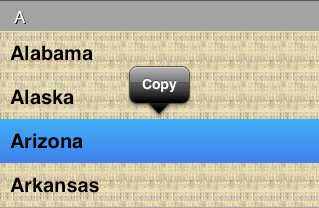
As Figure 21.10 shows, the long press gesture used to summon a menu also causes the pressed cell to assume its selected state — and hence its selected appearance. Moreover, tapping a menu item to choose it deselects the cell, even if it was previously selected; and tapping elsewhere, to dismiss the menu without choosing any menu item, may then select the cell under that tap. This interweaving of the ability to summon a menu with the cell selection mechanism is unfortunate, especially since Apple has not also provided any properties for detecting that menu display is occurring or for customizing what happens when it is.
A collection view (UICollectionView), new in iOS 6, is a UIScrollView subclass that generalizes the notion of a UITableView. Like a UITableView, you might well manage your collection view through a UIViewController subclass — a subclass of UICollectionViewController. Like a UITableView, a collection view has reusable cells — these are UICollectionViewCell instances, and are extremely minimal. Like a UITableView, you’ll make the cells reusable by registering with the collection view, by calling registerClass:forCellWithReuseIdentifier: or registerNib:forCellWithReuseIdentifier:, or, if you’ve started with a UICollectionViewController in a storyboard, just assign the reuse identifier in the storyboard. Like a UITableView, a collection view has a data source (UICollectionViewDataSource) and a delegate (UICollectionViewDelegate), and it’s going to ask the data source Three Big Questions:
-
numberOfSectionsInCollectionView: -
collectionView:numberOfItemsInSection: -
collectionView:cellForItemAtIndexPath:
To answer the third question, you’ll supply a cell by calling dequeueReusableCellWithReuseIdentifier:forIndexPath:.
As the Three Big Questions imply, you can present your data in sections. A section can have a header and footer, though the collection view itself does not call them that; instead, it generalizes its subview types into cells, on the one hand, and supplementary views, on the other, where a supplementary view is just a UICollectionReusableView, which happens to be UICollectionViewCell’s superclass. The user can select a cell, or multiple cells. The delegate is notified of highlighting and selection just like a table delegate. Your code can rearrange the cells, inserting, moving, and deleting cells or entire sections. If the delegate permits, the user can long-press a cell to produce a menu (with choices limited to Cut, Copy, and Paste).
In short, knowing about table views, you know a great deal about collection views already.
What you don’t know about a collection view is how it lays out its cells. A table view lays out its cells in just one way: a vertically scrolling column, where the cells are the width of the table view, the height dictated by the table view or the delegate, and touching one another. A collection view doesn’t do that. In fact, a collection view doesn’t lay out its cells at all! That job is left to another class, a subclass of UICollectionViewLayout. This class can effectively do anything it wants to do. The WWDC 2012 videos even demonstrate a UICollectionViewLayout that arranges its cells in a circle! The open-ended nature of collection view layout is what makes collection views so general.
To get you started, iOS 6 comes with one built-in UICollectionViewLayout subclass — UICollectionViewFlowLayout. It arranges its cells in something like a grid. The grid can be scrolled either horizontally or vertically, so this grid is a series of rows or columns. Through properties and a delegate (UICollectionViewDelegateFlowLayout), the UICollectionViewFlowLayout instance lets you provide hints about how big the cells are and how they should be spaced out. UICollectionViewFlowLayout also takes the collection view notion of a supplementary view and hones it to give you the expected notions of a header and a footer.
Figure 21.11 shows a collection view, laid out with a flow layout, from my Latin flashcard app. This interface simply lists the chapters and lessons into which the flashcards themselves are divided, and allows the user to jump to a desired lesson by tapping it. Previously, this was a table view; when iOS 6 came along, I instantly adopted a collection view instead, and you can see why. Instead of a lesson item like “1a” occupying an entire row that stretches the whole width of a table, it’s just a little rectangle; in landscape orientation, the flow layout fits five of these rectangles onto a line for me. So a collection view is a much more compact and appropriate way to present this interface than a table view.
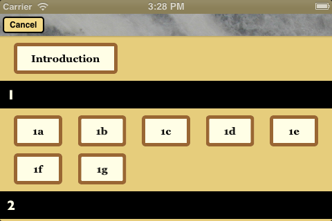
Here are the classes associated with UICollectionView. This is just a conceptual overview; I don’t recite all the properties and methods of each class, which you can learn from the documentation:
- UICollectionViewController
-
A UIViewController subclass. Like a table view controller, UICollectionViewController is convenient if a UICollectionView is to be a view controller’s view, but is not required. It is the delegate and data source of its
collectionViewby default. The initializer, if you create one in code, requires you to supply a layout instance for the collection view’s designated initializer:RootViewController* rvc = [[RootViewController alloc] initWithCollectionViewLayout:[UICollectionViewFlowLayout new]];Alternatively, there is a UICollectionViewController nib object.
- UICollectionView
-
A UIScrollView subclass. It has a
backgroundColor(because it’s a view) and optionally abackgroundViewin front of that. Its designated initializer requires you to supply a layout instance, which will be itscollectionViewLayout. There is a Collection View nib object.A collection view’s methods are very much parallel to those of a UITableView, only fewer and simpler:
-
Where a table view speaks of rows, a collection view speaks of items. UICollectionView even adds a category to NSIndexPath so that you can refer to its
itemproperty instead of itsrowproperty. - Where a table view speaks of a header or footer, a collection view speaks of a supplementary view.
- A UICollectionView doesn’t do layout, so it is not where things like header and cell size are configured.
- A UICollectionView has no notion of editing.
- A UICollectionView has no section index.
-
Where a table view batches updates with
beginUpdatesandendUpdates, a collection view usesperformBatchUpdates:completion:, which takes blocks. - A collection view performs animation when you insert, delete, or move sections or items, but you don’t specify an animation type. (The layout can modify the animation, however.)
Having made those mental adjustments, you can guess correctly all of a UICollectionView’s methods, except for
layoutAttributesForItemAtIndexPath:andlayoutAttributesForSupplementaryElementOfKind:atIndexPath:. To understand what they do, you need to know about UICollectionViewLayoutAttributes. -
Where a table view speaks of rows, a collection view speaks of items. UICollectionView even adds a category to NSIndexPath so that you can refer to its
- UICollectionViewLayoutAttributes
-
A UICollectionViewLayoutAttributes object is basically just a glorified struct, tying together a view’s index path within the collection view and the specifications for how it should be drawn — it’s
frame,center,size, and so forth. It is the mediator between the layout and the collection view, giving the collection view a way to learn from the layout where a particular item should go. - UICollectionViewCell
-
An extremely minimal view class. It has a
highlightedproperty and aselectedproperty. It has acontentView, aselectedBackgroundView, abackgroundView, and of course (since it’s a view) abackgroundColor, layered in that order, just like a table view cell; everything else is up to you.If you start with a collection view controller in a storyboard, you get prototype cells, just like a table view controller. Otherwise, you obtain cells through registration and dequeuing.
- UICollectionReusableView
- The superclass of UICollectionViewCell — so it is even more minimal! This is the class of supplementary views such as headers and footers. You obtain reusable views through registration and dequeuing.
- UICollectionViewLayout
-
The layout workhorse class for a collection view. A collection view cannot exist without a layout instance! It manages three types of subview (elements): cells, supplementary views, and decoration views. (A decoration view has no relation to data, which is why a collection view knows nothing of it.) The layout knows how much room all the subviews occupy, and supplies the
collectionViewContentSizethat sets thecontentSizeof the collection view, qua scroll view.The layout’s chief task is to answer questions about layout from the collection view. All of these questions are answered with a UICollectionViewLayoutAttributes object, or an NSArray of UICollectionViewLayoutAttributes objects, saying where and how something should be drawn. These questions come in two categories:
- Static attributes
- The collection view wants to know the layout attributes of an item, supplementary view, or decoration view, specified by index path, or of all elements within a given rect.
- Dynamic attributes
-
The collection view is inserting or removing elements. It asks for the layout attributes that an element, specified by index path, should have before insertion or after removal. The collection view can thus animate between the element’s static attributes and these dynamic attributes. For example, if an element’s layout attributes
alphais 0 after removal, the element will appear to fade away as it is removed.
The collection view also notifies the layout of pending changes through some methods whose names start with “prepare” and “finalize.” This is another way for the layout to participate in animations, or to perform other kinds of preparation and cleanup. (One of the “prepare” methods communicates its information through another glorified struct, UICollectionViewUpdateItem, that I don’t discuss here.)
UICollectionViewLayout is an abstract class; to use it, you must subclass it, or start with the built-in subclass, UICollectionViewFlowLayout.
- UICollectionViewFlowLayout
-
The included concrete subclass of UICollectionViewLayout; you can use it as is, or you can subclass it. A flow layout is easy to choose and configure as your collection view’s layout: a collection view in a nib or storyboard has a Layout pop-up menu that lets you choose a Flow layout, and you can configure the flow layout in the Size inspector (in a storyboard, you can even add and design a header and a footer).
Configuration of a flow layout is very simple. It has a scroll direction, a
sectionInset(the margins for a section), anitemSizealong with aminimumInteritemSpacingandminimumLineSpacing, and aheaderReferenceSizeandfooterReferenceSize. That’s all! At a minimum, if you want to see any section headers, you must assign the flow layout aheaderReferenceSize, because the default is CGSizeZero. Otherwise, you get initial defaults that will at least allow you to see something immediately, such as anitemSizeof{50,50}and reasonable default spacing between items and lines.The section margins, item size, item spacing, line spacing, and header and footer size can also be set individually through the flow layout’s delegate.
To show that using a collection view is easy, here’s how the view shown in Figure 21.11 is created. I have a UICollectionViewController subclass, LessonListController. Every collection view must have a layout, so LessonListController’s designated initializer initializes itself with a UICollectionViewFlowLayout:
- (id) initWithTerms: (NSArray*) data {
    UICollectionViewFlowLayout* layout = [UICollectionViewFlowLayout new];
    self = [super initWithCollectionViewLayout:layout];
    if (self) {
        // ... perform other self-initializations here ...
    }
    return self;
}
In viewDidLoad, we give the flow layout its hints about the sizes of the margins, cells, and headers, as well as registering for cell and header reusability:
- (void)viewDidLoad {
    [super viewDidLoad];
    UICollectionViewFlowLayout* layout =
        (id)self.collectionView.collectionViewLayout;
    layout.sectionInset = UIEdgeInsetsMake(10, 20, 10, 20);
    layout.headerReferenceSize = CGSizeMake(0,40); // only height matters
    layout.itemSize = CGSizeMake(70,45);

    [self.collectionView
        registerNib:[UINib nibWithNibName:@"LessonCell" bundle:nil]
        forCellWithReuseIdentifier:@"LessonCell"];
    [self.collectionView
        registerClass:[UICollectionReusableView class]
        forSupplementaryViewOfKind:UICollectionElementKindSectionHeader
        withReuseIdentifier:@"LessonHeader"];
    self.collectionView.backgroundColor = [UIColor myGolden];
    // ...
}
The first two of the Three Big Questions to the data source are boring and familiar:
-(NSInteger)numberOfSectionsInCollectionView:
        (UICollectionView *)collectionView {
    return [self.sectionNames count];
}

-(NSInteger)collectionView:(UICollectionView *)collectionView
        numberOfItemsInSection:(NSInteger)section {
    return [self.sectionData[section] count];
}
The third of the Three Big Questions to the data source creates and configures the cells. In the nib, I’ve designed the cell with a single subview, a UILabel with tag 1; if the text of the label is still @"Label", that is a sign that it has come freshly minted from the nib and needs further initial configuration. Among other things, I assign each new cell a selectedBackgroundView and give the label a highlightedTextColor, to get an automatic indication of selection:
- (UICollectionViewCell *)collectionView:(UICollectionView *)collectionView
        cellForItemAtIndexPath:(NSIndexPath *)indexPath {
    UICollectionViewCell* cell =
        [collectionView dequeueReusableCellWithReuseIdentifier:@"LessonCell"
                                                  forIndexPath:indexPath];
    UILabel* lab = (UILabel*)[cell viewWithTag:1];
    if ([lab.text isEqualToString:@"Label"]) {
        lab.highlightedTextColor = [UIColor whiteColor];
        cell.backgroundColor = [UIColor myPaler];
        cell.layer.borderColor = [UIColor brownColor].CGColor;
        cell.layer.borderWidth = 5;
        cell.layer.cornerRadius = 5;
        UIView* v = [UIView new];
        v.backgroundColor = [[UIColor blueColor] colorWithAlphaComponent:0.8];
        cell.selectedBackgroundView = v;
    }
    Term* term = self.sectionData[indexPath.section][indexPath.item];
    lab.text = term.lesson;
    return cell;
}
There is also a fourth data source method, asking for the section headers. I haven’t bothered to design the header in a nib, so I configure the entire thing in code. Again, I distinguish between newly minted views and reused views; the latter will already have a single subview, a UILabel:
-(UICollectionReusableView *)collectionView:(UICollectionView *)collectionView
          viewForSupplementaryElementOfKind:(NSString *)kind
                                atIndexPath:(NSIndexPath *)indexPath {
    UICollectionReusableView* v =
        [collectionView
            dequeueReusableSupplementaryViewOfKind:
                UICollectionElementKindSectionHeader
            withReuseIdentifier:@"LessonHeader"
                   forIndexPath:indexPath];
    // either we've already given this one a label or we haven't
    // if we haven't, create it and configure the whole thing
    if ([v.subviews count] == 0) {
        UILabel* lab = [[UILabel alloc] initWithFrame:CGRectMake(10,0,100,40)];
        lab.font = [UIFont fontWithName:@"GillSans-Bold" size:20];
        lab.backgroundColor = [UIColor clearColor];
        [v addSubview:lab];
        v.backgroundColor = [UIColor blackColor];
        lab.textColor = [UIColor myPaler];
    }
    UILabel* lab = (UILabel*)v.subviews[0];
    lab.text = self.sectionNames[indexPath.section];
    return v;
}
Two flow layout delegate methods cause the first section to be treated specially —it has no header, and its cell is wider:
- (CGSize)collectionView:(UICollectionView *)collectionView
        layout:(UICollectionViewLayout*)collectionViewLayout
        sizeForItemAtIndexPath:(NSIndexPath *)indexPath {
    CGSize sz = ((UICollectionViewFlowLayout*)collectionViewLayout).itemSize;
    if (indexPath.section == 0)
        sz.width = 150;
    return sz;
}

- (CGSize)collectionView:(UICollectionView *)collectionView
        layout:(UICollectionViewLayout*)collectionViewLayout
        referenceSizeForHeaderInSection:(NSInteger)section {
    CGSize sz =
        ((UICollectionViewFlowLayout*)collectionViewLayout).headerReferenceSize;
    if (section == 0)
        sz.height = 0;
    return sz;
}
That’s all there is to it! When the user taps a cell, I hear about it through the delegate method collectionView:didSelectItemAtIndexPath: and respond accordingly.
Without getting deeply into the mechanics of layout, I’ll introduce the topic by suggesting a modification of UICollectionViewFlowLayout. By default, the layout wants to full-justify every row of cells horizontally, spacing the cells evenly between the left and right margins, except for the last row, which is left-aligned. Let’s say that this isn’t what you want — you’d rather that every row be left-aligned, with every cell as far to the left as possible given the size of the preceding cell and the minimum spacing between cells.
To achieve this, you’ll need to subclass UICollectionViewFlowLayout and override two methods, layoutAttributesForElementsInRect: and layoutAttributesForItemAtIndexPath:. Fortunately, we’re starting with a layout, UICollectionViewFlowLayout, whose answers to these questions are almost right. So we call super and make modifications as necessary. The really important method here is layoutAttributesForItemAtIndexPath:, which returns a single UICollectionViewLayoutAttributes object. If the index path’s item is 0, we have a degenerate case: the answer we got from super is right. Alternatively, if this cell is at the start of a row — we can find this out by asking whether the left edge of its frame is close to the margin — we have another degenerate case: the answer we got from super is right.
Otherwise, where this cell goes depends on where the previous cell goes, so we obtain the frame of the previous cell recursively; we propose to position our left edge a minimal spacing amount from the right edge of the previous cell. We do that by changing the frame of the UICollectionViewLayoutAttributes object. Then we return that object:
- (UICollectionViewLayoutAttributes *)layoutAttributesForItemAtIndexPath:
        (NSIndexPath *)indexPath {
    UICollectionViewLayoutAttributes* atts =
        [super layoutAttributesForItemAtIndexPath:indexPath];
    if (indexPath.item == 0) // degenerate case
        return atts;
    if (atts.frame.origin.x - 1 <= self.sectionInset.left) // degenerate case
        return atts;

    NSIndexPath* ipPrev =
        [NSIndexPath indexPathForItem:indexPath.item-1
                            inSection:indexPath.section];
    CGRect fPrev = [self layoutAttributesForItemAtIndexPath:ipPrev].frame;
    CGFloat rightPrev =
        fPrev.origin.x + fPrev.size.width + self.minimumInteritemSpacing;
    CGRect f = atts.frame;
    f.origin.x = rightPrev;
    atts.frame = f;
    return atts;
}
The other method, layoutAttributesForElementsInRect:, returns an NSArray of UICollectionViewLayoutAttributes objects for all the cells and supplementary views in a rect. Again we call super and modify the resulting array so that if an element is a cell, its UICollectionViewLayoutAttributes is the result of our layoutAttributesForItemAtIndexPath::
- (NSArray *)layoutAttributesForElementsInRect:(CGRect)rect {
    NSArray* arr = [super layoutAttributesForElementsInRect:rect];
    for (UICollectionViewLayoutAttributes* atts in arr) {
        if (nil == atts.representedElementKind) { // it's a cell
            NSIndexPath* ip = atts.indexPath;
            atts.frame = [self layoutAttributesForItemAtIndexPath:ip].frame;
        }
    }
    return arr;
}
Apple supplies some further interesting examples of subclassing UICollectionViewFlowLayout. For instance, the LineLayout example (accompanying the WWDC 2012 videos) implements a single row of horizontally scrolling cells, where a cell grows as it approaches the center of the screen and shrinks as it moves away. To do this, it first of all overrides a UICollectionViewLayout method I didn’t mention earlier, shouldInvalidateLayoutForBoundsChange:; this causes layout to happen repeatedly while the collection view is scrolled. It then overrides layoutAttributesForElementsInRect: to do the same sort of thing I did a moment ago: it calls super and then modifies, as needed, the transform3D property of UICollectionViewLayoutAttributes for the onscreen cells. (It also overrides another UICollectionViewLayout method I didn't mention, targetContentOffsetForProposedContentOffset:withScrollingVelocity:, which is like UIScrollViewDelegate’s scrollViewWillEndDragging:withVelocity:targetContentOffset:. This is just a nice touch so that when the user scrolls, a cell always ends up exactly centered on the screen.)